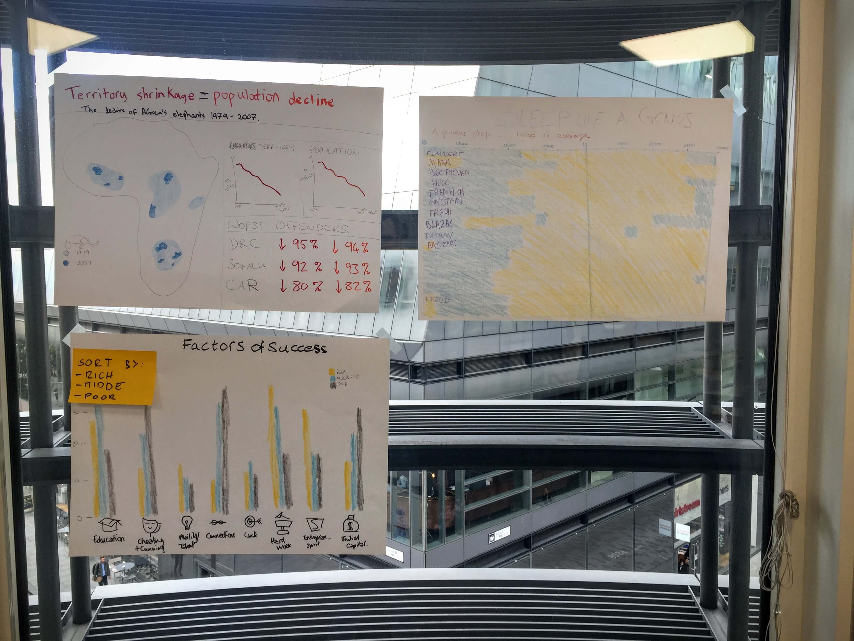
On day one of the data school, Andy emphasised the benefits of doing some fast sketches of data visualisations before getting to work in the software. Although tableau is extremely fast at building visualisations, the conceptual stage is still better suited to getting the wax crayons out. Here are three lessons that I learnt from our afternoon with the laptop shut:

Hand drawn charts from our first day at the data school.
- Choose your colours carefully: Red and green are difficult for colour blind people to distinguish and a surprising number of people are colour blind, 1 in 8 men and 1 in 200 women. Other combinations such as yellow on white are hard work for anyone to see. A great chart cannot be appreciated if it cannot be seen easily and if it is impossible to differentiate between colours important then a story could be missed entirely.
- Keep it simple. Stephen Few advocates avoiding chart junk at all cost and starting with pen and paper certainly encourages this approach. There is certainly no temptation to drop in some tacky clipart or chart backgrounds.
- Stand back to test. Standing back or zooming out from a chart can tell you how easy it is to understand. The perfect viz could be understood from space. If you need to squint at legends and labels to work out what’s going on then perhaps the chart is not clear enough.
Preparing for The Data School, I read Dear Data Two in which Jeffrey Shaffer and Andy Kriebel sent 52 hand-drawn visualisation postcards using data collected about their own life, such as transport use and sleep patterns. At the end of the project Andy’s conclusion was that “drawing visualisations makes you think differently.” In the next few months as I learn more skills in the software I plan to keep the discipline of spending part of each project with the screen off and felt tips out.
