For our first day of dashboard week(Producing a dashboard per day) , I worked on a project to highlight which London boroughs are underserved by step-free Underground stations. The brief was clear: produce a borough-level summary dashboard that could be used by a city planner at Transport for London, with accessibility at its core.
What Went Well
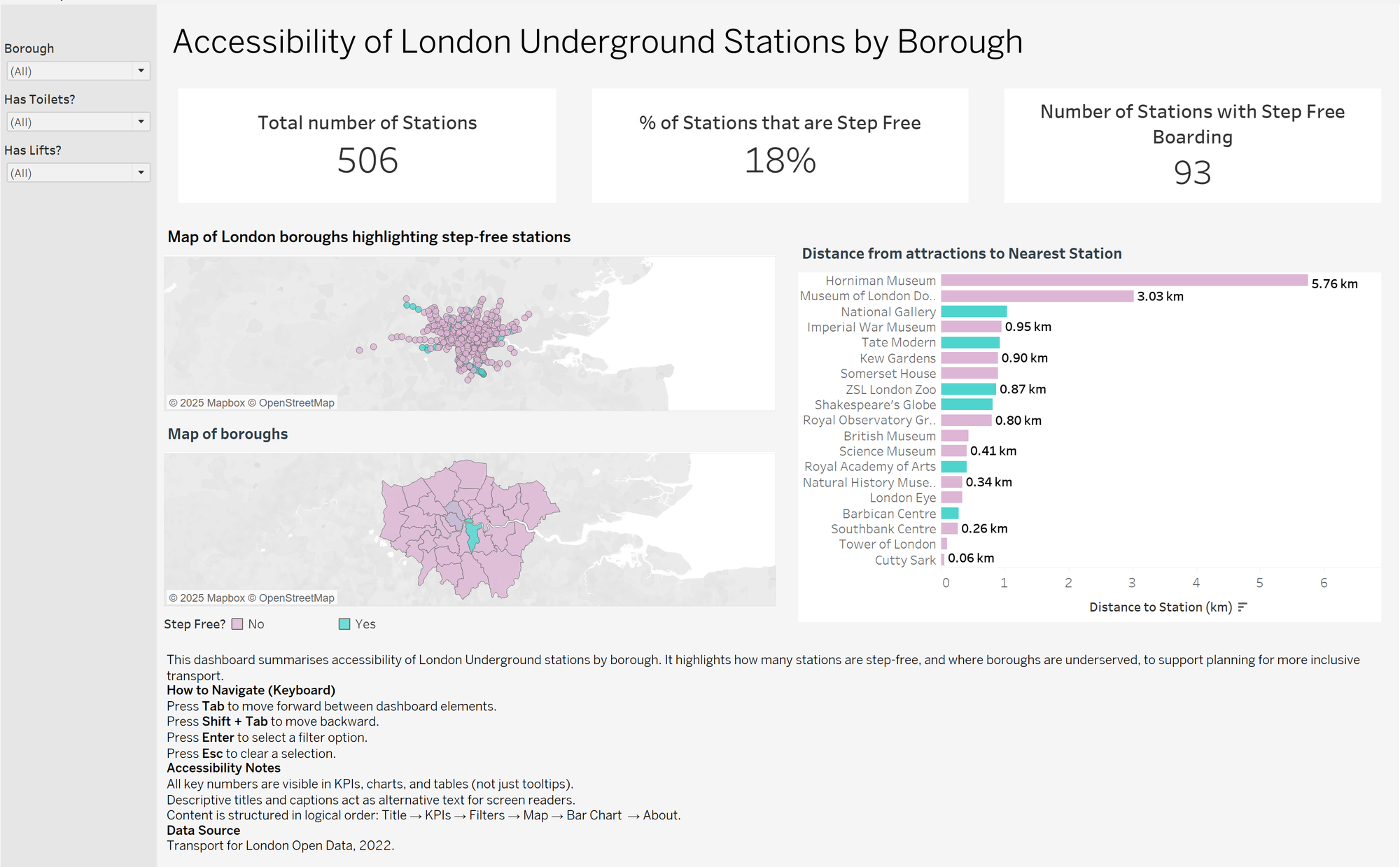
I was able to produce clear KPI cards showing the total number of stations, how many were step-free, and how many had lifts and toilets. These numbers set the scene straight away and gave context before moving into borough analysis. I also created supporting visuals — a map(faced some challenges), a ranking bar chart, and a table — which together told a coherent story.
What I Struggled With
The biggest challenge was handling borough data. While the station dataset contained names and accessibility features, it didn’t directly include boroughs, so mapping and joins were trickier than expected. To make borough-level analysis possible, I had to source and integrate a borough lookup or use spatial joins with GeoJSON boundary files. My aim was to map the individual station points onto a background map layer which showed the map of London boroughs, with the intention of being able to zoom into a borough level summary of the number of stations within each borough. This slowed down the process and showed me how critical clean, well-structured data is for accessibility projects, especially in a short amount of time.
Accessibility First
The brief pushed me to think carefully about accessibility. I made sure the dashboard used semantic ordering so that a screen reader user could move logically through the content: Title → KPIs → Filters → Map → Bar Chart → About. I avoided hiding insights in tooltips and instead displayed key figures directly in charts and labels. I also provided captions and an “About” section that included keyboard navigation tips.
What I Learned
Producing this dashboard made me more aware of how much design choices impact accessibility. For example, it’s not just about colour contrast — it’s about ensuring that all users can navigate, understand, and interact with the dashboard effectively. This task showed me that accessibility isn’t an afterthought; it’s a core part of building tools that serve everyone and has definitely made me more conscious about the end user viewing any product that i make in the future and not just the product itself.