This blog will go over the steps taken to create a colour coded filter detailing sub-categories sales and profits based on Regions that’s colour coded by performance (green if the region’s average meets/exceeds a dynamic threshold; yellow if not).
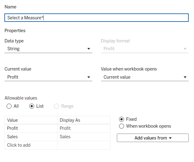
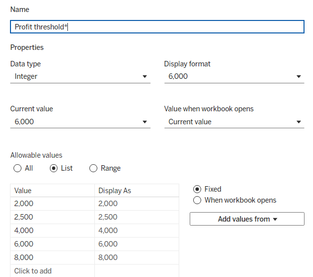
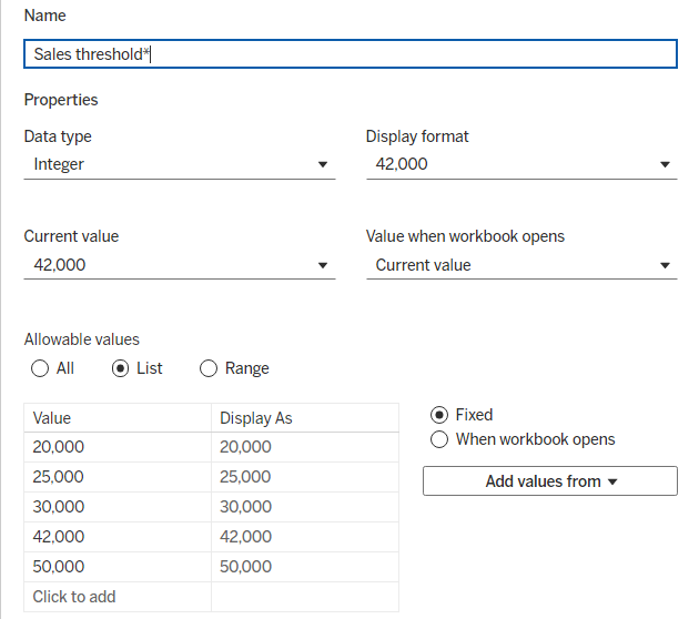
The first step is to create 3 parameters:
- Selected Measure (Profit/Sales)
- Profit Threshold
- Sales Threshold
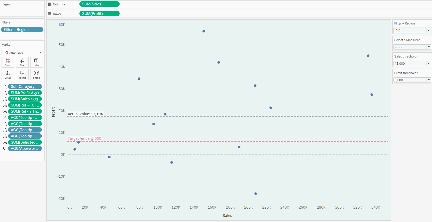
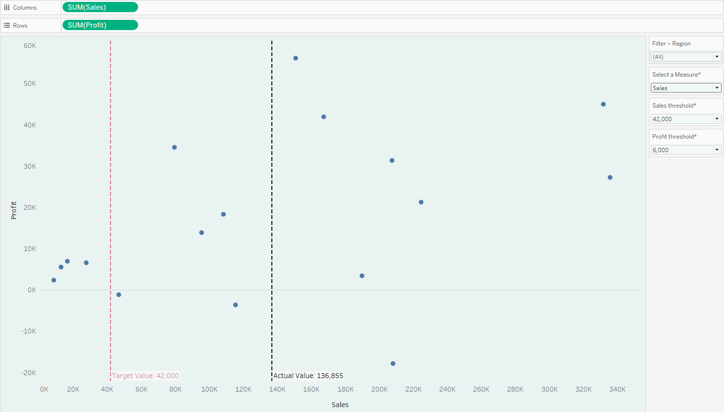
We then want to create two sets of lines showing the selected measure threshold compared with the selected measures average value, which are added through reference lines to each respective axis
E.g. for Profit Threshold
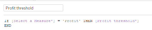
This tells us that when the user selects the profit measure then we should only display the Profit threshold
Then we want to calculate the profit average per region to help us calculate the Profit Average
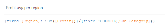
This fixed LOD adds up all Profit inside each Region and divides it by divides by the global sub-category count to create a fixed average for all sub categories.
*Repeat for Sales
In terms of displaying the target values based on the measure thresholds I had to wrap the selected threshold calc in a minimum aggregated fixed LOD as follows:
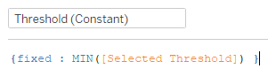
This was because reference lines aggregate their value (often SUM), so a row-level constant like [Selected Threshold] gets multiplied by the number of marks (number of sub-categories).
The fixed LOD collapses the selected threshold into one scalar for the whole view.
Ths gives us the horizontal and vertical lines based on the selected measure and threshold
Profit:
Sales:
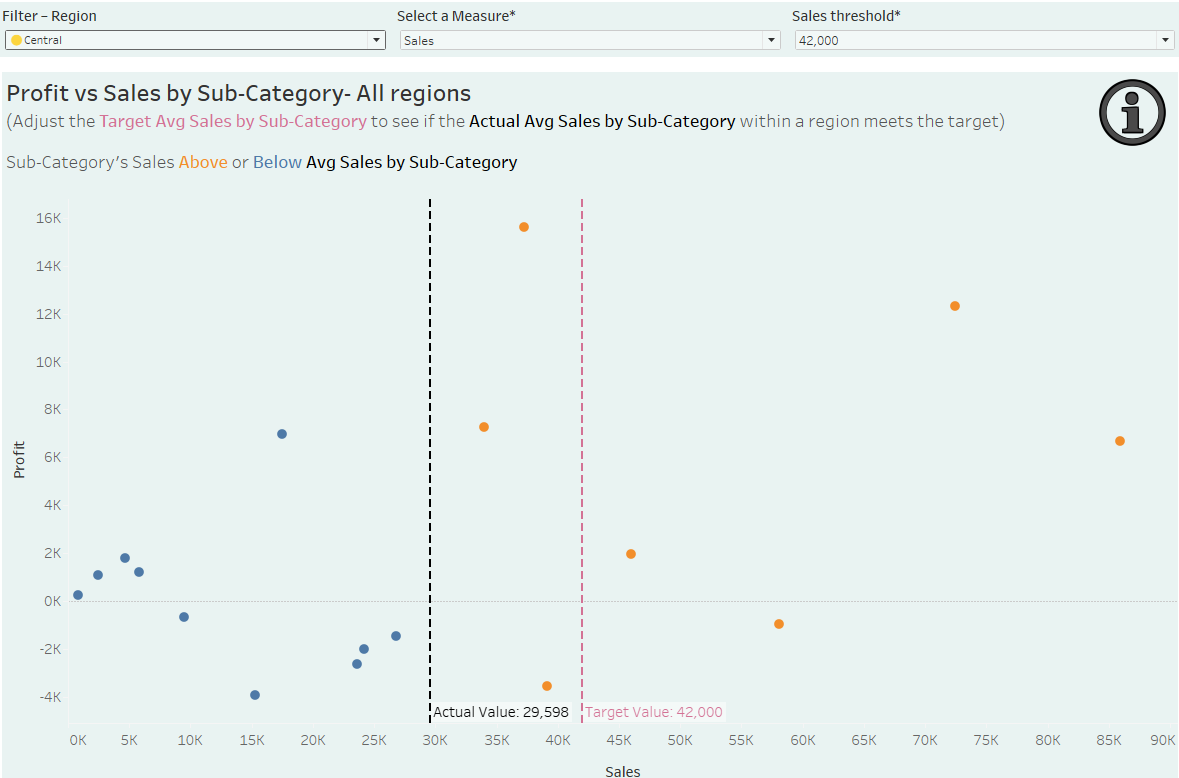
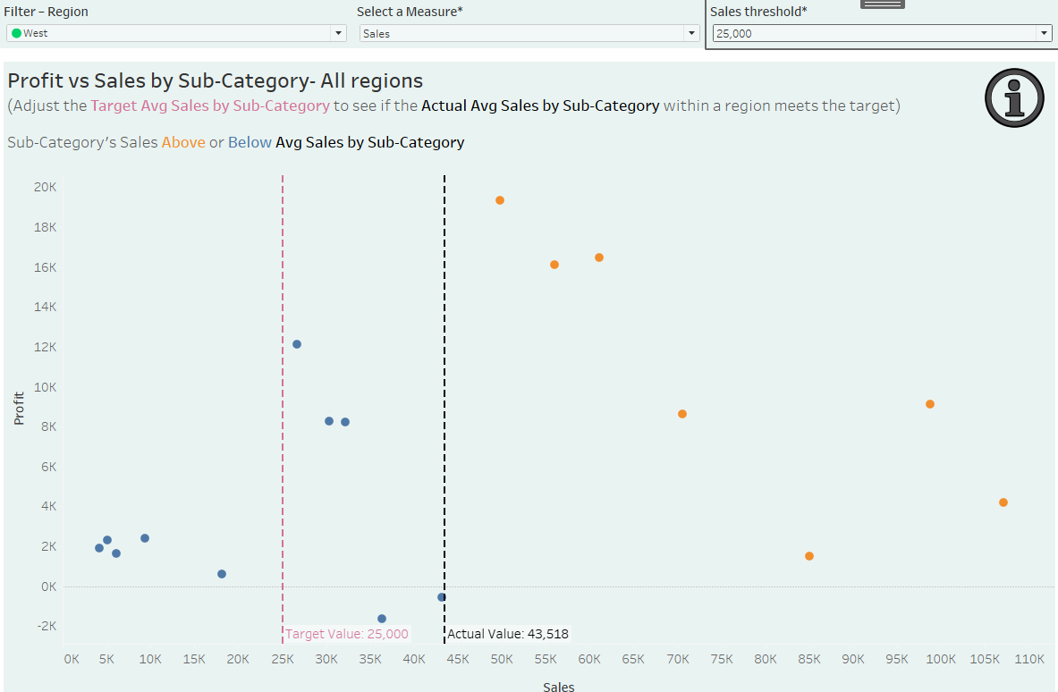
We then want to display colour variation so that each mark's colour based on whether it is above or below the average for the measure selected.
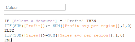
It checks the parameter to pick Sales or Profit, then uses the IIF function to return 1 when that mark is at/above its region’s average (else 0), giving a binary field for coloring.
The main request of this chart is to be filtered by region and the goal is to display the region name along with an indicator based on whether the average for the region is above the selected threshold or not.
The indicator was taken from https://unicode-explorer.com/ where:
Green circle- Above average
Yellow circle - Below average
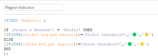
Once again it checks the parameter to pick Sales or Profit, then uses the IIF function to test if the average is above the selected measure threshold.
If so it will return the green icon and if not will return the yellow icon. This logic works in a similar fashion to the binary field.
This will give us working indicators and dynamic visibility to show profit vs sales by sub category for all regions with a working colour coded filter!