


The Numbers API serves bite-sized facts about years, dates, trivia, and math. Rather than treat those as static curiosities, I turned them into a human question: which facts do people actually find interesting? I pulled one fact for each year from 2000–2025, then ran a short survey so the TIL crowd could rate each fact from 1–5. That gave me two angles: the group view (TIL average) and my personal view—perfect for a “David vs TIL” comparison.
How I got the data
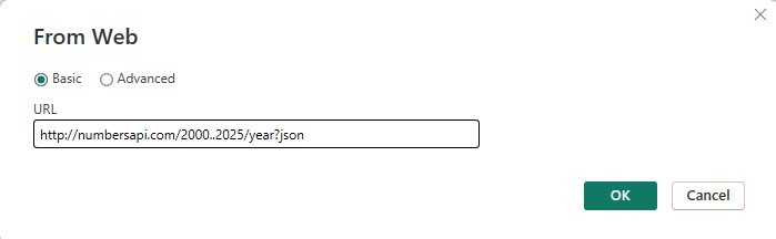
I used the Numbers API to pull one fact for each year from 2000 to 2025 (e.g., big events, quirky trivia). I brought those facts into Power BI and tidied them into a neat table with two columns: Year and Fact. From there, I was ready to collect opinions.
Turning it into a survey
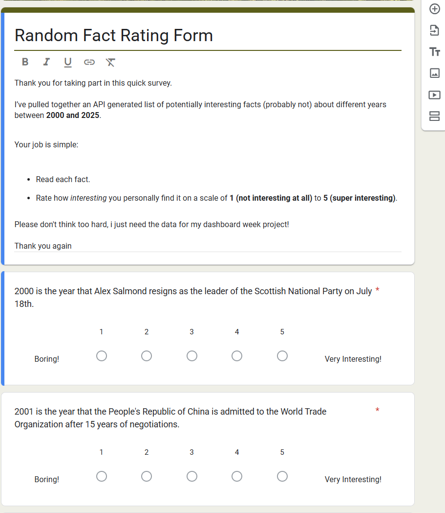
To get real human judgement, I built a short survey where each fact was rated 1–5 (1 = not interesting, 5 = very interesting). I shared the link internally and exported the responses. The result was a simple dataset: each person, each fact, one rating.
Reading the charts
- Trend across years: A line chart compares TIL average vs my rating from 2000–2025. The crowd’s peak was 2015, driven by the Darwin Mission fact. My personal high point was 2008, thanks to the Michael Phelps Olympics story.
- Top 5 facts: A bar chart lists the five best-rated years by the crowd and shows my score alongside each one. You can instantly see where I agreed (close bars) and where I didn’t (big gaps).
- Most-interesting callouts: Two big panels surface the #1 fact for each side:
- TIL: 2015 — Darwin Mission to search for exoplanets
- David: 2008 — Phelps’ eight gold medals
- Fact exploration: A page of year buttons lets you click a year and read the assigned fact at full size (no truncation).
What went well
The API → survey → clean table → visuals pipeline was a win because it got me from data to insight fast with minimal complexity. By locking one fact per year and collecting simple 1–5 ratings, I turned static trivia into a human signal that produced an instant headline (2015 topped the crowd; 2008 topped me). The tidy, long-format table kept modeling light, made issues easy to trace, and let KPIs and charts come together quickly. Showing the full sentences in a wrapped table boosted readability, while the same structure cleanly supported both “TIL average” and “my rating.” It’s reliable, transparent, easy to extend with context (like Darwin mission numbers), and perfect for a time-boxed Dashboard Week deliverable.
Challenges
- Getting clean JSON from the API (plain text tripped me at first).
- Making line charts behave (I had to make sure my personal rating plotted as a single per-year value, not an average or sum).