


As this week’s Makeover Monday’s dataset was pretty simple, I decided to focus on some little tricks that I had not tried before and really wanted to. Tooltips with “dynamic colours” and an info button with more detailed information are some of them.
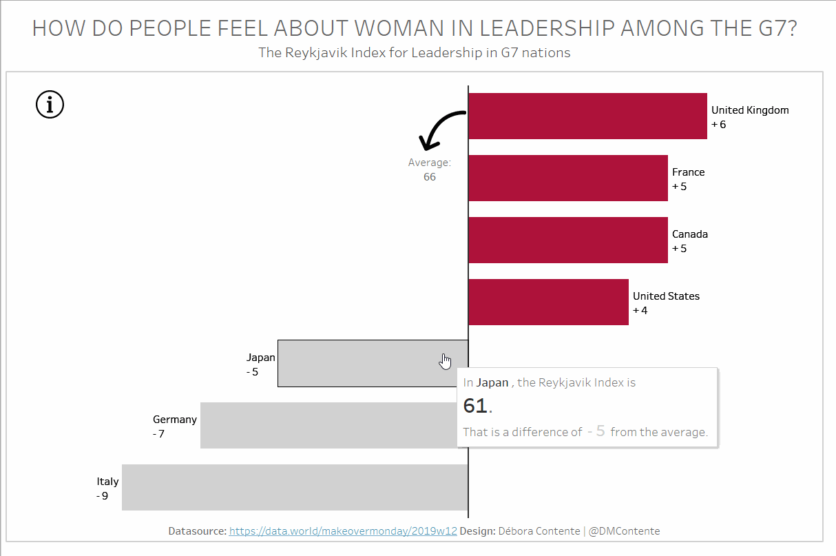
Final Result
I know you would usually start with the beginning instead of the end but I believe it will be easier to go through my process this way.
Even though this dashboard ended up being pretty simple, I feel like it is a good sum up of many tricks and tips we have been learning here at the Data School.
LOD’s
Not really sure this one was necessary, but I decided to ditch the G7 Average that already came in the dataset and just use a LOD to create a new field that I could after use to calculate the difference from average for each country.
Adding a “+” to positive values and keep the “-” on the negative ones
This is just another small detail that before this Viz I did not know how to do and is just so simple! Watch how I did it in the GIF below. In summary, you only need to change the Number Format of the field to Custom: “+” #;”-” #

Dynamic Colours in the Tooltip
For this one, I have literally followed Paul’s post. It was really easy to follow so I definitely recommend it! However, I have to be honest – I thought it was kind of a bummer having to create three different calculation fields just because of colours – two for the tooltip text and another one for the colour of the bars.
A solid foundation for the average line
I had already used this trick, but I believe it is worth bringing it up as well. In order to have the average line as bold as I have, I used the trick that Jon wrote about.
Add hidden information that will pop up when hovered over
Finally, I wanted to include an explanation on what the Reykjavik Index is but I felt like I needed a long paragraph for it and that would not look pretty had I just add it as a text in the dashboard. Luckily, Paul had already explained a solution that suited really well in this case!
What are your thoughts on my final result? Did you also create a Viz for this Makeover Monday? Share it with me as I am always on the lookout for different ideas and inspiration as well as feedback on my work!