


I have recently written a blog post on why Tableau assigns the colour blue to some fields and green to others. I would recommend you to read it after continuing on this one. If you have read it already, just continue reading.
The tip.
If you put a green pill (continuous field) on rows or columns, the data will be displayed in the axis (figure 1) while if you drag the pill to the canvas, it will give you the total (figure 2).
A similar thing happens to geographical fields – if you drag them to the canvas, a map will be drawn (figure 3), if you drag them to rows/columns, the values will be broken down into a table (figure 4).
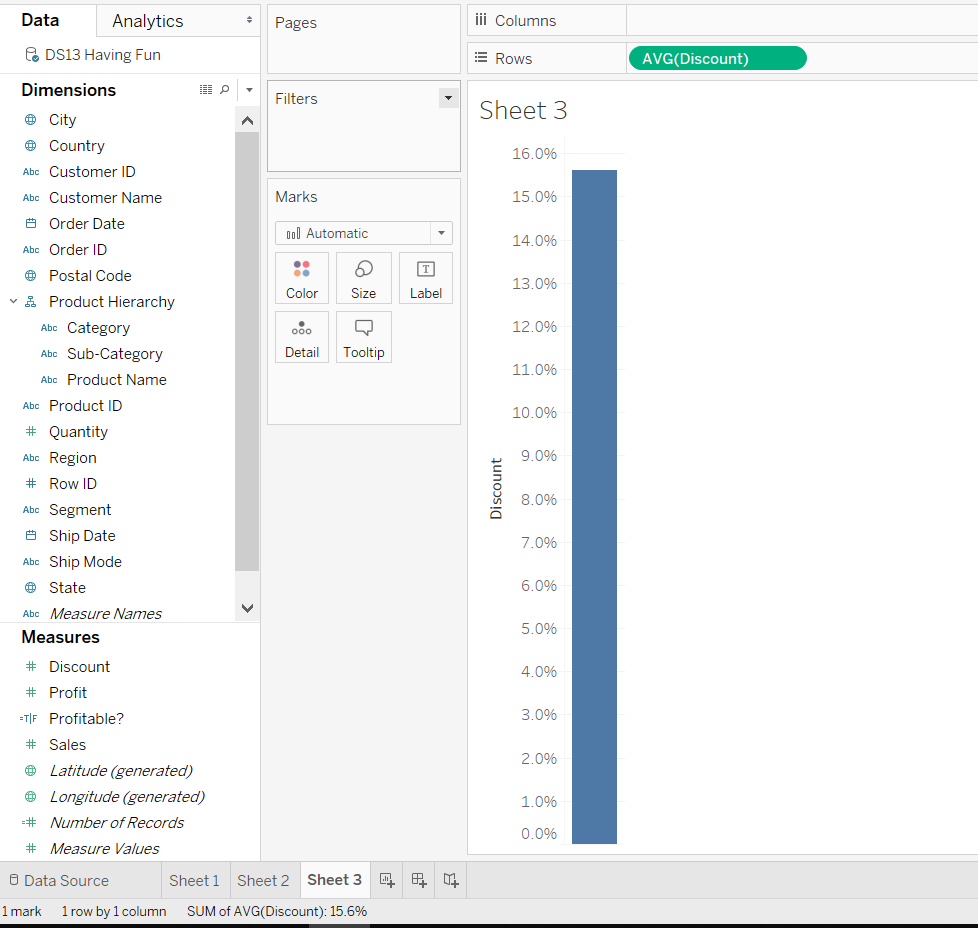
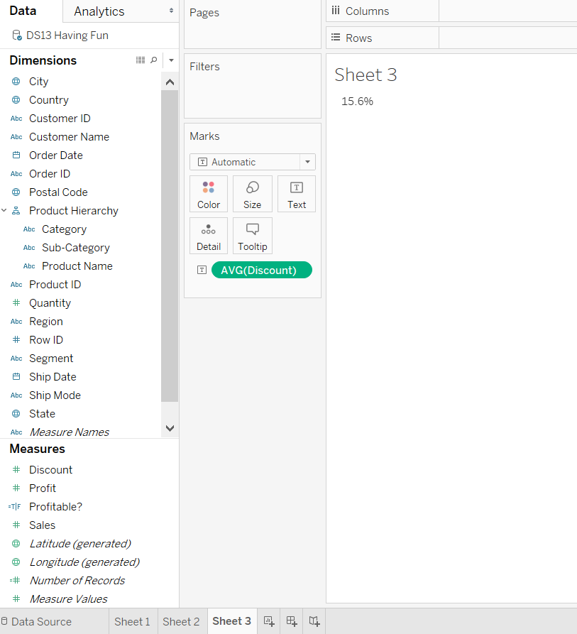
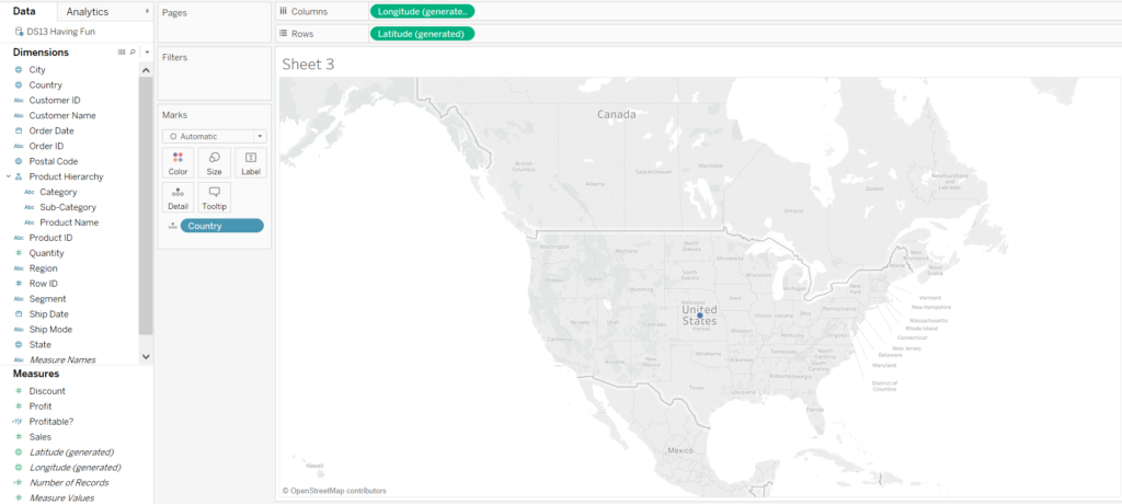
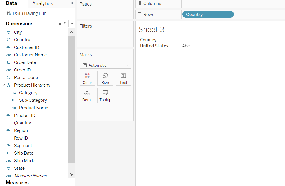
Figure 4 – Dragging a”geographical field” to rows/columns result
Hope this has been helpful!