


The challenge
Last week, on Friday, the project we were challenged with was building a Vizz with a dataset from Exasol. Nothing particularly new until here (apart from the fact that all datasets were ginormous!). The bit that made it even more interesting was that we could not just jump into Tableau and start creating stuff – we were only allowed to use the Describe option (right click a Field in the Data shelf and select Describe), that would give us an overview of the type of data each field would be.
So what are we supposed to do if we can not just play with Tableau? Plan! We had lots of paper, crayons, markers, post-its… All of this available for us to plan our final result beforehand.
The process
Step 1 – Draw all kinds of charts in post-its
My approach was starting with post-its and just draw all the types of charts I could think of given the fields of my dataset (which was about UK Prescriptions between August 2010 and June 2018). I ended up with more than 20 of these…
Step 2 – Group charts and choose possible titles
I loved that step one. Having all the charts made it so much easier to visualise everything ant try to make groups that would make sense together and create a story! In my case I ended up with these:
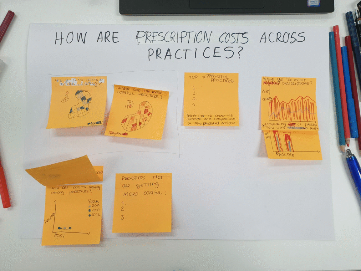
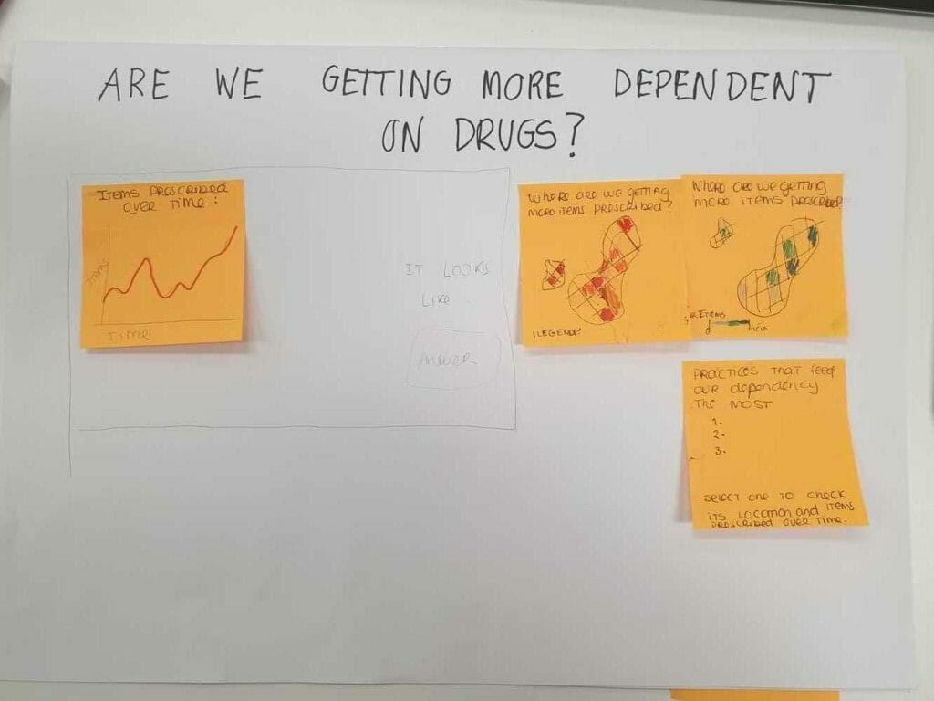
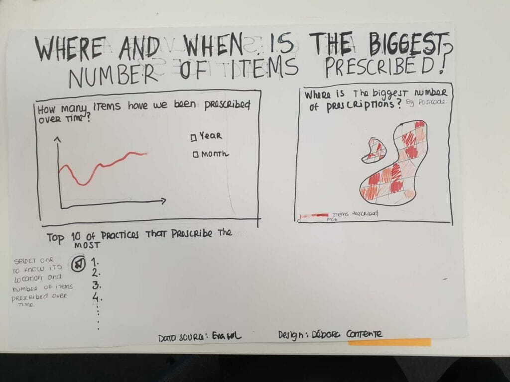
I have to be honest – I was tempted to go for the “Are we getting more dependent on drugs?” one but to make that assumption I would need, for example, population data as the increase in prescription numbers can be justified by an increase in population rather than increase of perscripsions per person. As I liked the idea of exploring the data based on the number of prescriptions, I ended up with this final draft:
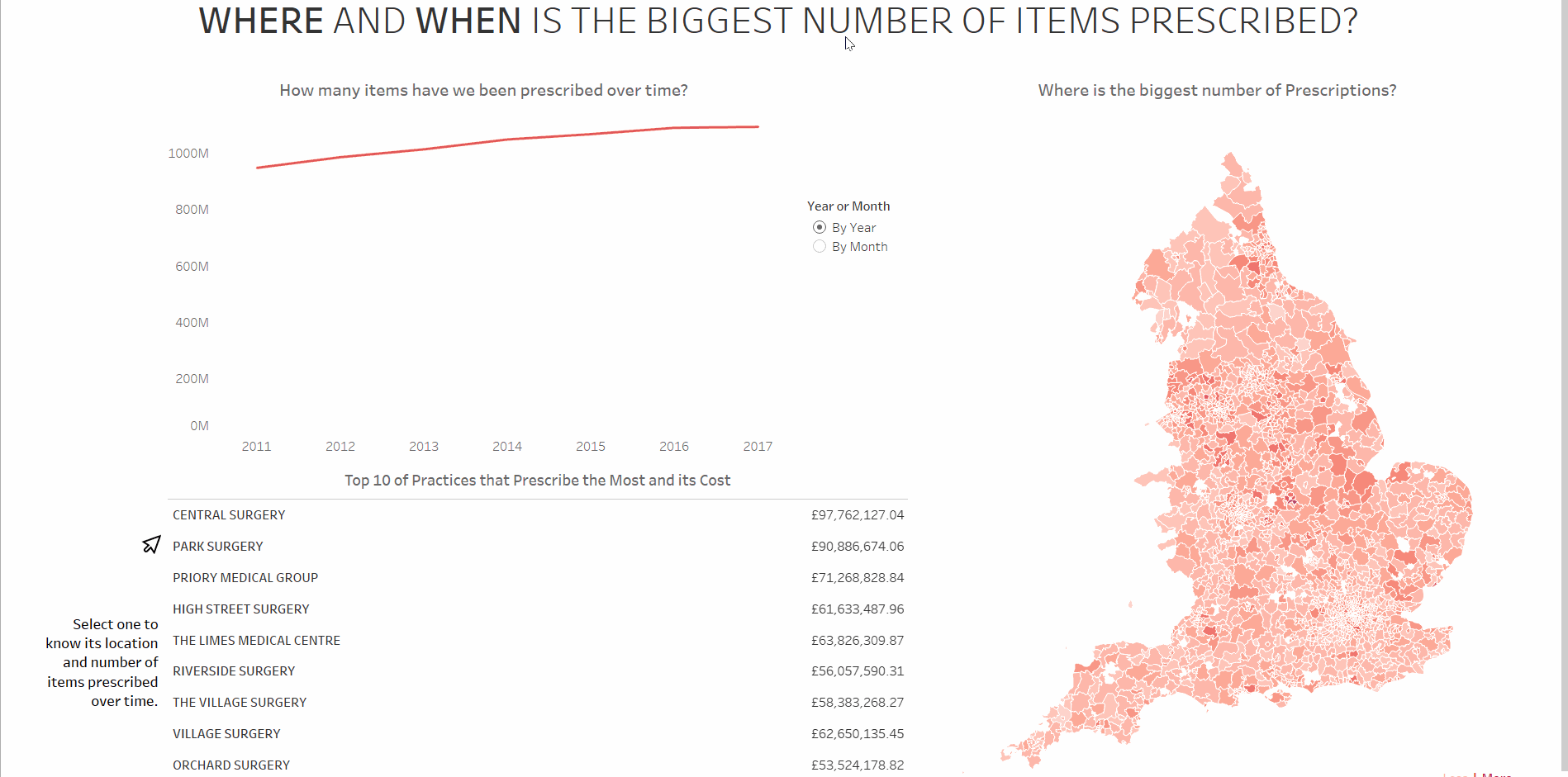
Step 3 – Build it in Tableau
As I had thought it through before, building everything in Tableau ended up being much easier and faster than usual! I will definitely remember this experience and try to apply these steps every time I need to build a dashboard from now on.
As the dataset is huge, I do not have a link for the interactive viz yet. As soon as I get it I will update this post but meanwhile I’ll leave you with this gift where you can get an idea of the final result.
Hope this has been helpful to you and that you can take advantage of planning and sketching as much as I did!