


When figuring out which charts to use on a Tableau viz there’s definitely different ways to achieve the same goal, but there is also a right vs wrong we have learned. You can make the viz look beautiful, but every chart has a time and a place. For business dashboards they should be simple, have context and make a point that all aligns with the objective the client has given. With Tableau public of personal dashboards and challenges you may have more freedom in creativity and the variety of charts to be used.
Business Dashboards:
In the realm of Business Dashboards, simplicity reigns supreme. The goal is to swiftly arrive at solutions for business challenges without unnecessary complexity. While flashy, intricate charts may catch the eye, opting for clear, straightforward visuals ensures clarity for the client. Line and bar charts emerge as reliable allies, universally understood and capable of presenting diverse data types effectively. BANs (Big Ass Numbers) and cards offer another potent tool, with prominent figures commanding immediate attention, especially when accompanied by change percentages and trend lines, transforming into indispensable KPIs (Key Performance Indicators) for swift decision-making.
However, a chart devoid of context is akin to a jumble of shapes and figures. Context is crucial for chart comprehension, prompting the question, "Compared to what?" Lack of context renders a chart potentially misleading and biased, resembling those manipulated for agenda-driven narratives. Enhancing context can be as simple as supplementing the data, ensuring transparency and accuracy in interpretation.
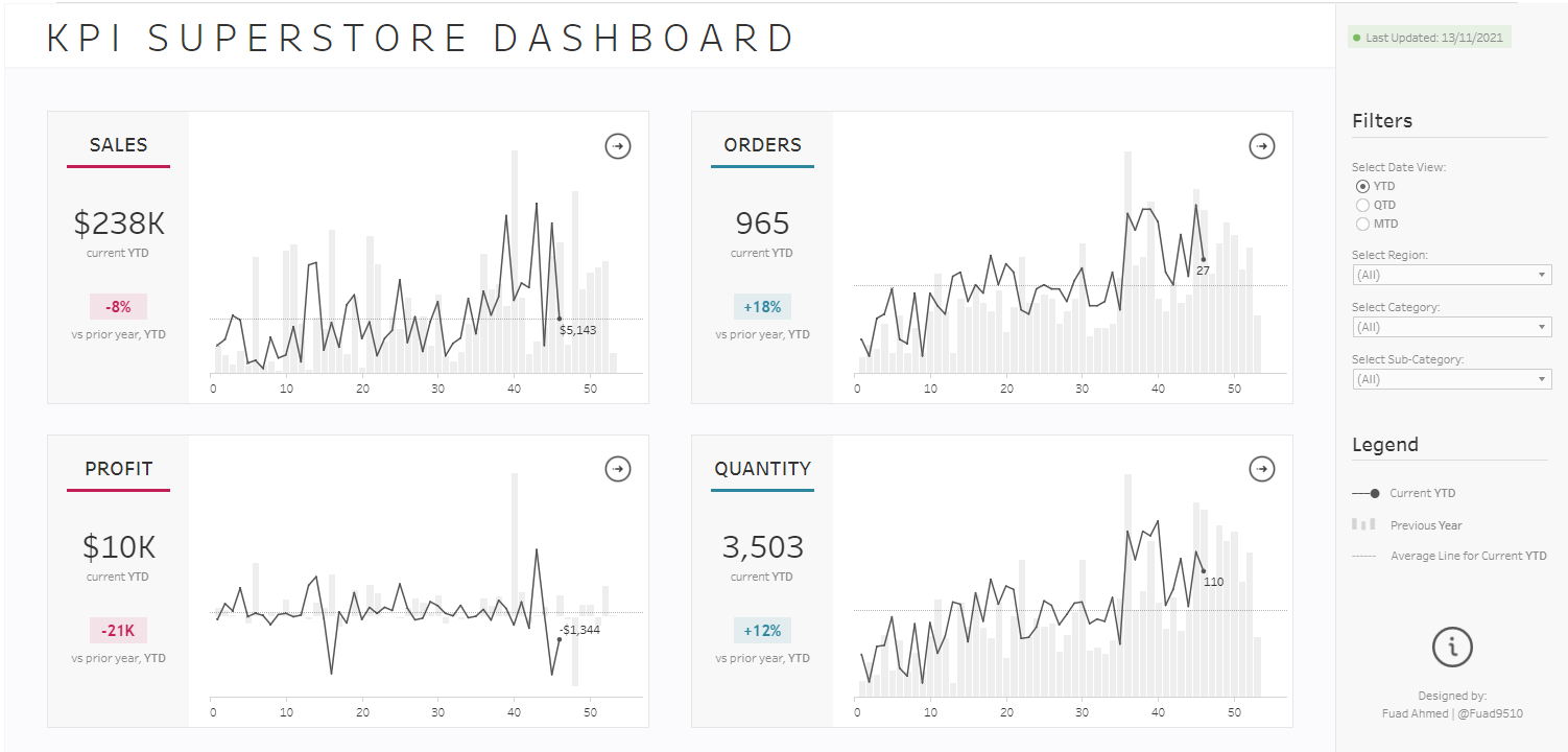
Business Dashboard
Personal Dashboards:
Your personal dashboards offer unparalleled freedom, allowing you to craft charts that captivate your audience's attention while maintaining clarity. This versatility extends to business dashboards too. Let's begin with titles, which are pivotal in guiding the viewer's focus. Crafting a title around a pertinent question ensures alignment with your visualization's purpose. Rather than relying on Tableau's default legends, integrating them into the title streamlines comprehension. Utilizing colors and descriptive language within the title eliminates the need for a separate legend. As for chart formatting, precision is key. Eliminate extraneous elements like gridlines, excess text, and axis titles to maximize the Data-Ink Ratio—ensuring the data takes center stage. While there are additional considerations, these strategies provide a solid foundation for creating impactful dashboards.
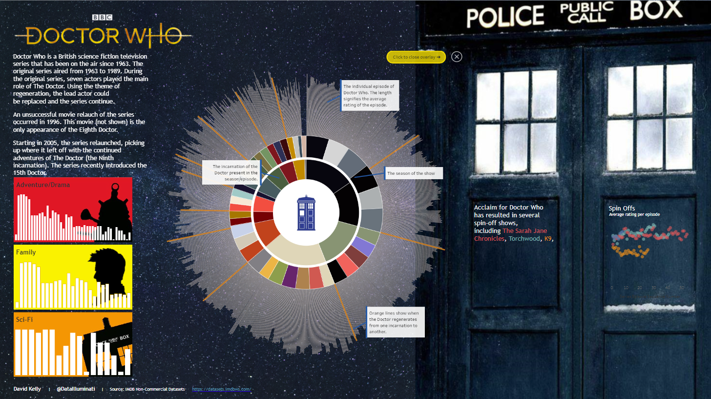
Doctor Who