


What if you only needed to fix three things to solve 80% of your problems? That sounds too good to be true, but this pattern shows up a lot in real-world data. A couple of products bring in most of the revenue, or a small group of defects cause most product returns. This is the Pareto principle, a.k.a. the 80/20 rule. The rule says that about 80% of the outcomes or outputs come from only 20% of the causes or inputs. For example, 80% of a company's sales come from only 20% of their customers. A Pareto chart aims to identify those top inputs by showing data in descending order.
A Pareto chart combines two views into one. A bar chart, sorted descending, to show how much each category contributes. And a line on top to track the cumulative percentage, showing how quickly those contributions add up to the whole. Where the line climbs steeply then flattens out, those are the top few contributing inputs responsible for most of the outcome. Your data may not line up exactly with the 80/20 rule, and could look more like 70/30, 90/10, or even more different. Either way, this chart is valuable to show where the real concentration is and find those three things that cause 80% of your problems.

Getting Started
To begin, I'm going to use a dataset on Lego set colors. It includes a row for each color, including the total number of Lego parts using that color, and the total number of Lego sets using that color. The goal of this chart is see that only a few top colors (maybe Black, White, Gray, Brown, etc.) contribute to most of the available Lego sets. You can follow along with your own data or find the Lego data here under colors.csv.
Building the Base Chart
First, we want to drag the input into columns, in this case 'Name' which is the different colors. Then drag the output into rows, which is the number of Lego sets, Num Sets. Num sets is already an aggregation, but if you need to aggregate by the input field you're using you'll have to make sure that's a sum. Then sort descending as well.
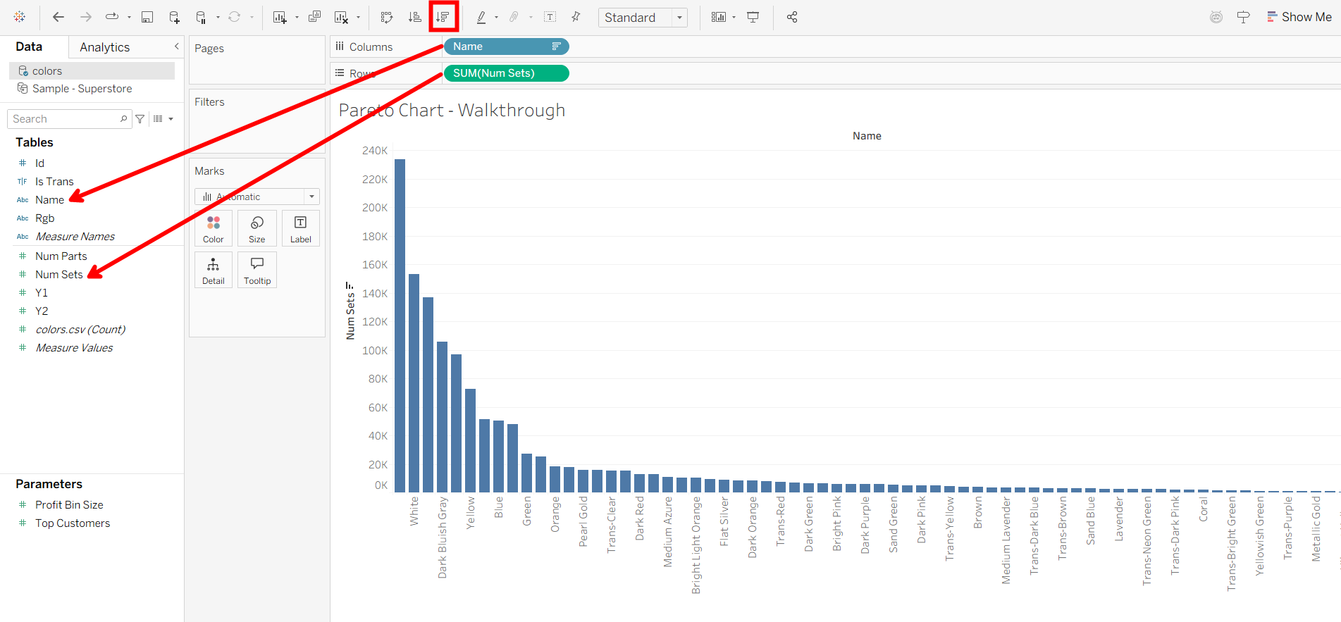
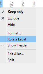
Additionally, right-click on the x-axis and click 'Rotate labels' to make the names easier to read.
Creating the Percentage Table Calculation
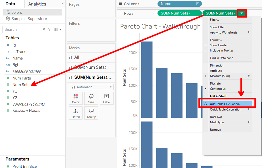
Next, we want to create a table calculation for the output field, Num Sets, that shows a cumulative percentage to see how much percent of Lego sets the colors contribute to. To do this, drag in the same output field to rows, Num Sets. Then, click the dropdown on the pill and click 'Add Table Calculation'.
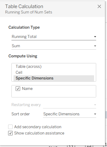
Next, configure the table calc with these steps. We want a running total as a sum, with 'Compute Using' set to specific dimensions, then your input field (Name).
Now, to get the percentage, we need to add a secondary table calculation that computes the total percentage along this running total. So, click 'Add secondary calculation', and it will open up a new table calculation window.
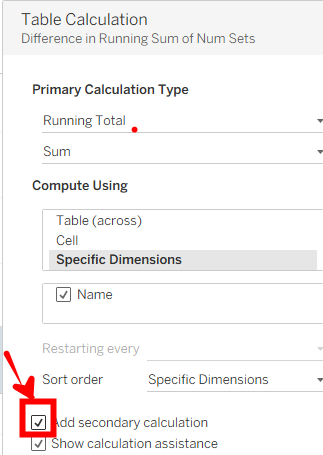
To configure the second table calculation, we'll use these settings. We want the percent of total as a sum, with 'Compute Using' set to specific dimensions, and select the input field (Name).
Changing to Dual Axis and Line
Now that we have the proper table calculation, we need to dual axis both charts to have the line overlay the bar chart. Right-click on the right Num Sets pill, and click 'Dual Axis'.
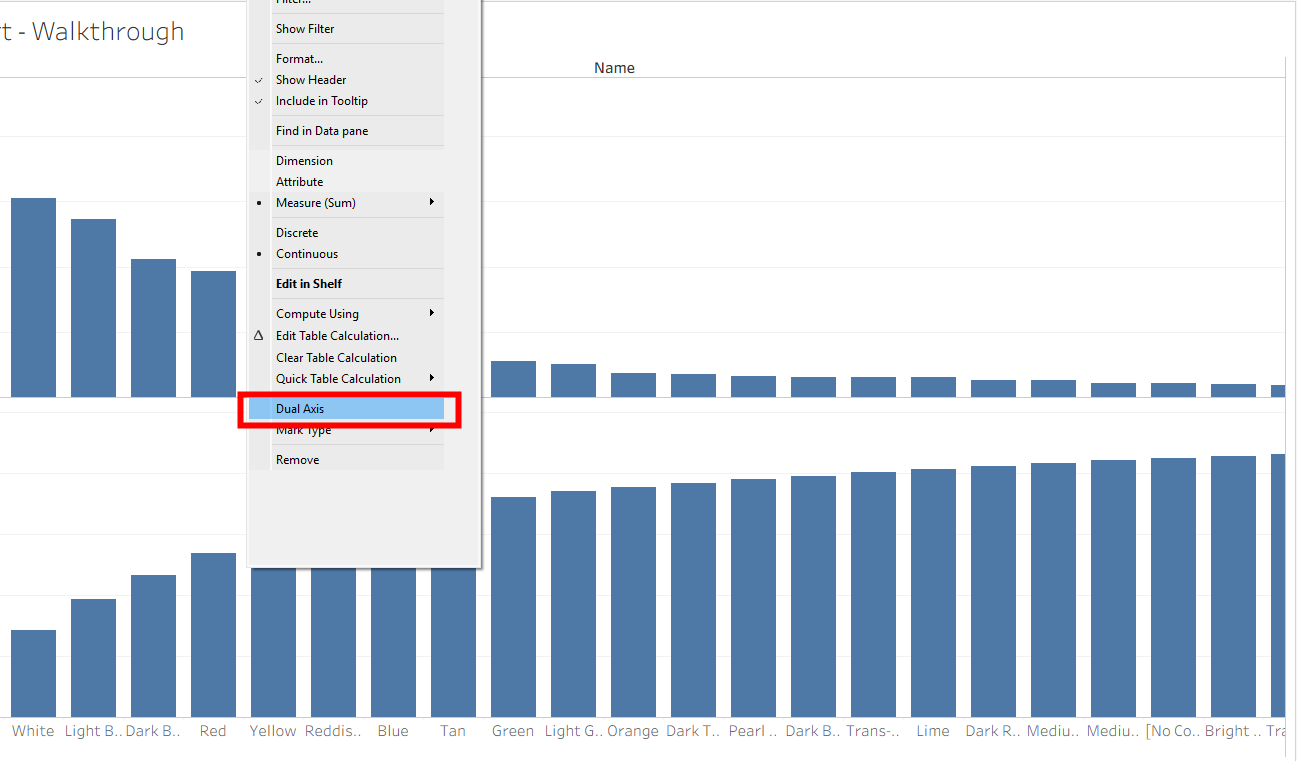
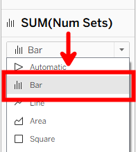
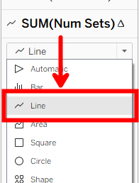
After it's Dual axis-ed, make sure the mark for the non-table calculation field, SUM(Num Sets), is set to bar, and make sure the marks for the table calculation field is set to line.
Also, get rid of the Measure Names on color.
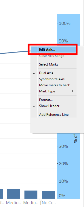
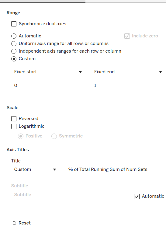
Then, edit the right axis to fix it from 0 to 1 (0% to 100%).
Adding a Reference Line and Final Touches
Now we're going to add a reference line to show when the cumulative percent reaches 80%.
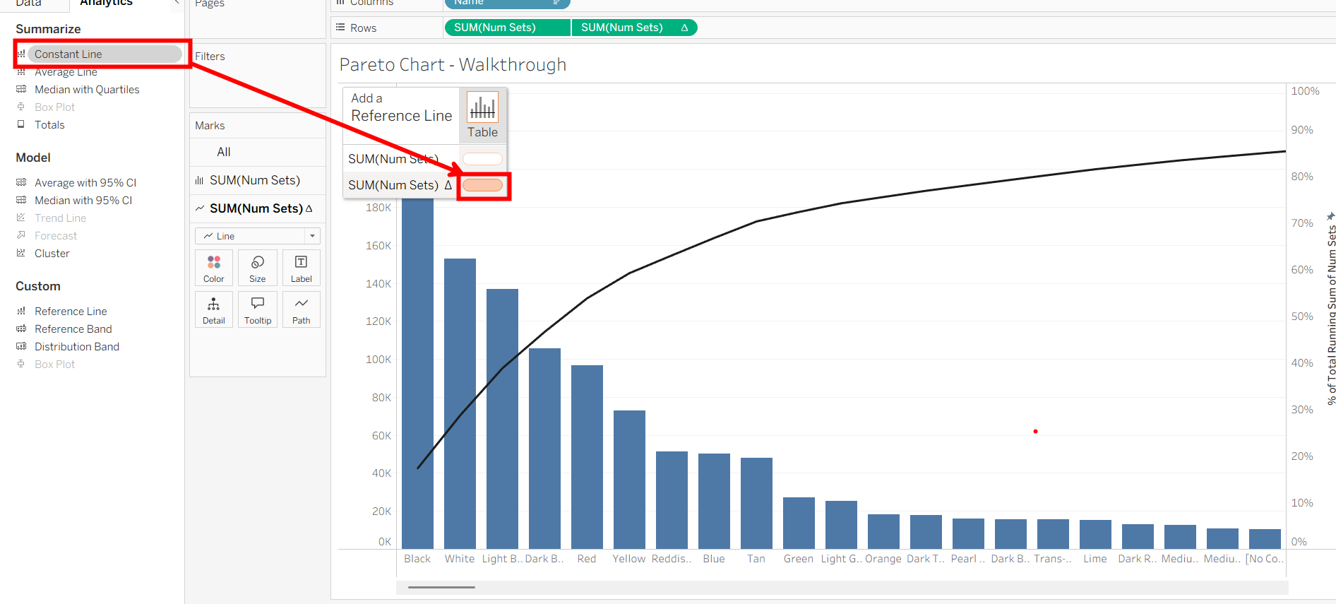
In the analytics pane, click and drag a Constant Line into the orange pill for the percentage table calculation of the input field. Then, a value text box will open up. Type 0.8 in the text box to show an 80% constant line.
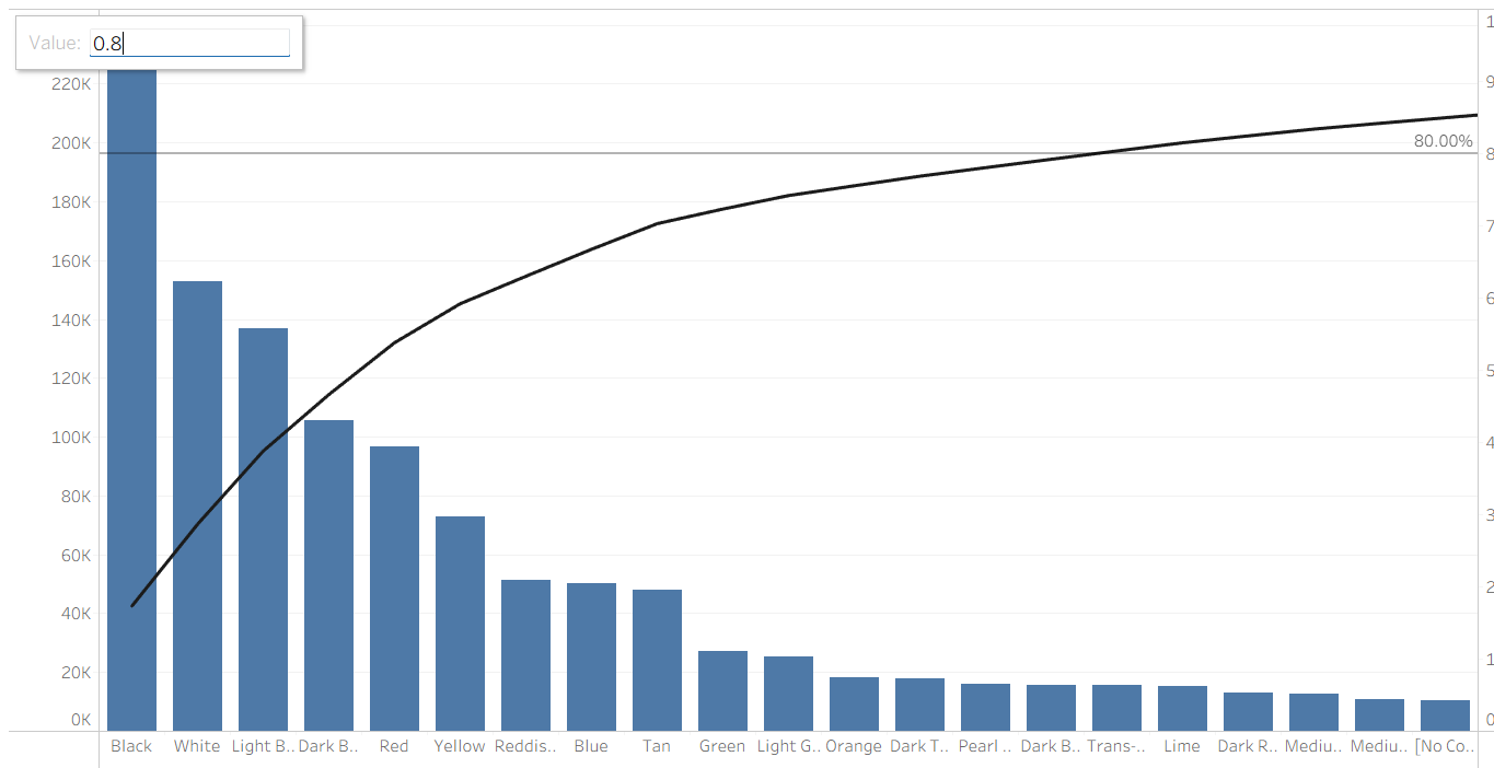
That's the chart! I did some additional cleaning and formatting to fit my Lego data and this is the final output:
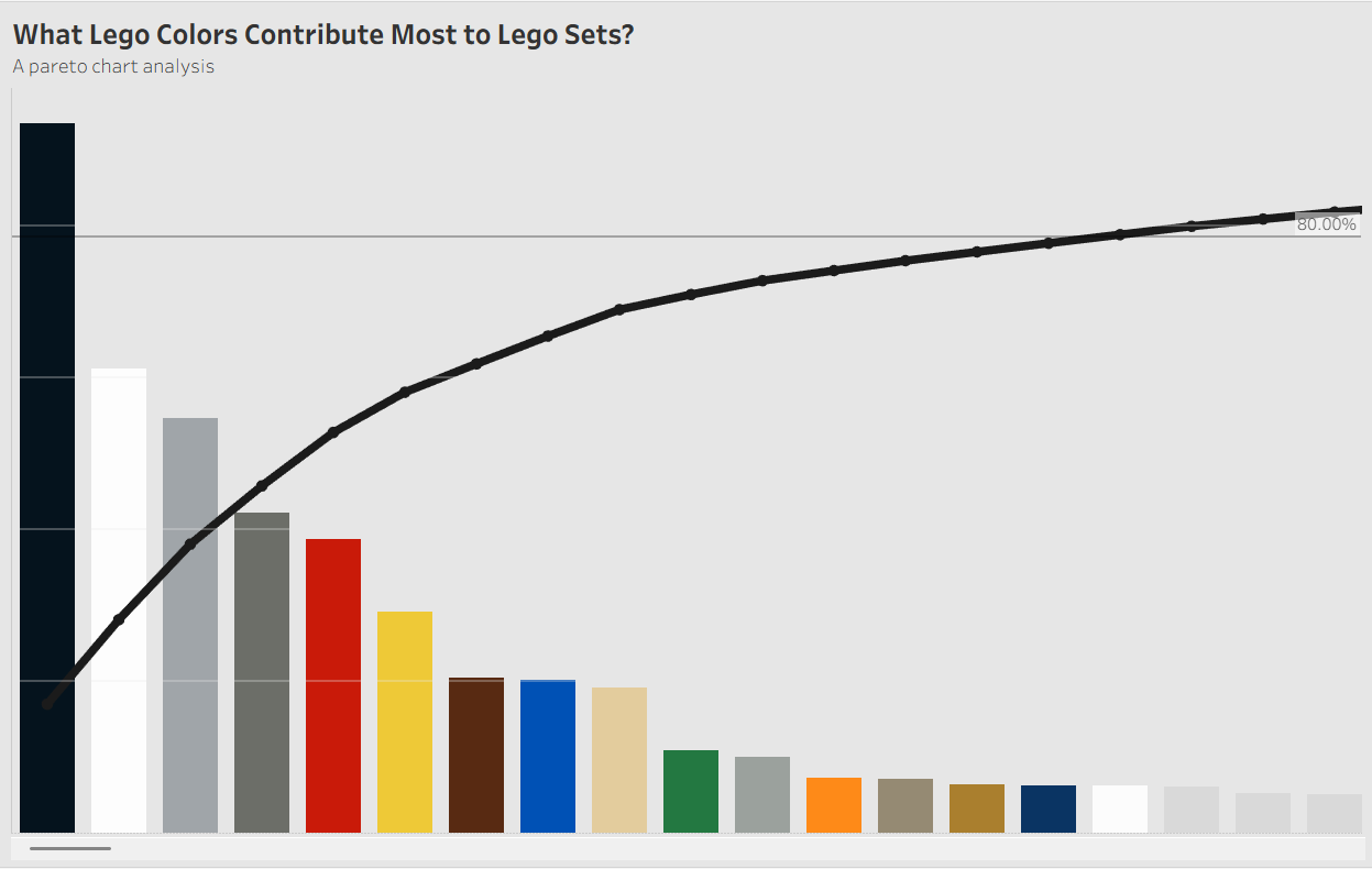
Based on the chart, we can see that the colors black, white, gray, red, yellow, and several others contribute to almost 80% of Lego sets. Definitely makes sense and thought this data would be pretty interesting to look at using a Pareto analysis! Thanks for following along!