


After working on my Power BI rebuild for Dashboard Week, I just couldn’t let go of getting those selected countries to move to the front. This is where I left the dashboard.

I’d been working on it just before the end of day Dashboard Week presentation, so the version I actually presented was missing the non-selected dots in the top dot strip plot.
This is a perfect time to remind any readers to save and save and save again and maybe (...definitely) if you’re going to continue exploring non-necessary functionality right before a presentation, make a copy of your page and work off the copy.
As I mentioned in my last blog on the topic, I knew I needed to duplicate the charts and create two filters- one to only show the selected country, and another to show every other country. Then, I would apply those filters to separate copies of charts and stack them on top of each other.
My (limited, potentially incorrect) understanding of why these steps are necessary is because even if you make the backgrounds transparent, the top visual will still cover the bottom visual. Even when it's transparent, it acts as an invisible layer sitting on top, blocking any dots beneath it.
Before duplicating, I made sure the charts were all the same size, using the General Properties section of the Visualizations pane. You can select multiple charts and make those size changes all at the same time. In hindsight, I wish I’d gone ahead and made the backgrounds transparent at this stage too- it would’ve saved me a few extra clicks later.

There was a little weirdness when I duplicated the charts- for some reason, the duplicates would automatically filter to only the selected country. Yes, that’s the outcome I wanted, but I wasn’t sure why it was happening. I also struggled with constructing the measures (Power BI’s term for what we call a calculation in Tableau) in a way that worked. I tried writing them a couple of different ways and eventually landed on these:
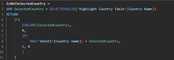

I’m still not sure why the duplicated chart was automatically filtering to only the selected country, but I decided to lean into it, applied the IsSelectedCountry measure as a filter, just to be safe, and moved along.
To keep the page from getting too chaotic, I went through the charts one by one: duplicating, applying the filters, and stacking them roughly on top of each other before moving to the next chart.
Once I had all twelve charts, the formatting definitely took some time. To ensure everything was aligned precisely, I first pulled the selected country charts off to the side, selected all of the non-selected country charts, and used the formatting options to Align Right and Distribute Vertically. Then, I did my best to drag the selected country charts back on top of them. This was definitely one of those moments when I found myself wishing for a nice Tableau-style container with an “evenly distribute” option.

Once everything was lined up, I locked the page down and called it good enough for now.

The biggest downside of this method is that tooltips for non-selected countries no longer work, because the selected country chart sits on top and blocks interactions with the chart beneath it. Tooltips in Power BI is a rabbit hole for another day.
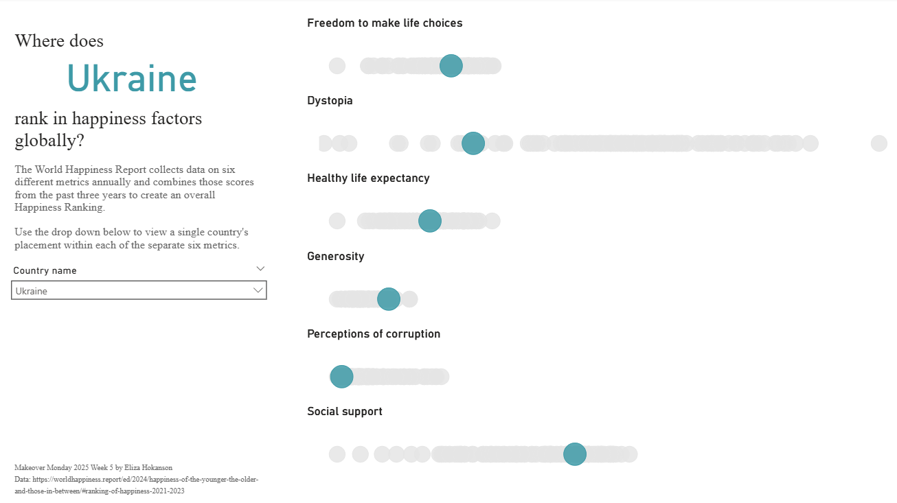
Here's the view at the end of it all. It achieved what I wanted to, but I'm not sure that in a client setting the extra time required for this and limited options for exploring the data outside of the selected country make this the best choice over just using the size measure.