It is the last week of The Data School and that means dashboard week! Dashboard week is where a coach will set a brief and we willhave to do data prep and create a dashboard accordingly. To do this we are given about 6 hours with the brief being set at 9:00 and presentations of our work at 15:30. However, today we had from 11:30 to 15:30 as we had an introduction to designing for accessibility beforehand!
Today's Challenge
Today's challenge was to create an accessible dashboard. I created a report in Power BI for the brief below:
Brief 1: Consultant Needs Fast, Keyboard-Only Navigation
Scenario: Access London has hired an expert in accessible urban design to assess how inclusive the city's top attractions and transport links really are. They’re billing us £4.5k/day, but have a visual impairment and rely solely on keyboard navigation with screen magnification.
Data: The London Accessibility Dataset (Attractions + TfL Stations)
Output:
Upload to Tableau Public or Power BI Service. The dashboard must be fully keyboard-navigable, allowing them to:
- Tab through borough-level filters, accessibility feature checkboxes, and attraction lists
- View summaries with no mouse interaction
- Highlight keyboard focus areas for fast analysis
🎯 Key Requirement:
Efficient keyboard-only navigation across filters, tooltips, and pages — no mouse dependency.
The Process
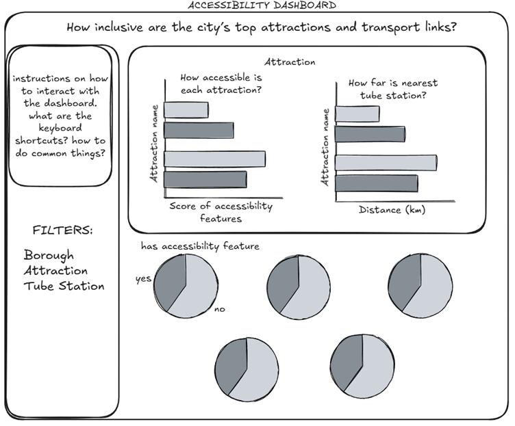
I started off by investigating the data in Tableau Prep and loaded the data into Power Query. There was very little data prep to be done, where I just had to rename a few values. After investigating the available data, I created a brief user story before I drew up a sketch in Excalidraw.
I then took some time to investigate the accessibility features available in Power BI and the specific keyboard shortcuts that would be useful for the user.
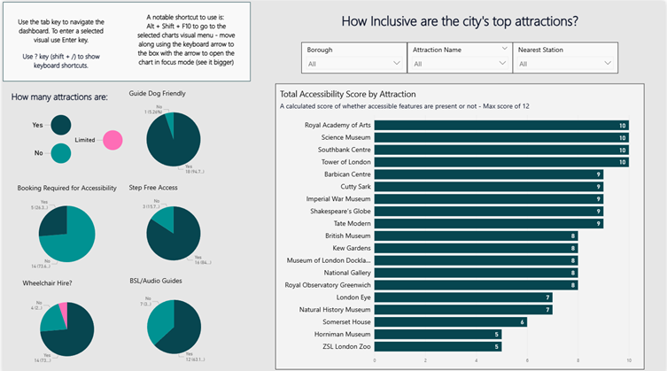
Now I just had to create the report in Power BI. To do this, I first created my scoring system, giving an attraction 1 point if they had an accessibility feature (0 if they didn’t). Some of the features had more than the binary outcome, with options of ‘limited’ or ‘some’. For this, I adjusted my scoring system i.e., ‘some’ 1 point and ‘yes’ 2 points.
I created the bar chart using my score system and created the pie charts for most of the features to use in the report. I didn’t include the distance for the nearest tube station as I felt this crowded the view. I also decided to adjust the layout of the report with the filters being at the top and the pie charts on the left as this made more sense when navigating using the keyboard. I also included instructions on how to navigate the dashboard using the keyboard.
I used a colour blind friendly palette from Power BI and used a non-white background to make the contrast between the charts and text less vivid. I also made sure to label data points as tooltips are not accessible when using the keyboard to navigate.
The Outcome
The final report I created is embedded below with an accompanied screenshot.