It is the last week of The Data School and that means dashboard week! Dashboard week is where a coach will set a brief and we willhave to do data prep and create a dashboard accordingly. To do this we are given about 6 hours with the brief being set at 9:00 and presentations of our work at 15:30. Today's brief can be found here.
In summary, the brief requires us to download street crimes for the UK (July 2024-July 2025) and create an app that would allow the user to select specific date range, crime types, and location (on a map). This would then update a dashboard made in either Tableau or Power BI.
The Process
I started off by downloading the data and loading it into Alteryx to investigate. The download returned a zip file with a folder for each month-year and a .csv file for each force (authority).
To understand what fields were included in the data set, I investigated a single authority for one month in Alteryx. I then created a brief user story and sketch before starting to build the app.
I knew I wanted to create a chained app from the start so that the options for the user to choose would change depending on previous choices. To bring all the data into Alteryx, I used the Directory tool to be able to get all the file paths for each authority for each month. From which, I parsed out the date field to allow the user to choose the dates that they were interested in before rendering all the data. However, I ended up putting this into a separate flow as when uploading my app to server as the directory tool errored. The separate flow loaded all the data for all the month-years for all authorities that I used in my input for the first part of my flow.
I then spent most of my time completing the chained app and uploaded it to server (which caused me to make a few changes as mentioned above). My app worked in server after these changes, however, the map wouldn't show - this was a limitation of the server and not my app. I therefore focussed on keeping the app in desktop. To upload the output as a datasource on the Tableau Server, I had to download the Tableau Output Tool. Due to these barriers, this meant that, although the app was finished by lunch, difficulties with both the alteryx server and uploading to tableau server meant it took longer than I had planned.
Having created my app, I started creating charts and building my dashboard in Tableau using a live connection to my published data source - this was a bit of a rush as I had left only 45 minutes until presentation to do this!
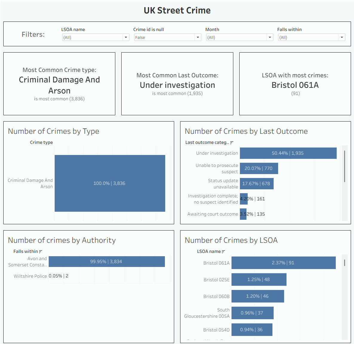
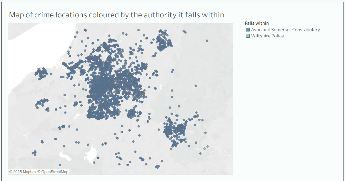
My Ouput
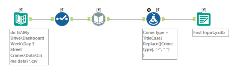
Data Prep before the Chained App
The image below shows the flow of bringing the file paths in for each authority and each month-year. I use the dynamic input tool to load in all the data and use the formula tool to clean up the crime type field. With more time, I would do more data prep in this step i.e., create new fields where my month-year would be recognised as a date.
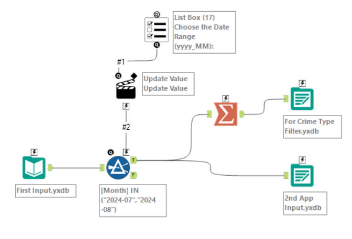
The Chained App: Part 1
The first part of my app is shown below. It allows the user to select which month-years they are interested in using a list box. I chose to do this as I felt it was easier for the user to select the months they were interested in more easily than if it was configured as a date with a calendar. I then have two outputs from this:
- The top output is just the crime types in two columns that will be the input for the filter in the second part of my app.
- The bottom output is the main dataset which has the details of the crimes for all authorities for the selected month-years.
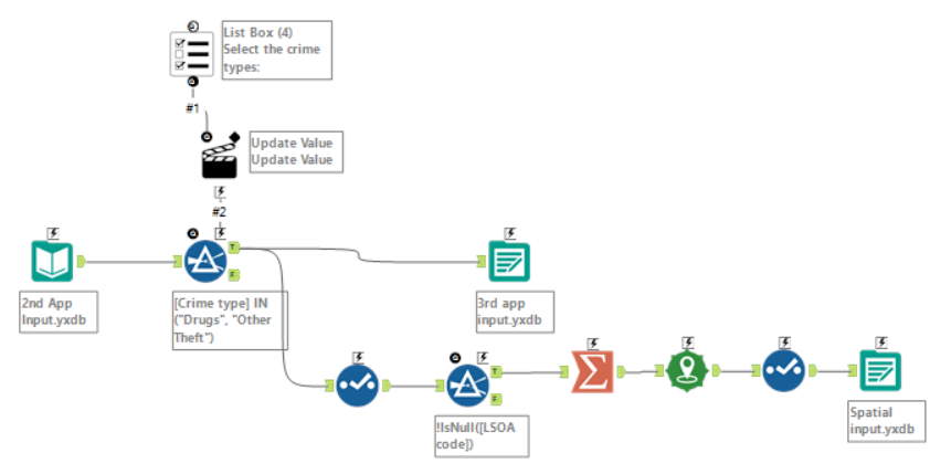
The Chained App: Part 2
The second part of my chained app is shown below. Here I use the bottom output from the previous part as the input and allow the user to filter by crime type using a list box. The list box is populated by the top output from the previous step. Again, I have two outputs:
- The top output contains the filtered details of street crimes.
- The bottom output are plotted points of each crime, to be used for the next part of my app.
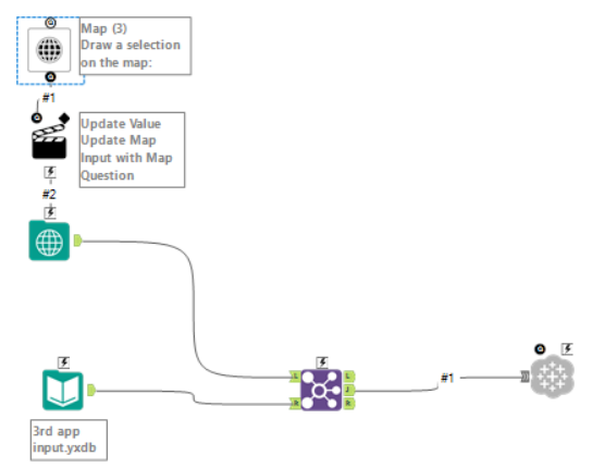
The Chained App: Part 3
The last part of my chained app is shown below. It allows the user to draw a selection on the map with the points of the crimes (from the bottom output of the previous part) shown. It then joins the selected parts to the main dataset (from the top output of the previous part) to only return the details for crimes in those areas. This is then output to Tableau Server using the downloaded tool (as mentioned above).
The Dashboard
Click here to see the dashboard on Tableau Public. I've also put images of the final dashboard below. And that concludes day 3 of dashboard week!