


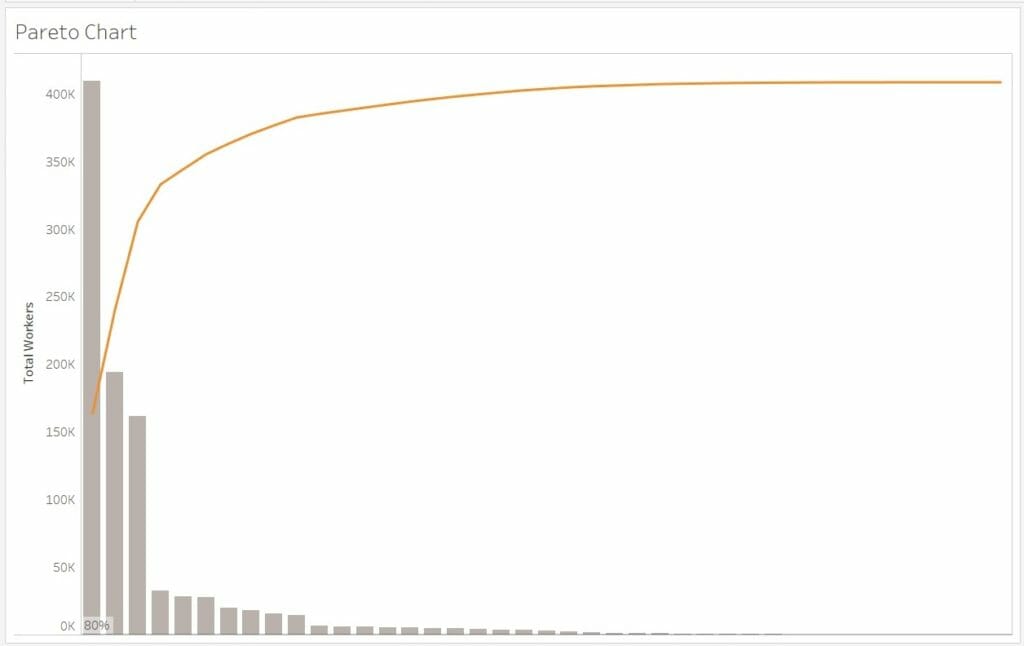
The Pareto principle (or the 80/20 rule) dictates that 80% of the effects come from 20% of the cause. In a typical Pareto chart, values are often represented within a descending bar chart with a cumulative percent of total represented by a concurrent line. An example of this can be seen here:
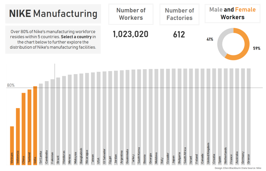
Another way of approaching a Pareto chart (which I much prefer) is to only reflect the cumulative percent of total within the bar chart itself. I used this format within my recent attempt at Makeover Monday Week 36, which explores the locations of Nike manufacturing around the world. Accordingly, this is the chart I’m going to go through step by step below.
Data source: Nike Inc
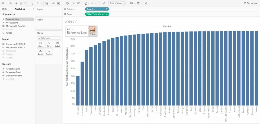
1) Firstly, select your measure and dimension, and create a simple bar chart in descending order.
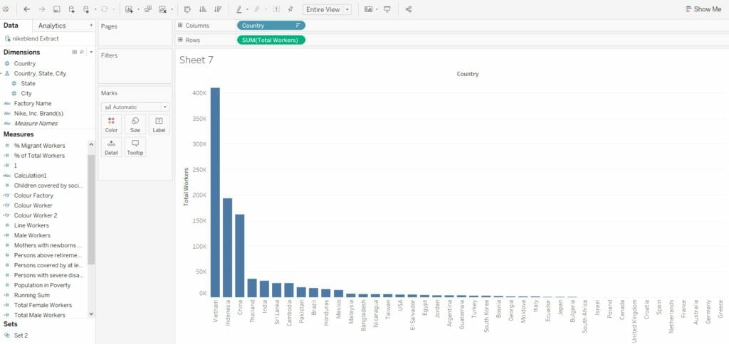
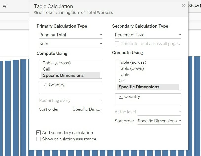
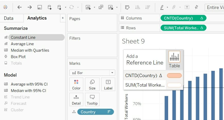
2) Right-click and add a table calculation to the measure within your rows shelf (in this case, Total Workers). This first calculation should be a running sum across each of the countries within the chart. Within this calculation, be sure to select ‘Specific Dimensions’ and tick ‘Country’, ensuring the running total doesn’t restart for each country.
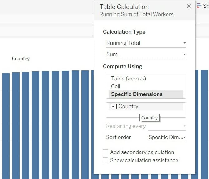
3) Add a secondary calculation which calculates the Percent of Total of our running sum, again, making sure to select specific dimensions and tick the ‘Country’ field.
4) Following this, enter the analytics pane and add a constant line and enter ‘0.8’ for it to lie at 80%. This represents the ‘80% of the effect’ portion of the Pareto principle.
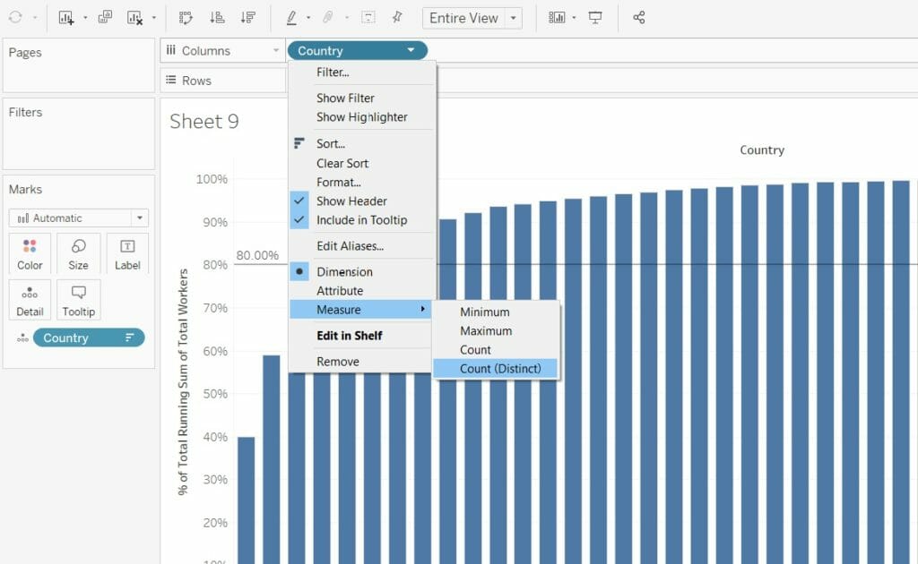
5) The next few steps treat our dimension very similarly to our measure. Before adding more table calculations, first drag ‘Country’ (dimension) onto detail the detail shelf, as well as having it upon the columns shelf. Failure to complete this step will break the table calculations for our measure.
Right-click on ‘Country’, go to Measure and select Count Distinct. This will return the number of unique values within this field.
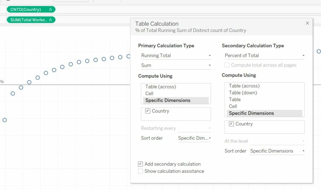
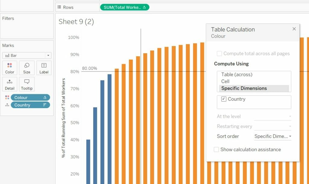
6) As we’ve converted Country into a dimension, we can now aggregate this field accordingly. Go to Country, add a primary table calculation of a Running Sum, and a secondary calculation which is Percent of Total (again, selecting Specific Dimensions and ticking Country for both calculations).
8) Turn your marks back to bars.

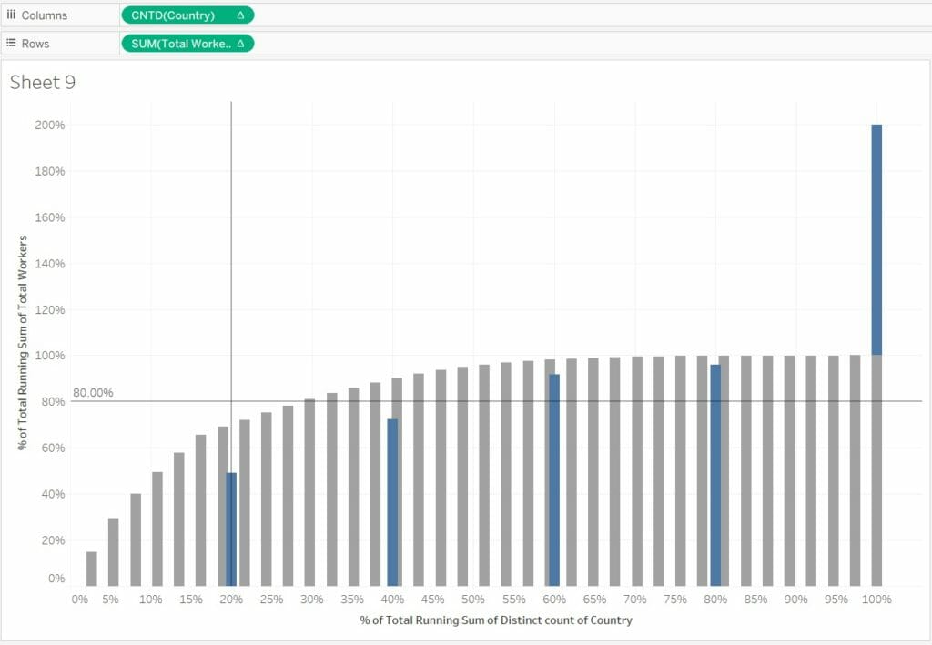
9) Add a second constant line for the X-axis. Our conversion of Country to a measure alongside the addition of table calculations has enabled us to identify the ‘20% of the cause’ aspect of the Pareto principle.
10) The next step is to colour your chart. This can be done in several ways. The first is a calculated field which details:
RUNNING_SUM(SUM([Total Workers])) / TOTAL(SUM([Total Workers]))>=.8
You can complete this by dragging the green pill from our rows shelf into the calculation, and adding “>=.8” or “<=.8”, thereby identifying the countries which are greater than/less than the 80% of cumulative percent of total.

Dragging this onto the colours shelf will yield the following result:
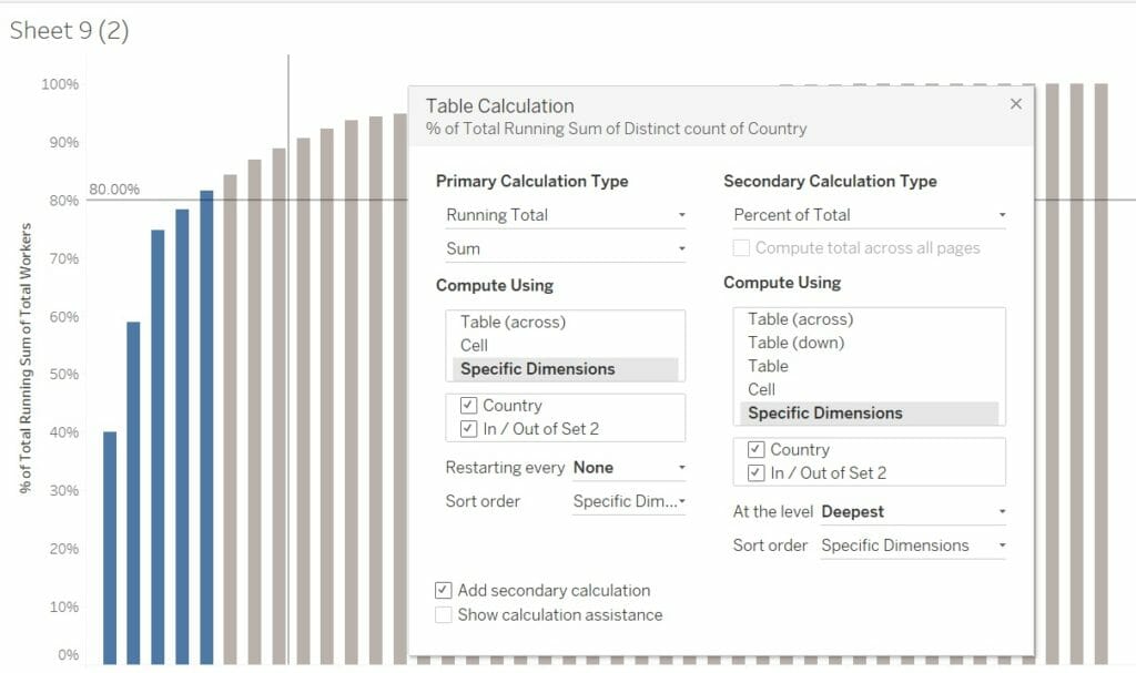
11) Similar results can be achieved through creating a set. By lassoing the bars which fall below/intercept our 80% constant line, right-clicking, and selecting ‘Create Set’, this view will appear. Select OK, and you have your set.
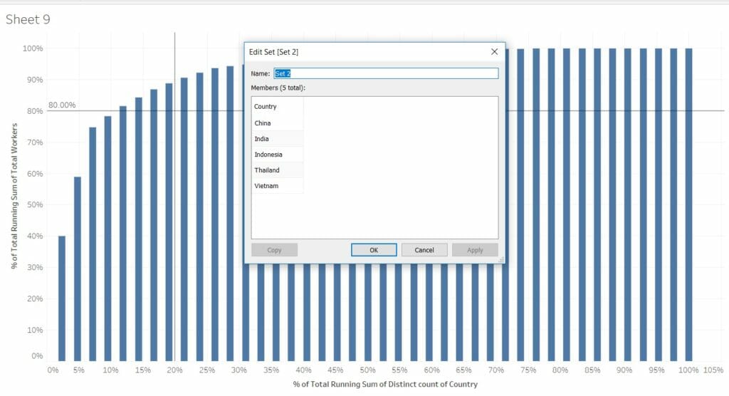
12) However, when you drag this set onto the colour shelf, you’ll see your view change (see below). By dragging this set into the view, it’s been added into our prior table calculations. As the boxes remain unticked for the sets in both our Country and Total Workers calculations, these calculations are restarting for each set, disrupting the view.
To fix this, simply go into your table calculation and include your set within the primary and secondary table calculations for Total Workers and Country.
After some formatting and a few more simple charts, this is the finished result. See the interactive version within my viz.