


If you want to display multiple charts with the same axes without the clutter, a trellis chart might be for you! In this blog, I'll go through how you can build this chart in Tableau. For this walkthrough, I will use the Sample Superstore data.
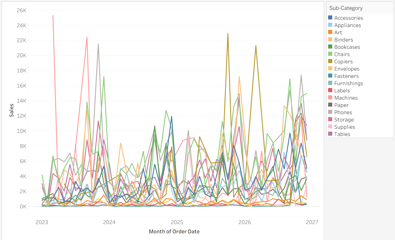
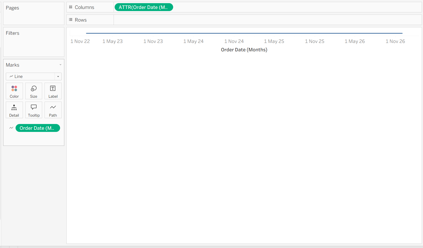
This is our starting point. The aim is to break up the lines into separate charts so we can view them all properly.
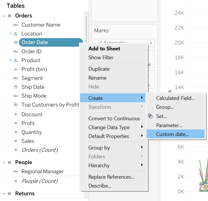
Step 1: Create a Custom Date
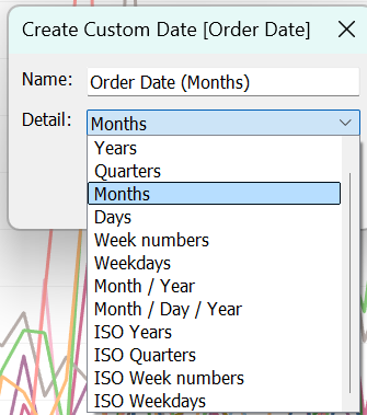
If you are working with dates, you first need to make sure that it can used as a measure rather than a dimension. To do this, right click on Order Date ▶ Create ▶ Custom date. You can then choose the level of detail you want from your date field. In this case, we are choosing Month.
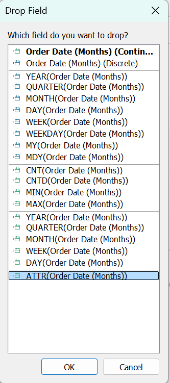
Then, right click and drag the new date field into the column shelf and select ATTR.
Once you turn your marks card into Line, drag the new date field onto path and you are done with the first step!
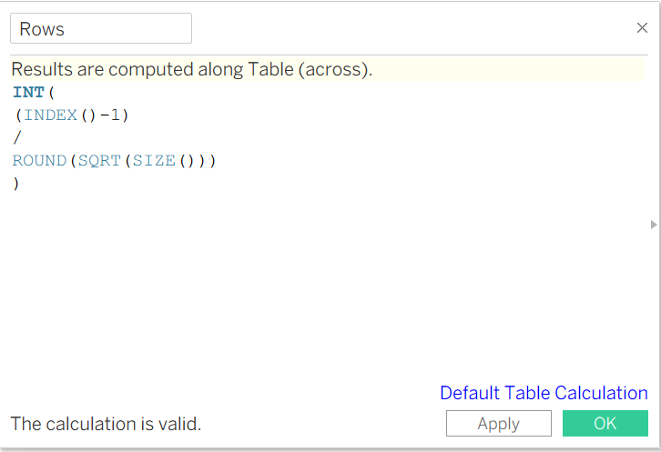
Step 2: Create Dummy Fields
Create a field called 'Rows' with the following:
INT((INDEX()-1)/ROUND(SQRT(SIZE())))
Next, create a field called 'Columns' with the following:
(INDEX()-1)%ROUND(SQRT(SIZE()))
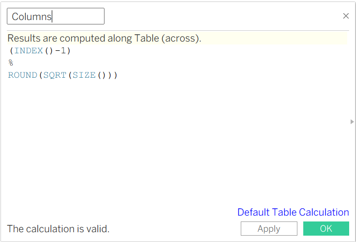
Make sure to turn both of these fields to Discrete. Drag Columns to the Column shelf and Rows to the Row shelf.
Step 3: Add Measure and Dimension to Chart
Drag SUM(Sales) to the Row shelf and Sub-Category to Colour (this is a very short step).
Step 4: Adjust the Table Calculations
Edit your table calculations so that:
- Both Sub-Category and Order Date (Months) is ticked
- It is calculated at the Sub-Category level
- (⚠ Important) Move the order of the dimensions so that Sub-Category is at the top
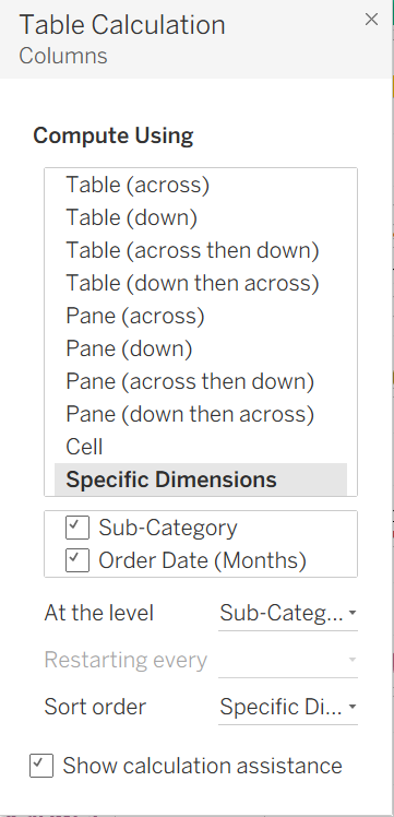
Make sure you edit both your Rows and Columns fields in the same way.
Those are the steps to create a Trellis Chart! Now you can format it to hide the dummy fields etc.