


Stepping away from our laptops for a day.
DS11; Week Three started with a really fun and engaging training day with Caroline Beavon. She talked to us about focusing our design skills, some good visualisation practices and took us through a design exercise with some mock charity data – on paper. After tackling and visualising a really big dataset in 4 hours on Friday of week two, it was actually really fun to get back to ‘basics’ and think about what message we wanted to say. It was also fun to properly learn how to say these messages using design – before getting specific with the data.
The importance of sketching
One of the main things I took out of today was the importance of sketching and planning before using the data. To get us in this mindset we were tasked with quickly sketching 6 layouts of an infographic that would describes ourselves and our history – but to only spend 5-10 seconds on each little sketch. This would help us think through components we wanted to show, as well as to discard anything that didn’t work.
As Caroline said – “behind every bad sketch is a good sketch waiting to get out“.
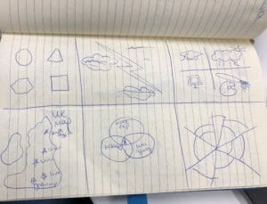
My six 5-10 second layout ideas
We then swapped notebooks and discussed which of our partner’s idea(s) we thought were the best and why. Due to everyone loving maps, Harry chose the UK as my best layout, and I chose a more football type of pathway for his. We then had to expand that into a one page sketch, adding a little more detail but still no colour.
One of Caroline’s tips was to only add colour as the last step, as not only does this focus the story, it helps the user to more clearly and simply understand a story.
An exercise in Design
For the majority of the afternoon we worked on an infographic/ poster that would help a made up Charity get additional funds and new donors. Caroline acted as our client and gave us a mock dataset to work from – so we did use the laptops for around 20 minutes but were quickly told to shut them!
Step 1: Check the data and ask the client any questions. This was particularly useful as some of the data was ‘wrong’ to catch us out, so we got to ask about why the figures didn’t quite add up, and for clarity on some of the variable headings. For my group, this was especially useful as we were designing a local campaign so could ask ‘Leeds’-specific questions giving us some additional context.
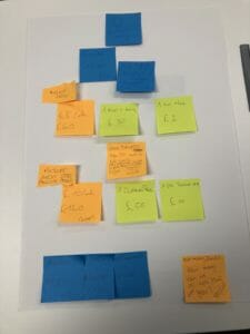
Step 2: Write one piece of data on each post-it note. This was extremely helpful as it allowed us to easily see links between the data; rearranging the post-its and grouping them to make sense of the story. In our case we used blue for local data, pink for national level data and orange/ yellow for case studies and story points. It was a fun, flexible way of exploring the data, and even though we ended up not using a lot of the post-it notes, I think it was a really valuable exercise because it stripped the dataset right back.
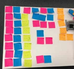
One data point was written on each post it note; colour coded to match the level of the data.
Step Three: Create the report by arranging, and rearranging, the post-it notes. This meant we could revise what we wanted the story to be and which data points actually supported this. We put lots of post-it notes on at first, and initially had it landscape but that changed as the story did. We found it helpful to take photos of each revision to let us compare the various layouts and developments of the narrative.
Having the data on post-its allowed us to strip back what we actually needed to make the points, showing the value of white space as we physically removed the unnecessary data to align a clear narrative.
Our post-it note layout of the poster
Step Four: Sketch the design, post-it note by post-it note. But first – draw any section-separating lines! We forgot to do this and our lower portion of the final poster is a little squished! Keeping the other post-it notes there also helps keep the narrative at the forefront of the design.
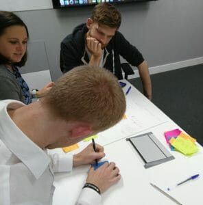
Jonathon, Tom and I sketching from post-it to poster
Step Five: Use colour to emphasise key points. One colour tends to be really effective at highlighting key statistics and also helps guide the user through the poster. All groups really effectively did this and it really brought the story out from the page.
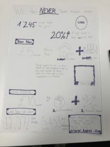
Our final poster!
It was a really fun day, and one we’d all looked forward to, with many useful take aways! Thank you Caroline!