Standard deviation is used to show how far away data is from the mean. This is used because when data is far from the mean, it can be a random ‘event’ or erroneous data. Therefore, the measure of standard deviation is often used to identify outliers/ spikes in the data for further analysis.
A control chart uses standard deviations above and below the mean. These are displayed as a band around the mean in the control chart, with outliers identified using colour. The band’s width in the control chart around the mean can be multiples of standard deviation, but often a range of multiples between 1 to 3 is used. This is because most of the time as much as 95% of values are within 2 standard deviations of the mean.
In the example I walk through below, we used Airbnb data, looking at when prices spiked for different rooms types across the year. I’ve also included how to incorporate a control parameter, which allows the user to adjust the standard deviation/ grey band on the graphs, as well as an outlier colour indicator.
See some insights at the end and view my workbook here.
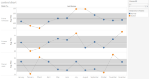
Control chart
Step One: Make the base chart
For this we want to see the price over the months for room types. So, drag the dimension ‘room type’ and the measure ‘price’ (average) pill onto the row shelf, and put the dimension ‘Last review’ (date as month dimension) on the column shelf.
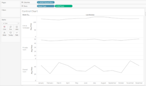
Base chart showing average monthly prices for different room types
Step Two: Layer to create two chart types
Duplicate and dual axis the measure, not forgetting to synchronise axis’ and hide the right header, to create a dot and a line on the same chart.

Duplicate price to dual axis and synchronise the axis

Tidy the chart a little by hiding the second, unnecessary header and change the type of the chart on top from line to circle
To make the variation in the data clearer, edit the right axis and untick show zero.
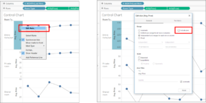
Untick include zero within the axis
Drag on average line from the analytics pane. Note that we want this to be for each pane, rather than for the table. This is because we want an average line per room type (in the rows).
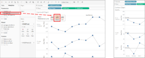
Add a reference line (average) to the pane
Step Two: Create the Control Parameter
Create a control parameter, ‘Choose sd’, as an integer with a range of 1 to 3 and a step of 0.1. Custom format the control parameter to show 1 decimal place. Right click on the control parameter pill to show it in the view.
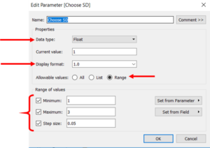
Create a control parameter
Step Three: Create the Upper and Lower Bound calculated field
Create 2 calculated fields to act as the upper and lower bounds of the graph bands. These will interact with control parameter. The calculated fields use window averages for both the price and the standard deviation. It uses the following formula but remember to have the correct + and – in the middle for upper and lower: WINDOW_AVG(AVG([Casualty Age])) (- or +) ([Choose SD]*WINDOW_STDEV(AVG([Casualty Age])))
NB we want to use SD for sample not population. Often standard deviation for the population (STDEVP) isn’t used, unless you know you’ve got the whole population

Create 2 calculated fields for the upper and lower standard deviation bands
Some people prefer to break formulas into a few fields for simplicity, by adding a calculation in for the window standard deviation separately and reference that where WINDOW_STDEV(AVG([Casualty Age])) is in the above calculation(s).
Step Four: Add the reference band(s)
To be able to use the two calculated bounds, they need to be in the view, i.e. on a shelf, so drag these to the details shelf on the marks card. They won’t show in the graph, but they’ll be on the details shelf.
Next, drag the reference bands from the analytics pane onto the chart. Set the new calculated fields as from (lower) and to (upper).
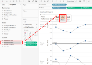
Add reference bands to the pane on the graph
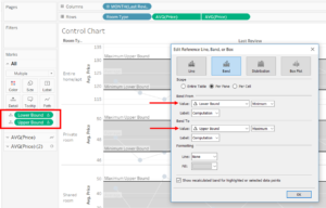
Using the two calculated fields as lower and upper bands
Step Five: Colour the control chart
You can even colour the chart to immediately draw the eye to those outliers that need attention.
Create a calulated field to ‘group’ the values on the chart by whether they are outside or inside the reference bands. This, like the calculated fields, will also be dynamic, based on the upper/ lower bands and therefore the control parameter. The formula for the colours is: IF AVG([Price]) > [Upper Bound] THEN “Outlier” ELSEIF AVG([Price]) < [Lower Bound] THEN “Outlier” ELSE “Normal” END
Put this onto the colour shelf on the second ‘circle’ marks card, rather than all or the line.
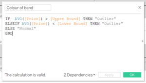
Colour indicator formula
And voila a control chart!
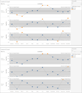
Final outputs, using the slider bar to increase the multiples of standard deviation away from the mean
Useful Insights
A control chart helps create really useful insights for a company. Here we can see that over December and in March prices spike for shared rooms – probably because of Christmas/ New Years get-aways or Easter holidays.
But, other more commercial insights can look deeper into reasons behind spikes of customers calls to a cal centre for example.
There have been a few Data School blog posts on how to create these types of charts from previous data schoolers (including Joe Macari’s which has a video!), but hopefully this one has put a different spin and helped make it clear!
