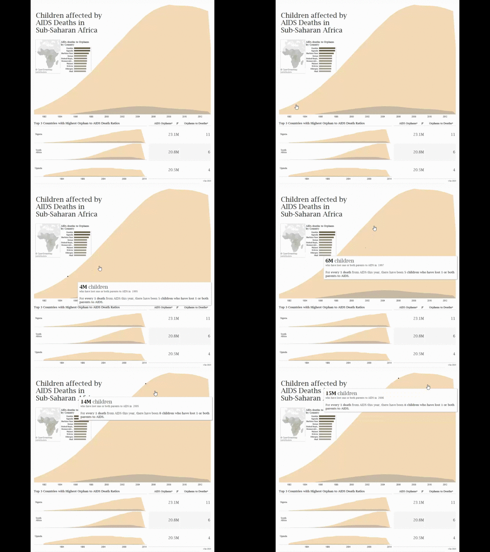
This was probably the saddest dataset I’ve worked with so far. The staggering numbers of children impacted by AIDS really made a toll on me. I picked the topic because I associate the UN with Stephen Lewis‘ work in HIV/AIDS. A rather specific thought, but his Massey Lecture on this topic was moving and served as my inspiration here.
Here it is to take a look at as well as interact.
I went through a lot of internal debate about whether or not comparing a running total (Number of Orphans) to AIDS deaths per year would be a misleading figure. It wouldn’t be “apples to apples” as they say.
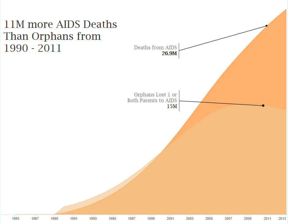
So I did the analysis to compare running totals (see below) and another sad truth is that we have lost more people to AIDS than Orphans in 2011. So was my analysis wrong?
I think my initial visualization demonstrates what I found hard to initially articulate – the bullwhip effect of AIDS deaths upon children.
The running total viz doesn’t illustrate the bullwhip effect nearly as well since by 2001, the AIDS deaths start to overtake the accumulated number of orphans. We start thinking more about why is this… is it more children growing up and moved out of the definition of “child”? Perhaps they’ve succumbed to AIDS like their parents if they were carried to term by a HIV positive mother during pregnancy. And of course, perhaps more people without children are dying. We need to ask lot of more questions to understand the situation. Unfortunately, this isn’t productive as I don’t have the data on whether or not these attributions had a signifcant effect. A rather disapointing place to take this conversation.
Craig asked us to ponder what our responsibility was as data visualization experts on our second day at the Data School. I think at the end of the day, we can only tell so many stories with the data we have and we will always ask an infinite amount of questions. This particular excercise has really made me understand that data visualization is the catalyst for data literacy. It really is the most approachable avenue for people to understand that data can be expressed at an elevated level; in the same way we know the English language can be expressed through rhetortic. It’s an exciting time to be here 🙂


