Pareto Analysis is used in business to compare the impact of one variable on another variable. It is based on the 80/20 rule – often businesses will find that 80% of an output variable comes from 20% of an input variable.
In a positive sense, a company might be able to identify that 80% of their profits are derived from just 20% of the products they sell. In a negative sense, a company might see that 80% of complaints can be traced back to just 20% of their stores.
This information can be very useful in decision making.
So how can we use Tableau to investigate something like this?
Step 1: What variables do you want to investigate? In this example we will use the Superstore dataset to compare Sales (output variable) with number of Products (input variable) and see if they follow Pareto’s Principle. Does the store earn 80% of its Sales value from its top 20% of Products?
If you would like to apply this to a different situation, replace ‘Sales’ with your OUTPUT variable and ‘Product Name’ with your INPUT variable.
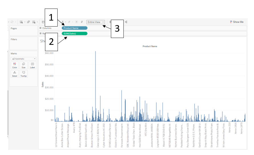
Step 2: Create a simple bar chart – Drag the ‘Product Name’ dimension onto the Columns shelf (If you get a warning message, you can select ‘Add all members’). Drag the ‘Sales’ measure onto the Rows shelf – Tableau will automatically sum these together. Fit the chart to the Entire View.
You should see something like this:
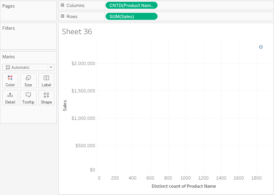
Step 3: Change the Product name dimension to a measure – at the moment, our ‘Product Name’ Field is a dimension, which means Tableau splits up the view into one column for each product, but we want to have two axes. Right-click on ‘Product Name’ in the Columns shelf, then:
Measure > Count (Distinct)
You should now have something like this in your view:
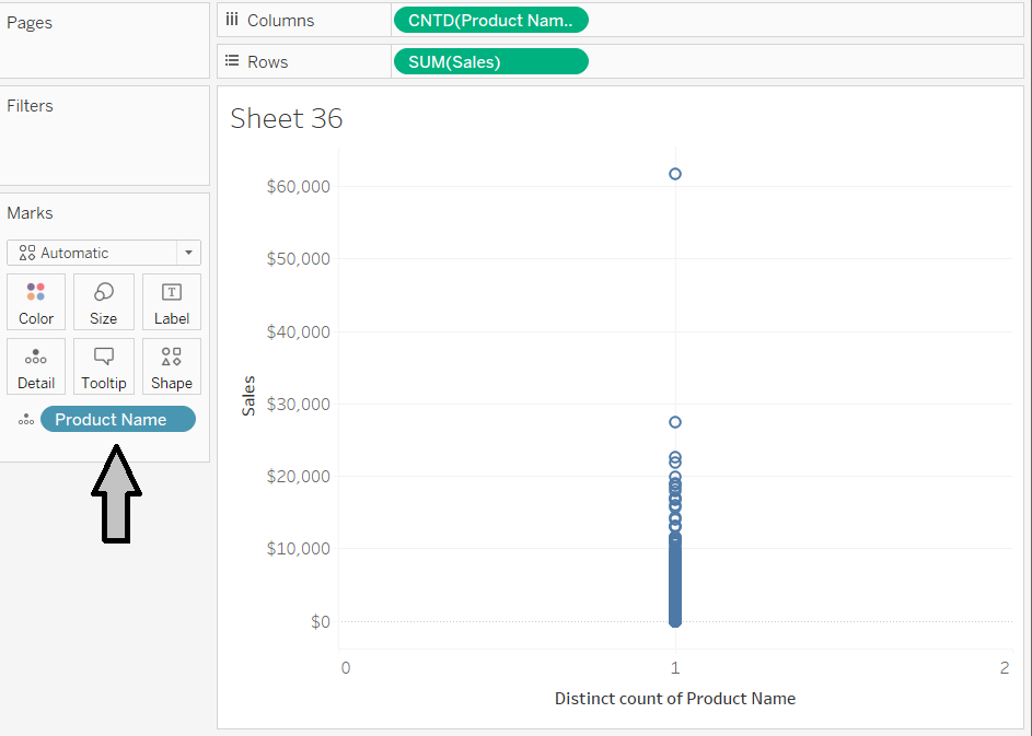
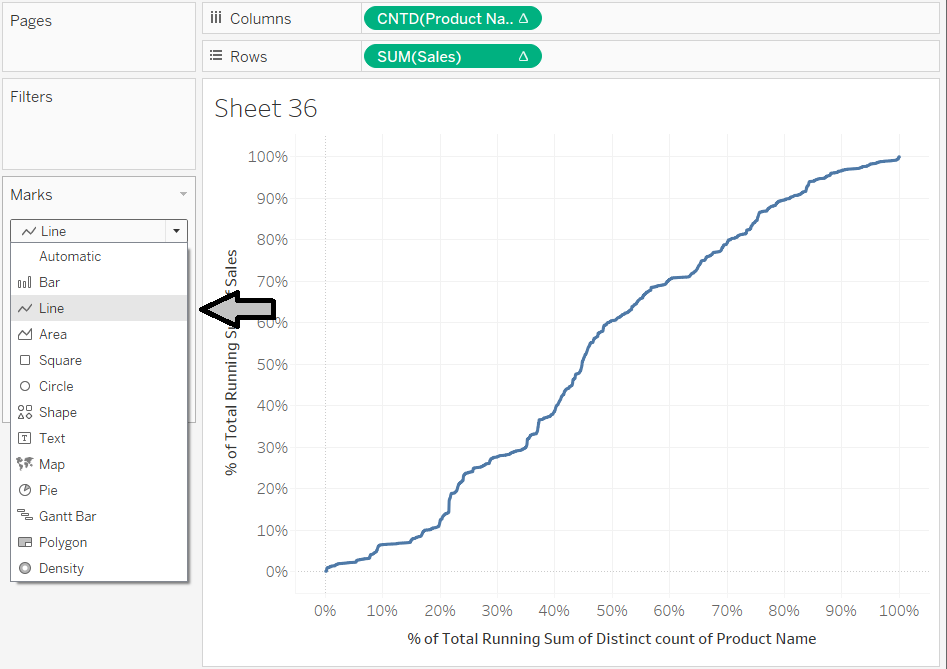
Step 4: Create a mark for each Product – drag ‘Product Name’ onto the Detail Shelf in the Marks Card
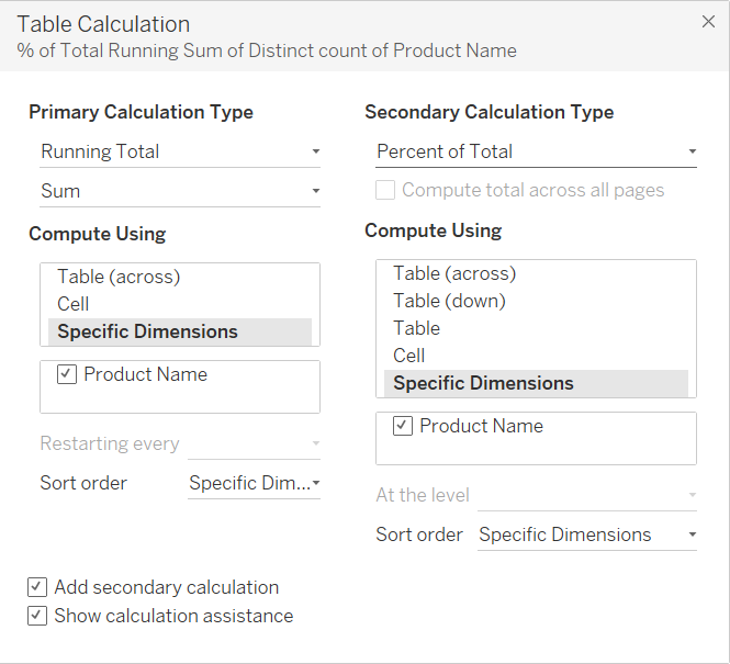
Step 5: Create a line –the idea of 80/20 comes from looking at the cumulative Sales/number of Products so we need to use a table calculation on each of the variables. Right-click on each and follow the following steps:
Add Table Calculation > Calculation Type: Running Total (Sum) > Specific Dimensions: select ‘Product Name’ (this creates a cumulative sum where each new Sales value is added onto the sum of all of the previous Sales values)
Select Add Secondary Calculation > Secondary Calculation Type: Percent of Total > Specific Dimensions: select ‘Product Name’ (this turns those sums into percentages, where 100% is the total sum of all of the Sales or the total number of all of the Products)
Change the Mark Type to Line and you should see something like this:
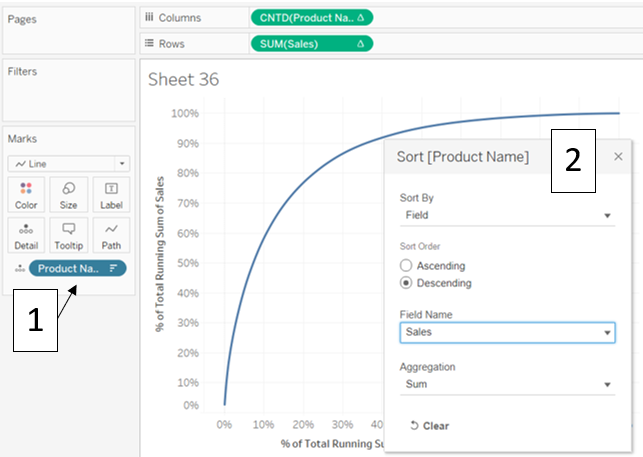
Step 6: Create a smooth curve – We want to be able to determine the % of Sales based on the TOP 20% of Products, so we want to sort the Products by their respective Sales values. To do this, right-click on the ‘Product Name’ field on the Detail Shelf:
Sort > Sort by: Field > Sort Order: Descending > Field Name: Sales > Aggregation: Sum
Close the Sort window
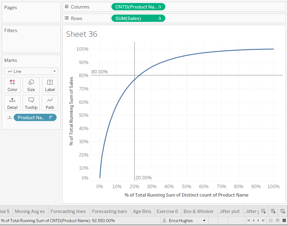
You should now have a nice smooth curve:
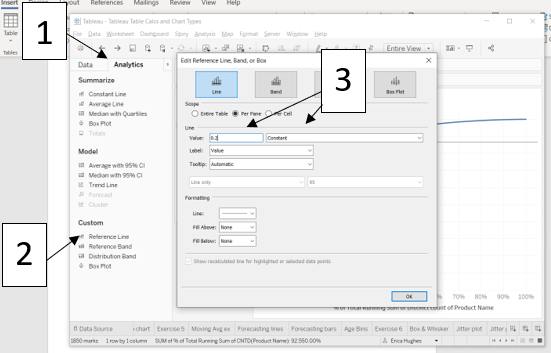
Step 7: Add reference lines – go to Analysis and double-click on Reference Line to create two reference lines.
For the vertical reference line (INPUT variable), right-click on the line, then:
Edit > change the second drop-down from Average to Constant > change the Value to 0.2 (20%)
Repeat for the horizontal line (OUTPUT variable) but make the Value: 0.8 (80%)
You can also choose to change some of the line formatting – for example, turning Label to Value, Tooltip to None and changing the colour of the lines.
In the end, you should have something like this: