


Today we learned about effective data communication to help prepare us for our future placements and client work. Most of the lesson was like a summary that tied together everything we learned within these past four months. We learned about:
- Exploration vs. Explanation
- The Audience vs. Stakeholder
- Assessing the data that you have
- How can we make meaning with data
- 6 main relation types that a visualization can show
- 7 C’s: How to organize data in charts (refinement)
- Chart choices
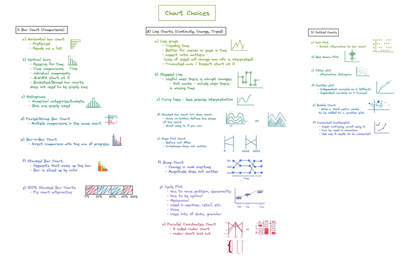
However, the part that I found the most impactful was the different chart choices. Before The Data School, even during my application process, I used bar charts and line graphs way too much. I thought that The Data School would teach me how to use alternative graphs and stray away from your typical bar charts and line graphs, but instead what I learned was that we will never escape from them. The main charts that we use and know about are basically different versions of bar charts, line graphs, and dotted charts. It’s just a matter of choosing which visualization presents the data the clearest by showing enough info but not too much and shows all large/small differences well.
Below is a list of the different variations of the bar charts, line charts, and dotted charts:
References:
1) Storytelling with Data: Let’s Practice! book: https://a.co/d/f4WOvrk
2) Data Visualization Handbook: https://a.co/d/6MkNcBu
3) “45 Ways to Communicate Quantities” Article: https://rockcontent.com/blog/45-ways-to-communicate-two-quantities/
4) Effective data communications class notes: https://www.thedataschool.co.uk/erlina-cahyadi/effective-data-communication-class-jan-24-2023