


How often have you found yourself struggling to let go of a beautiful chart on a dashboard because it doesn't advance the story? I've found myself in this predicament often, enamoured with a particular chart or data point that's fascinating, yet lacks a meaningful purpose within my dashboard.
During one of the sessions at The Data School, we learned about the value of defining user stories through sketching. Creating a user story and sketching an illustration of what a solution might look like is a great way to understand the scope of a project and align stakeholders. I realized, however, that this process offers an additional benefit: helping you decide what to keep and what to exclude.
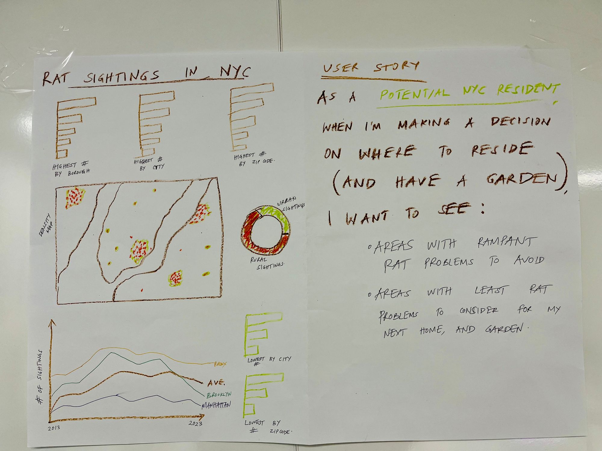
Our task was to sketch a user story related to data on rat sightings. A helpful format to use when defining a user story is: “As a(n) X, when I Y, I want to be able to Z”
Here's how I defined my user story using this format: As a prospective NYC resident, when I'm deciding where to live (and have a garden!), I want to see: i) Areas with prevalent rat problems to avoid; ii) Areas with minimal rat issues to consider for my future home - and garden! This is the sketch I came up with based on this user story:
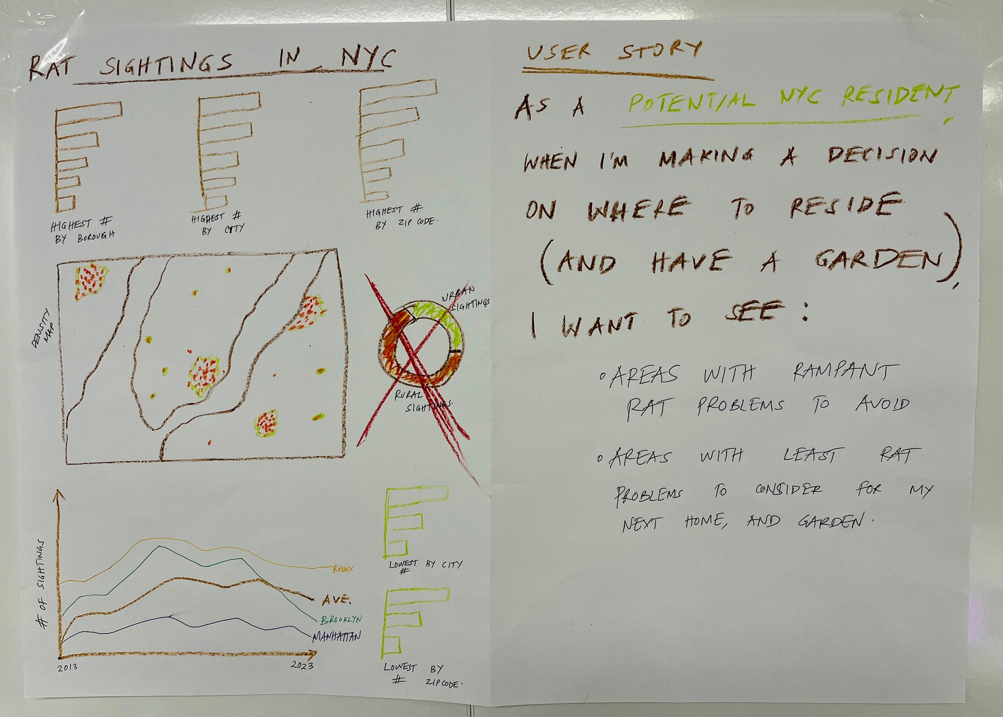
When revisiting my story, I realized that while the donut chart with the urban/rural rat distribution is interesting, it's not so useful for the user. In fact, it could merely reflect the correlation between human population density and rat sightings in New York City. Therefore, guided by the user story I had defined, I decided to exclude that particular chart. This was my final sketch:
Embracing the constraints of a user story can be a powerful way to let go of elements that, while dear to us, may not truly serve the greater narrative.