In this blog I'll guiding you step by step on how to create a heatmap which uses parameters to change the dimensions of the X and Y axis.
Firstly I'm assuming you've already connected everybody's favourite data source into your Tableau workbook, Sample Superstore.
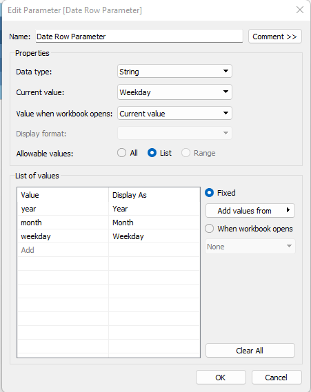
- Create your row and column parameters. In this example we'll be using the order date in our parameters, here you will manually enter the year, month etc. It is good practice to capitalise the 'Display As' column too. Once you have created one parameter i.e the Date Row Parameter, you can duplicate this and rename to Date Column Parameter.
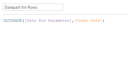
2. Next you need to create the calculated fields that will incorporate these parameters into the view. You will want to use the DateName function to bring back the string, i.e February instead of '2'. Now replicate this again but substituting the row for columns for the parameter inside the formula and the title of the calculated field.
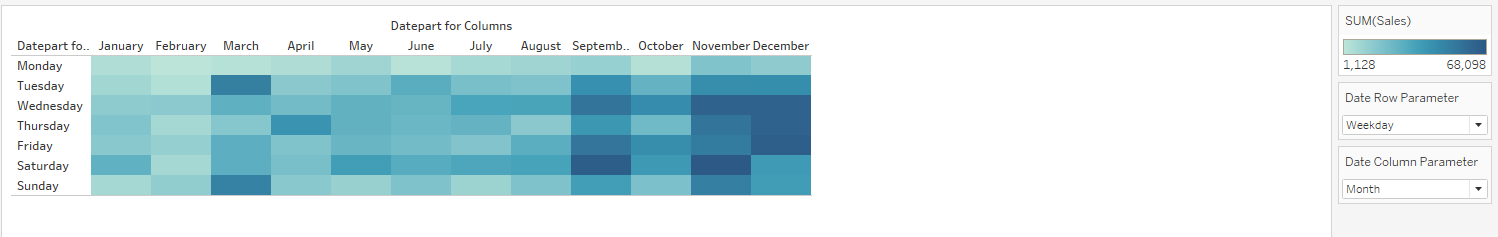
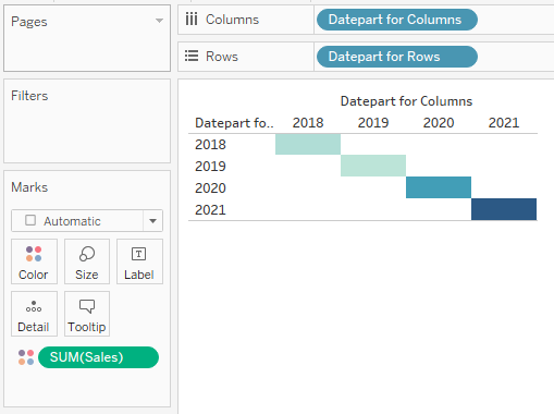
3. It's time to start putting this together. Drag your calculated fields onto their respective shelves, rows to rows and columns to columns. Also drag the Sales field onto your colour, your view should now look something like this:
4. Finally, right-click on each of your parameters and select 'show parameter'. They will now appear on the right side of your view, if you select different time measures then the heatmap for every square should now appear.