


Iteration functions or "X" functions in PowerBI are a build on to the usual aggregation functions, written with an X as suffix (SUMX, AVERAGEX etc). They enable you to create more complex measures or columns, by evaluating expressions for each row of a table, and then aggregating that result by the aggregation chosen.
For today's blog I will be walking you through two examples of when you might want to use iteration functions, particularly the AVERAGEX function.
Coloring Above or Below Average
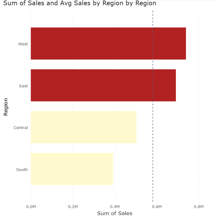
- Build the View: Place Region on the y-axis and Sales on the x-axis.
- Add Reference: Drag an Average Line from the Analytics panel onto the chart.
- Replicate the Reference Value: Create a measure that represents the country-wide average by adding all sales for each region and averaging that value.
Avg Sales by Region =
AVERAGEX(
ALL('Regional Managers'[Region])
, [Total Sales]
)
- Apply Logic: Create a color encoding that identifies whether a region's sales are above or below the country-wide average. Assign red to "Above Average" and yellow to "Below Average" to match the above visualization.
Total Sales > Avg Total Sales by Region =
IF(
[Total Sales] > [Avg Sales by Region]
, "Firebrick"
, "Lemonchiffon"
)
You will need to add this measure within the formula (fx) section of the bars > color.
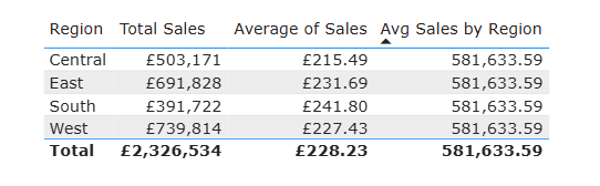
Why would you use AVERAGEX instead of AVERAGE in this scenario you might ask. This is why it's worth looking at the data in a table format to truly understand how AVERAGEX works differently to the AVERAGE function in terms of the way it calculates the end result. AVERAGE will only calculate the very basic mean value of the sales for each region, however, AVERAGEX will add up the total sales for all regions and then find the median of that value.
Coloring marks depending on Quadrants
Another fun use of AVERAGEX is coloring marks based on the quadrant they are in a scatterplot. This uses the same principle as the example above but with a few more steps.
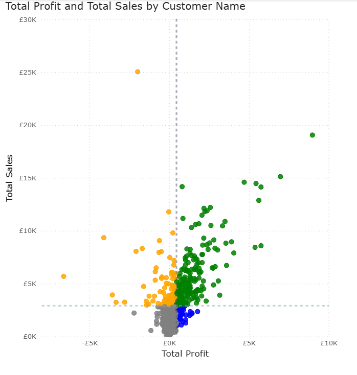
First, create a scatterplot with Total sales and Total Profit on y and x axis, Customer Name on values. Then add the average lines for each axis.
Next you want to calculate the measures for those average values. You can do this by creating two Average measures, one for Avg Sales per customer name and another for Avg Profit per customer name.
Avg Sales by Customer Name =
AVERAGEX(
all(Customers[Customer Name])
, [Total Sales]
)
Avg Profit by Customer Name =
AVERAGEX(
all(Customers[Customer Name])
, [Total Profit]
)
To create the color legend based on which the marks in the scatterplot will be colored, you need to create a third measure with nested IF statements and the equivalent colors for each scenario. Note that you only need 3 IF statements as the 4th quadrant can be in the ELSE argument (equivalent to Tableau).
Quadrant colors =
IF(
[Total Sales] > [Avg Sales by Customer Name]
&& [Total Profit] < [Avg Profit by Customer Name]
, "Orange"
,IF(
[Total Sales] > [Avg Sales by Customer Name]
&& [Total Profit] > [Avg Profit by Customer Name]
, "Green"
,IF([Total Sales] < [Avg Sales by Customer Name]
&& [Total Profit] < [Avg Profit by Customer Name]
, "Grey"
, "Blue"
)
)
)
Add that to (fx) in scatterplot > color and you will get the desired output shown above!
I hope this content helped, more PowerBI blogs on the way 😼