


When you first open Tableau, you’ll notice that some fields are colored blue and others are green. It’s a common misconception that Blue = Dimension and Green = Measure. While that’s usually how they start out, the truth is a bit more nuanced, and understanding this "color code" is the secret to mastering how Tableau displays your data.
Discrete vs. Continuous
Blue Fields
Blue fields represent discrete data. Think of these as individual "buckets" or categories. These are things like region, product category, or a specific department name.
When you drag a blue field onto your row or column shelf, Tableau responds by creating a header.
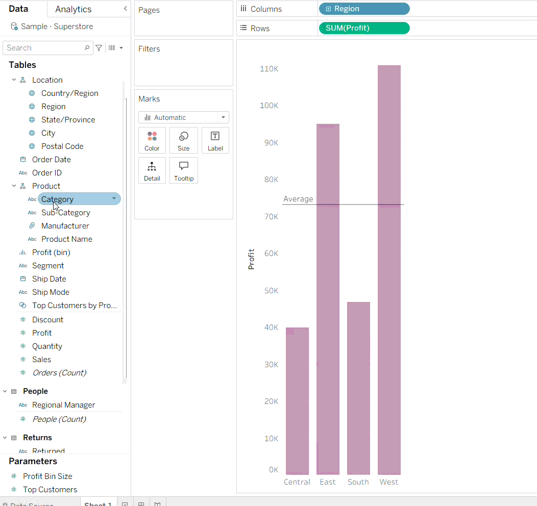
Green Fields
Green fields represent continuous data. This is data that forms an unbroken whole, like salary or profit. These values can fall anywhere on a scale.
When you add a green field to your shelf, Tableau responds very differently, by drawing an axis. Instead of creating separate buckets, it plots the data along a range.
Pro Tip: You might notice that blue fields always come before green fields in your shelves. Why? Because you can’t have an axis before you have a header!
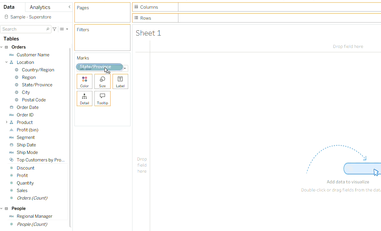
In the left-hand data pane, you’ll see these fields separated by a thin grey line.
Can a field be both?
Yes! This is where it gets interesting. Some fields, like Dates, are shape-shifters. They can be either discrete or continuous depending on what you need for your analysis:
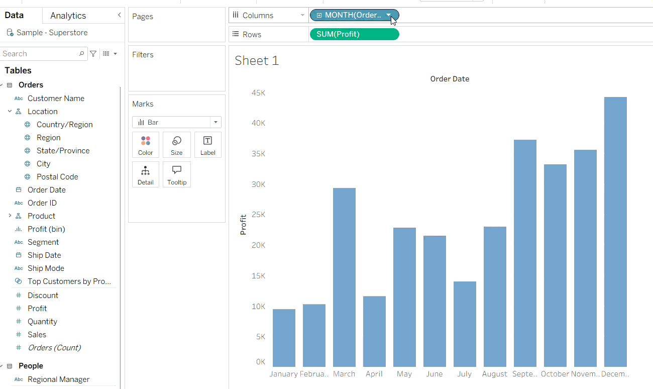
Discrete (Blue): One value corresponds to a specific month or year (in the above example "January" as a bucket, regardless of the year).
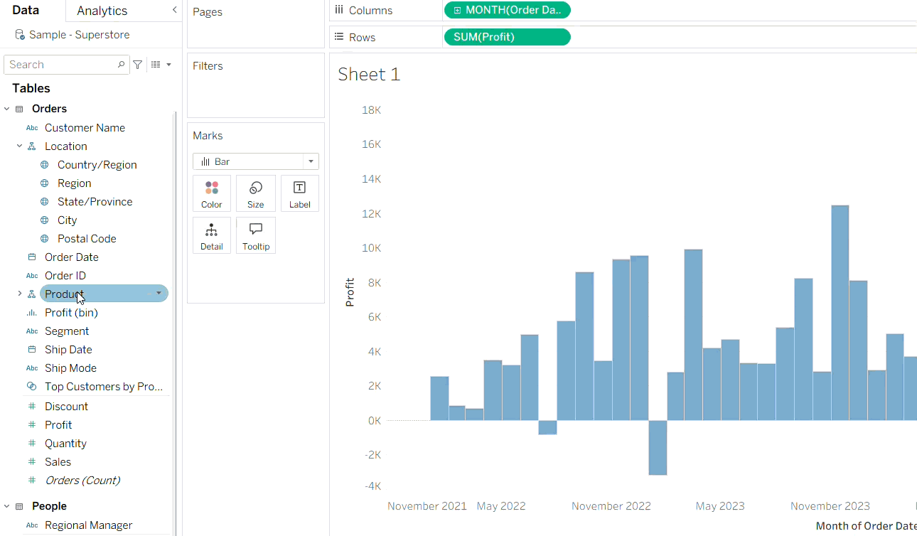
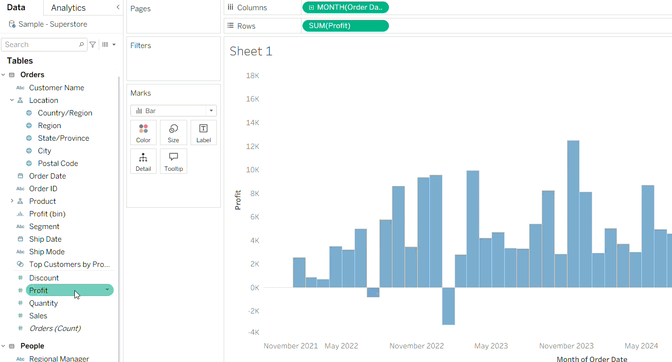
Continuous (Green): The value corresponds to a specific point in time on a chronological scale (November 2021 value in a time scale from 2021 to 2025).
So What?
Knowing the difference between blue and green fields is fundamental in learning how to use Tableau, by understanding that Tableau treats them as two entirely different sets of instructions for building a viz.
Beyond just creating headers or axes, this distinction fundamentally changes how Tableau handles:
Filters
Blue fields create a checklist of individual items (e.g., "Which category should I show?").
Green fields create a range of values (e.g., "Show me profits between $500 and $1000").
Color
Blue fields assign distinct, categorical colors to each unique item (e.g., each segment will be colored differently and independently, so changing the color of one won't affect the other segments).
Green fields create a color gradient, showing the intensity of the data (e.g., from light to dark).
The color or type of gradient can be changed by clicking the color legend, and typically the two types of gradient (Standard and Diverging) use sequential color palettes.
Summary
Once you realize how this color code dictates everything from seamless chronological mapping to the magic behind filters and gradients, you can say goodbye to the common pitfalls that trip up beginners and get ready to transform your data into a masterpiece!