


Parameters in PowerBI serve the same function as parameters in Tableau in allowing the user to dynamically change dimensions, measures and variables within reports without changing the underlying data.
The only difference in PowerBI is that the parameter configuration automatically creates a DAX calculation which you can drag to the visualization, whereas in Tableau you'd need to integrate the parameter into a calculated field in order to enable it.
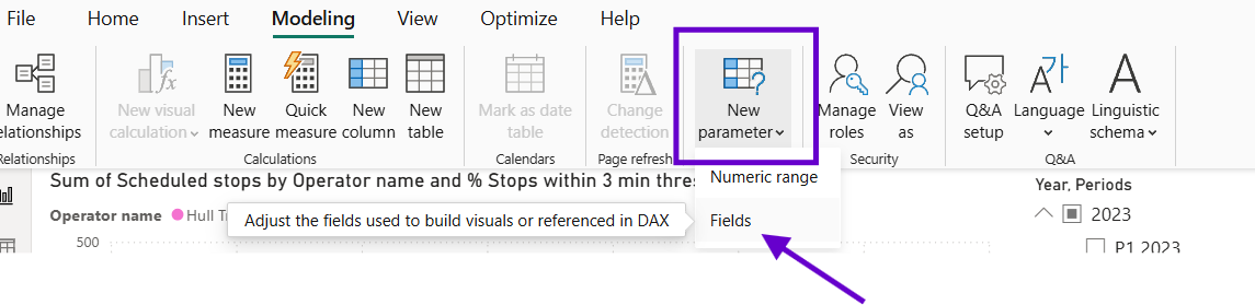
To add parameter > Modelling > Create New Parameter > Field (for both Dimensions and Measures)
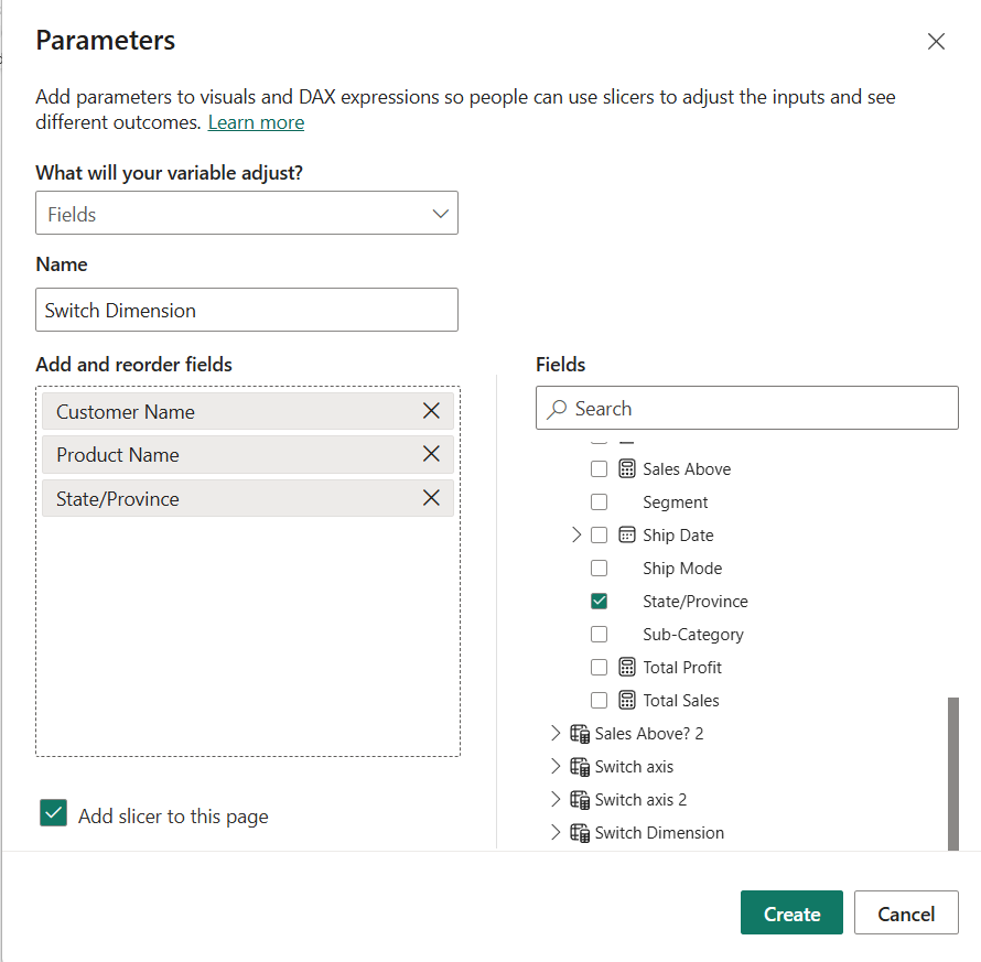
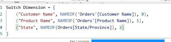
Once you create the parameter you can't access the pop up window again, so you need DAX to edit it. The numbers after the "," just show the order that the dimensions will appear in the parameter. In the example below, I've created a parameter that switches between the dimensions Customer Name, Product Name and State.
To test that the new parameter works, we can create a bar chart with the "Switch Dimensions" parameter on the y-axis and sales on the x-axis. Drag in a slicer using the parameter like below:
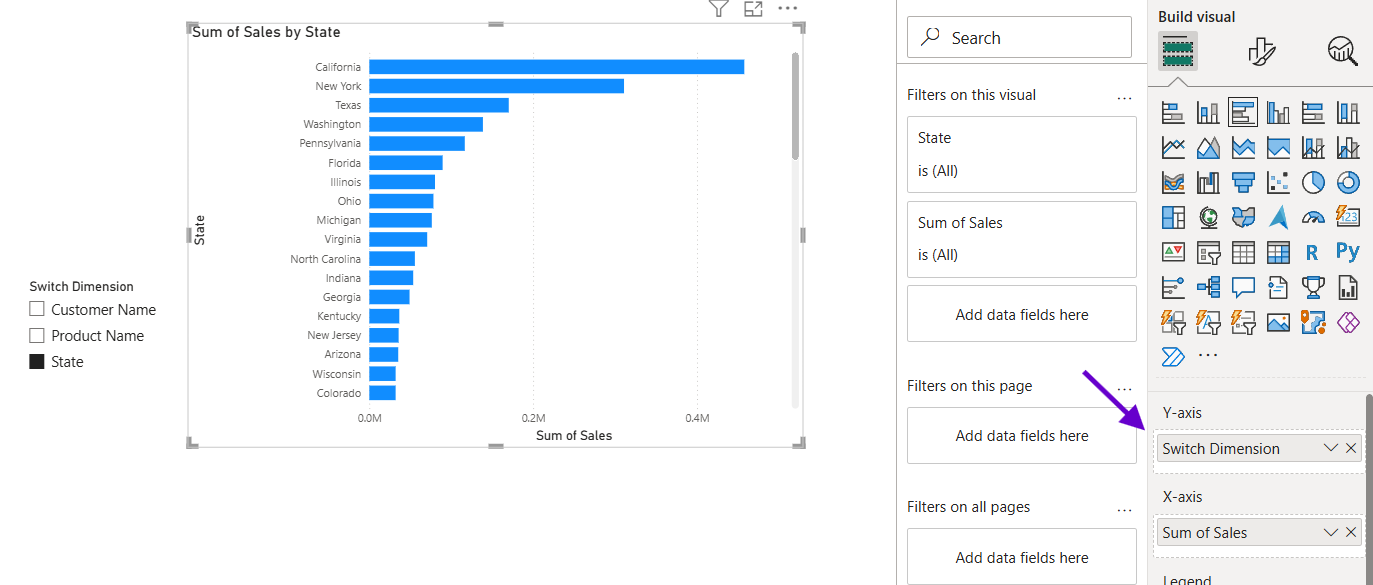
Each dimension in your parameter will now filter the dimension on the y-axis of your bar chart! Wait, there's more you can do with parameters.
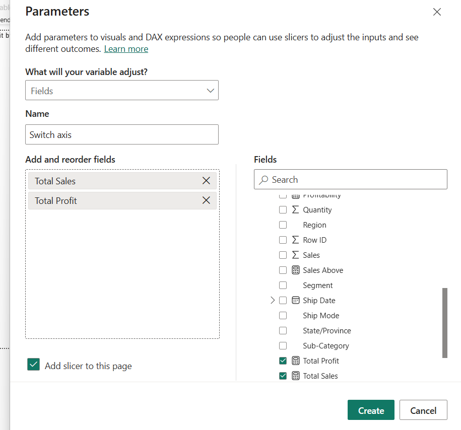
You can also, create a parameter to switch your axes around. For example, you could switch between total sales and total profit on your x-axis.
First, you need to create two measures for your total sales and your total profit:
Total Sales =
SUM(Orders[Sales])
Total Profit =
SUM(Orders[Profit])
Then in the configuration pop up when you add a parameter, you need to select those two measures you just created:
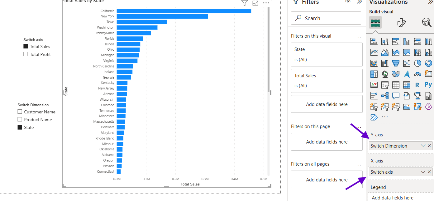
If you test this out on the same bar chart from the example above, you will notice that you can now change both y-axis and x-axis dimensions/measures making the chart very dynamic for the user.
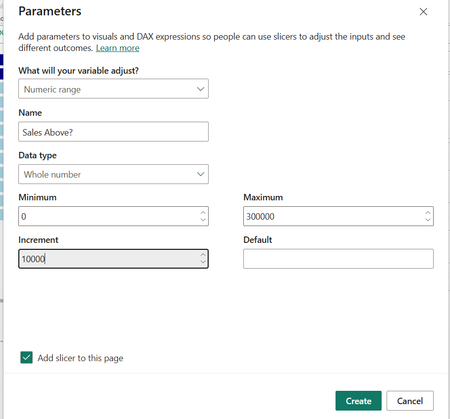
In the final example of this blog, I'll be walking you through how I've added the parameter as a reference line into a bar chart and how you can color the bars dynamically depending on if they are above or below that line.
When you create a parameter this time, you'll need to select the Numeric Range instead of Fields like the previous examples, then you need to set a min and a max value along with an increment:
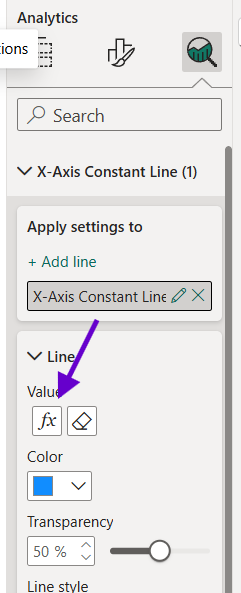
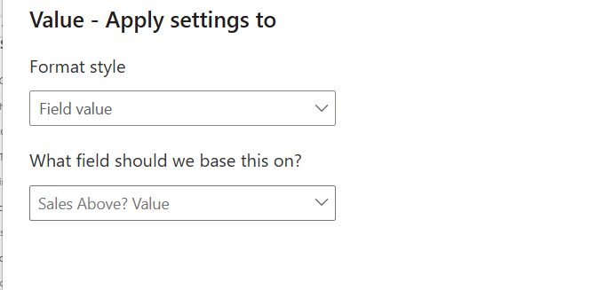
Drag a bar chart into the view and go into the analytics pane, then create a constant line for your x-axis. You can set the value to the parameter VALUE by clicking the fx icon which will open the pop up window below:
Then the last step is to add a dynamic color to the bars. For this you'll need to create a measure that colors the bars according to whether they are above or below the parameter value.
Sales Above =
IF(
SUM(Orders[Sales])
>= 'Sales Above?'[Sales Above? Value]
, "Dark Blue"
, "Light Blue"
)
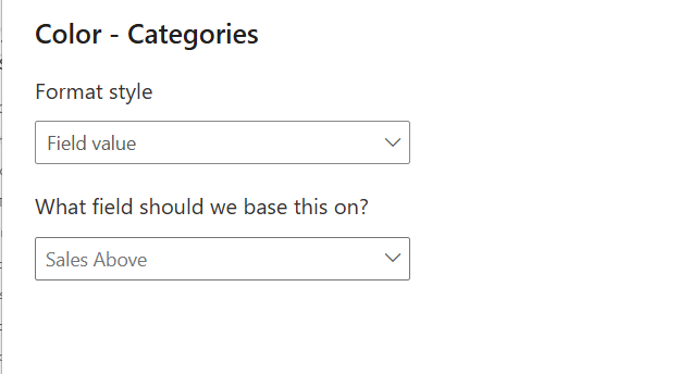
Go to the Format visual tab of the bar chart and select Bars > Color > fx. Then in the pop up window simply add the "Sales Above" measure you just created.
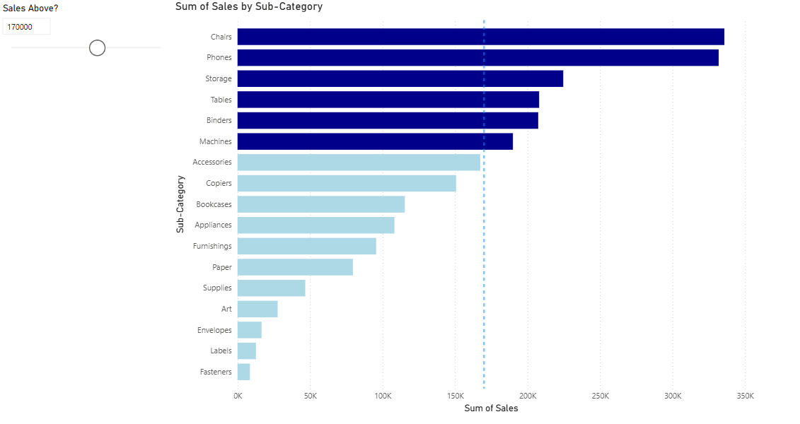
The end bar chart should look like below; where the bars are colored dark blue if they are over the parameter Sales Value which can be controlled by the user through the slicer.
Personally, I found it easier creating parameters in PowerBI compared to Tableau, however, it does require a basic knowledge of DAX to integrate the parameter into a measure and being familiar with where everything exists in terms of the fx tool that you need to use the parameter/measure value in.
Really hope this blog helps you out in some way, I know I will definitely have to refer back to this when I'm further into training!