


A few weeks ago now (wow, how is time flying so fast?!), we had a full week studying Power BI and PowerQuery. As we became more adept at the software, we levelled up our game by adding to our charts using dynamic parameters to impact bar colours. Several other members of my cohort chose to write about this topic or thereabouts during that week, so I thought I'd explore how to complete the aforementioned actions in Tableau. This blog post will enable you to boost your visualisation skills by also taking you through the steps to achieve extra details like conditionally formatting your labelling. I'll be using a sample superstore dataset to create the Tableau version of the chart in the feature image (the image at the top of the post) so feel free to follow along with that or use your own dataset to create your own masterpiece.
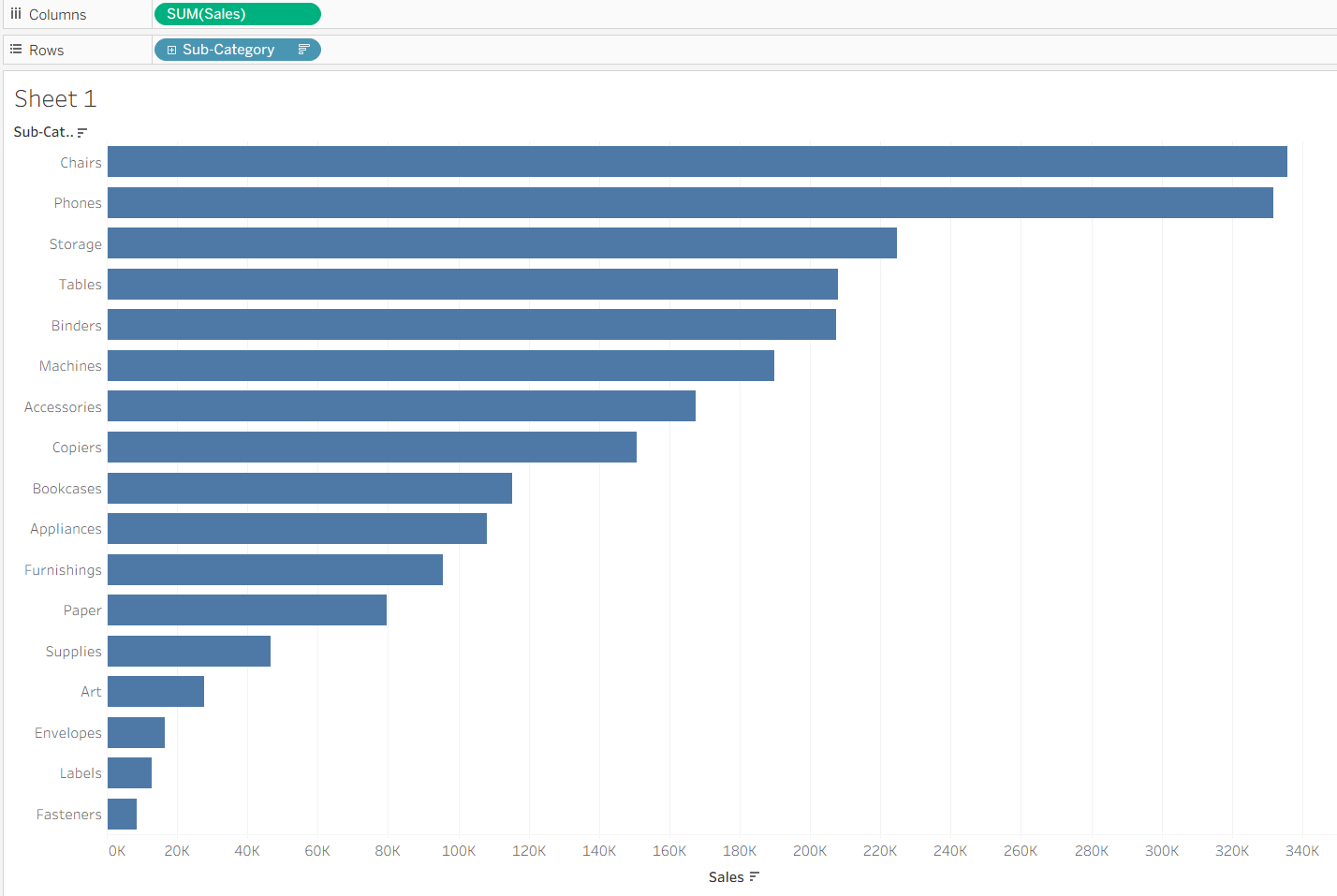
Step 1: Create the chart. Drag your sum of sales (or your measure) onto the columns and and sub-category (or your dimension) to rows. Sort by sum of sales.
Step 2: Create the parameter. You may ask, what exactly is a parameter? And that would be understandable because I had been using them for a little while and knew roughly what they did and how to use them but what they actually were, well that's something that was a little vague until we were taught about them not too long ago. A parameter is essentially a user-set value. The user chooses from the options that the creator has set (e.g. numeric range or list of categories) to customise their view of a chart.
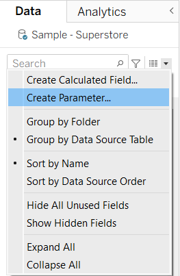
Now that's cleared up, to create the parameter go to the data pane and click on the little drop down carrot > create parameter.
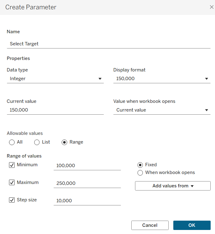
A pop-up window will appear where you can specify the details of your parameter. For a parameter specifying a numeric value, like this one, it is useful to know what your range of values is for your measure so take a look and decide what you want your parameter to show. For me, I'm suggesting that this could be for proposing a sales target so that's what I'm calling the parameter. My data type is an integer and my allowable values is a range (so the user can select a span of numbers to use). Based on the values in my dataset, I've chosen the minimum to be 100,000 and the maximum at 250,000 with a step size of 10,000 - so the user can select 110,000, 120,000 etc. but not 125,000. I've also edited the current value to be 150,000 so that will be the automatic value that the workbook will show when it opens. Once you're happy with your choices, click ok and then show the parameter in the pane. Now, try changing your parameter value. Nothing happening? That's right because your parameter isn't connected to anything right now. The way I understand this is by likening it to a television remote without batteries. You've got all the right buttons but you can press what you like and it won't do anything. So let's find some batteries (the way to connect our parameter to the chart).
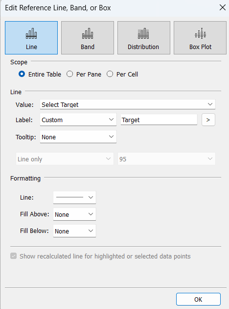
Step 3: Add your parameter as a reference line. Go to the analytics pane and drag a reference line onto your chart. A pop-up window will appear where you can edit the details of the line, setting it to your parameter value, editing the label, formatting the thickness etc. Below you can see the formatting options that I chose but experiment with what you think looks best for your chart. N.B. There is also a way you can combine step 2 and 3 by choosing 'Create a Parameter' in the value drop down. I like to do things in a step-by-step process as I think it's easier to follow but maybe next time, try it out!
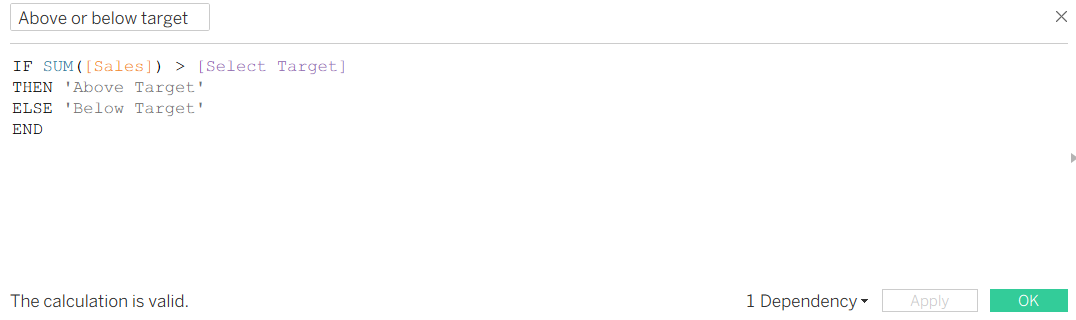
Step 4: Adding dynamic colour to your bars. To enable your bars to change colour depending on whether they're above or below the target, you'll need to create an IF statement in a calculated field. By relating your sum of sales to the parameter which is dynamic, this means that the colours can change accordingly. If you had used an exact value, in my example my target is set to 150,000 at the start, then the colours wouldn't change when you change your value as they're based on something static.
Use the calculation below, hit ok and then drag it onto colour on your marks card. There are actually several ways to write out this calculation but this is my preferred one as you can specify the alias of the result (e.g. above target). If you like a different way more, go ahead and use that!
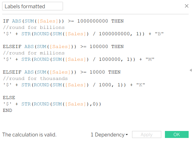
Step 5: Conditionally formatting your labels. Unfortunately, there isn't as simple a way to complete this formatting as there is in Power BI. You can do this two ways, either by using multiple calculated fields and formatting the labels individually or in one HEFTY calculated field. See below for the calculated field example (with thanks to a previous data school blog which showed me how to do this in Tableau). The good thing about this example is that you can use it over again in different workbooks and you only need to edit the measure.
WARNING: Be careful with the brackets if you copy and paste then edit your measure, because it can get rather fiddly! I myself got rather confused as to why my calculated field kept coming up with issues with floats, integers and strings when it was actually that I didn't have brackets in the right places.
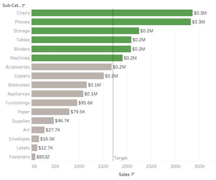
There you have it. A beautiful chart with some excellent formatting choices, maximising the information that the user can see at a glance. That's everything from me this week so all that's left to say is onwards to week 9!