


If you're anything like me before I started at The Data School, you might think that a map is a great way to demonstrate something in your data. You can imagine my shock when I discovered that maps actually aren't all that helpful, at least political maps anyway (the maps that at the basic level show you countries, states etc., not related to political party allegiances!). The key issue with political maps is that there is a size factor which is unrelated to the data at hand i.e. the difference in size between Rhode Island and Alaska on a map is not being used to convey a difference in customer profitability, it's just the difference in land area. You may be thinking, of course people aren't going to assume that because Alaska is bigger than Rhode Island that it has greater customer profitability, and you would hope that this would be the case. However, when you look at a map coloured by customer profitability, you will automatically see Alaska more easily than Rhode Island, and distinguishing between many of those North Eastern states clustered together can be more difficult too.
So, how do you fix this issue whilst still keeping the visually appealing element of a map? Well you create a hex map (it would have been a rather awkward blog post if that wasn't the answer)! This eliminates the size issue completely so all of the states can be viewed equally as easily and it keeps the fun visual element of a map. In this blog post, I'll take you through the step-by-step process of creating this type of map in Tableau Desktop. I'll be using the sample superstore dataset but grab any dataset you fancy that has data across the US states and then we can get started.
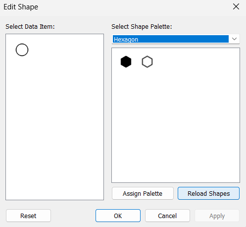
Step 1: Adding your hexagon shape to shapes in the marks card. As a hexagon isn't one of the shapes that is automatically found in Tableau, you'll need to download one online (I suggest this website). Importantly, make sure that you select a hexagon with the pointy top and not a flat sided top so it fits with the visual. Once downloaded, go to your Tableau Repository (typically found in your documents) > Shapes folder. I created a new special hexagon folder but it's up to you and then moved my download to there.

Step 2: Download the hex map template which Tableau will use to position the hexagons in the right space on the worksheet.
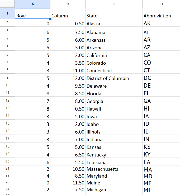
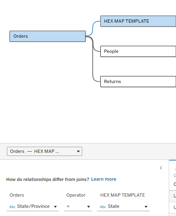
Step 3: Create a relationship between your hex map template and your dataset so that Tableau knows that the state columns in both datasets correspond to the same thing. To relate the datasets, simply add both files as connections to your workbook. Drag one table in and then drag the other table near enough that it creates a noodle (the wiggly line between the two tables). Ensure that you add which columns the tables are relating on as well.
Step 4: Lay the foundations for your chart. Drag your rows and columns fields onto their respective axes. Then reverse the rows axis so that zero is now at the top.

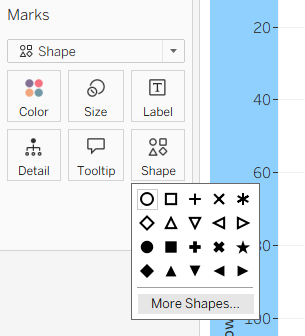
Step 5: Add the hexagons. Check that you have the marks set to shape and then select more shapes to choose your hexagon. If it doesn't load in the 'more shapes' pane initially, you can select reload shapes and go to your chosen folder.
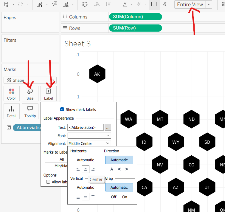
Step 6: Creating the overall shape of the map. Add abbreviation onto label and like magic, you should start to see a rough map of the US appear. Amend the size of your hexagons to make them fit better (you might have to redo this when you drag it into the dashboard too so don't be too picky at this point), adjust your view to entire view and edit your label alignment so they are centred on the state. You might also want to change the font colour of your labels if you chose the solid black hexagon like I did but you will probably be adding colour to your chart next anyway (if you want it to actually show something) so it isn't a necessary step right now.
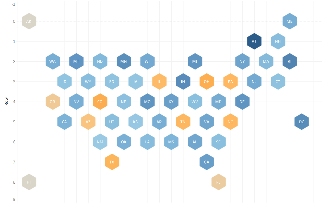
Step 7: Add the colour. Drag your measure of choice onto colour in the marks card. I have gone for average profitability of customers created using a calculated field:
(SUM([Profit])/COUNTD([Customer Name])
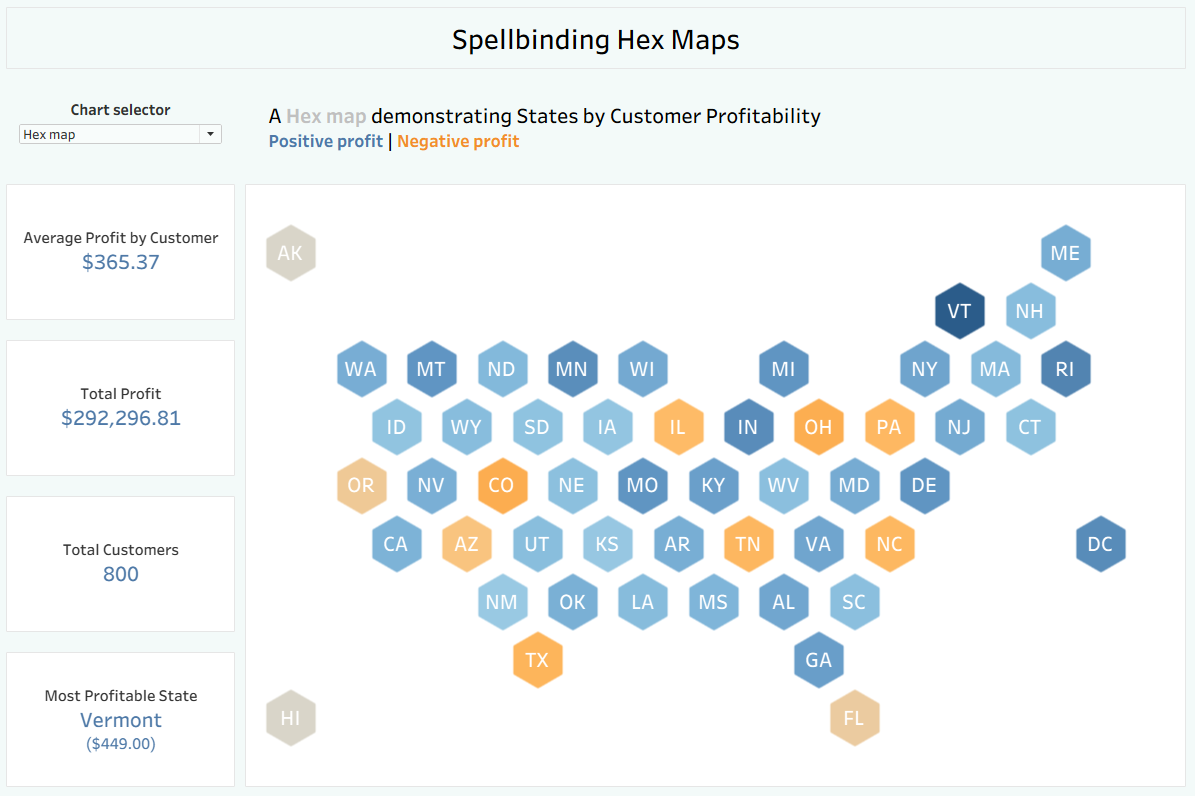
Step 8: Make it pretty! Clean it all up by removing the gridlines, hiding the headers etc. Then add it to your dashboard for something for people to marvel at.
I hope you found this tutorial helpful and are equally as spellbound by hex maps as I am. For now, onwards to week 8!
P.S. After discussing with the rest of my cohort, apparently my pun about hex maps being spellbinding is maybe too much of a reach. To explain to anyone who enjoys puns and didn't spot the Easter egg, a hex is also a magic spell and therefore why a hex map might be spellbinding. I have no apologies for anything pun-related.