


I have always loved the idea of a toggle button. First of all, the word itself is just great. Second of all, it's a fun bit of interactivity that looks cool as well. So when during a recent personal project (so recent that I'm still completing it, there's never enough time in the day with training as well!), the perfect situation arose to use one, I was very excited to implement my very first toggle button. Due to some of the constraints of the chart I wanted to use the toggle on, it didn't seem like it would work with solutions like the more traditional measure switch (I'm not sure if this is truly the case now I have reevaluated although I have found a different foolproof method which should work in all cases anyway), but I did find a video that took me through most of what to do to make a toggle that would work for my use case. In case you're like me and find a step-by-step written guide with explanation easier, I thought I'd write a blog post on the subject. I also decided to go one step further and learned how to get rid of the pesky double click (where you have to click the toggle twice to deselect and select it again to make it work after using it). If your dashboard is like mine and you only want the button to show for certain cases or you need it to revert to one value depending on the case, I will cover that too but in a secondary blog post so this one doesn't feel like death by powerpoint. So, without further ado, let's toggle!
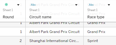
Step 1: Create a chart with differing views. You can just create this as normal without changing anything for the toggle. The toggle example I'm explaining today works if you have two different categories within one field that then impact other values in the data. For me, this was my podium for the different rounds in Formula 1. If you're not familiar with the sport, in some rounds there are two races so I wanted to create a toggle where I could switch between the view of the 1st, 2nd and 3rd place finishers for each race in those rounds. The race type (grand prix vs sprint) was one field so to make this work in a like for like way, you will need a categorisation field in your data too. For example, imagine sample superstore had two categories instead of three. You would then be able to create a chart showing sum of sales over time and toggle between whether this was for the furniture or office supplies category. Below you can see what a couple of rows look like in my data if it's still not making complete sense.
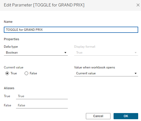
Step 2: Create your parameter that your toggle will be based upon. Simply create a Boolean parameter for this where one of your values will be assigned as true and one as false. Which is which can be decided later on and isn't so important right now.
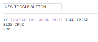
Step 3: Create a calculated field to link with your parameter. In the calculated field below, you're essentially saying if the parameter is true then make your toggle false and if it's false, make it true. It works because they can never be the same thing, creating a switch effect that can never be broken.
Step 4: Make the button. You can find toggle buttons online and if you do, make sure that you credit the creator. Freepik or unsplash are great resources for this. Because my plan for my toggle button was more unique and less of an on-off switch, more switch between, I decided to create my own toggle on google drawings. I'd highly recommend this if you have a specific vision for your toggle and then you don't have to worry about credits etc. because you're the creator anyway. Of course, you will actually need two button images to show the switch so make sure that whatever you're doing, you've got one image to associate with one view and a separate image (I'd recommend of the same size and shape to keep the illusion of the toggle alive) to associate with the other view.
Once your button images are sorted and in your tableau shapes repository (here's a link to a great blog if you don't know how to do this yet), create a new sheet specifically for your toggle button. Show your toggle parameter and add your new toggle button calculated field to shape. Assign your toggle images to each condition of the parameter - you'll have to change your parameter from true to false to be able to assign the false image.
Now try giving it a little toggle using your parameter. It should change images. How fun is that already? But it's not doing everything we want just yet.
Step 5: Create your calculated fields to connect your toggle button to your sheet. Now, this is where it all gets a little trickier or at least it's more confusing in my mind so make sure to follow this closely. I think it's all the trues and falses that confuses me about which way is up but now I'm going through it again slowly, it doesn't actually look so bad. You'll need two calculations as follows:
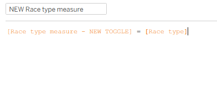
Calculation 1: Setting what your true/false parameter means in terms of your chart. This is when you specify the two categories in your categorisation field that you're toggling between. For me, this was setting whether the race type was a grand prix or a sprint. Remember, case sensitivity and spelling is crucial here.
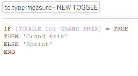
Calculation 2: Filtering for just the measure chosen in your parameter using your 'calculation 1' and the categorisation field. For me, this was race type (quite obviously, as below).
Add your 'calculation 2' (please name it something more appropriate to your chart - don't name it calculation 2) to your filter pane on your chart worksheet and select only true to be shown.
Now when you flick your parameter between true and false it should change your chart view. But we want the toggle to be controlling that and to do so, you need to create an action.
Step 6: Put everything into your dashboard. To save yourself the extra effort of doing everything twice, first in the worksheet and then in the dashboard, I would recommend waiting to sort out any actions until your worksheets are in the dashboard. That's just a general Tableau life tip too, speaking from the experience of someone who has taken the time to do it in the worksheet, put it into the dashboard and then had to sort it all. Sort any other associated actions that aren't your toggle action now too. I have multiple rounds that I want to show the podiums across so I've brought in my parameter that changes which round is being shown too.
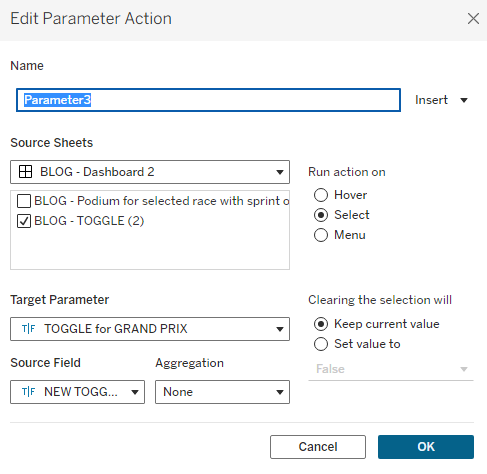
Step 7: Create your toggle dashboard action. Go to dashboard > actions and change parameter then set it up as I have done below. Now try it out in your dashboard! It should work although you will have to double click your toggle to get it to deselect and toggle again, as I spoke about at the start of this blog post (all that time ago!). That's the pesky little issue that we will be sorting next.
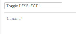
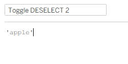
Step 8: Create two calculated fields for a filter action. So, to be perfectly honest with you, this is a slightly hacky way to do things but you know, sometimes those things need to be done. I'll explain the logic once we've sorted it all out because I think that will make more sense. Start by creating your toggle deselect fields. In the ones I saw online, they used true and false but it wasn't working for me (potentially because of all the trues and falses I have in my other calculations/parameters - I'm not sure), so I tried this a slightly different way and it did work and uses the exact same principle, just different words. So try to overlook the fact that I've chosen random fruits and just marvel at the fact that this will sort all of your problems! Then add these two calculated fields to detail on your toggle worksheet.
Step 9: Add a filter action in your dashboard. Follow the exact steps that I have carried out in the screenshot below. Note, I have used a filter action specifically and that the target sheet is not the dashboard but the toggle sheet itself. If your toggle disappears when you clicked it, make sure that you have 'show all values' when clearing the selection. If it's still gone, make sure you remove the action from your filter pane in the worksheet and try again.
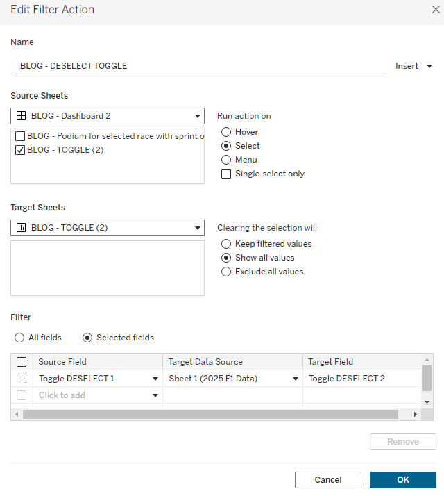
To explain how this works, essentially you're using a filter to say when my toggle is clicked I want to filter my 'toggle deselect 1' field to equal my 'toggle deselect 2' field. But banana can never be equal to apple so it automatically clears the selection to show all values. By clearing the selection, it means your toggle is essentially unclicked and back to square 1 so you can now click it afresh to toggle the first time around.
And there you have it - a wonderful toggle button that you can use to switch views of your chart (save for my honestly terrible attempt at creating a gif - I have no idea what I'm doing and why it's so small). If you're interested in getting your toggle to automatically switch to a particular view if you change another aspect of your chart (for me, this meant changing the round in F1 automatically switched the chart view to grand prix - a potentially comparable example from earlier would be when you change segment shown in sample superstore, the category automatically shows office supplies), I've written a blog on how to do that. It also covers dynamic zone visibility so the toggle only shows on certain occasions (for me, that was in the rounds that there are sprint races and grand prix as most weekends only have a grand prix - a potentially comparable example would be only showing the toggle for the customer segment). These two extra tips will take your dashboard the extra mile and I would definitely recommend adding them if they're appropriate for your dataset. Adding these options can also prevent your dashboard user from clicking the toggle when they're not supposed to (in my case, using the toggle on a weekend when there wasn't a sprint which led to a blank chart - I have run out of alternative examples and let's be realistic, they weren't the best in the first place. It's hard thinking of examples that aren't exactly the same as your own dataset and something that most people will understand!).
Thank you for sticking with me through this hefty blog post. I hope it's helped you achieve your toggling dreams. As mentioned above, head to my secondary blog post to elevate those dreams to cloud nine (I don't know what I'm saying anymore - slightly delirious from a long day of Workout Wednesdays using advanced LODs and table calcs). Until next time, happy toggling!