


You've created an excellent small multiples chart which shows the difference in sales between your current and previous year across multiple categories and segments, but it's missing that extra something. That's where your coloured Gantt comes in; a fantastic way to visually demonstrate the significance of the difference between the two years, with colour and triangular formatting highlighting whether these difference lines are positive or negative (Did I use the semi colon correctly? I'll never know). The chart couldn't be more show, don't tell. To anyone who hasn't joined from my other blog post, this is a two parter (double the fun!) based on an old Workout Wednesday that we were challenged with in training. Head on over to the first part if you want to see how to create the basic small multiples chart and then return to learn how to create that something special with the Gantt bars. If everyone is now ready and in the right place, let's get started!
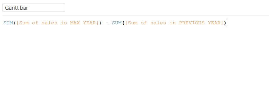
Step 1: Create your difference calculation. This is a very simple difference calculation subtracting the previous year sales from the current year sales. The only place you can really go wrong is by subtracting them the wrong way around and even then, that's an easy fix. See my calculation below.
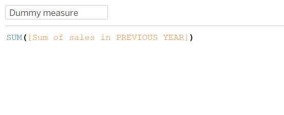
Step 2: Create a dummy measure for where your Gantt bar starts. To get your Gantt bar to start at the end of the previous year sales bar, rather than at zero on the axis like a normal bar would, you need to create a dummy measure. By setting the dummy measure to be your sum of sales in the previous year, this is the perfect fix to get your Gantt bar to start where you want it to, sort of like setting sum of sales as zero on the Gantt axis.
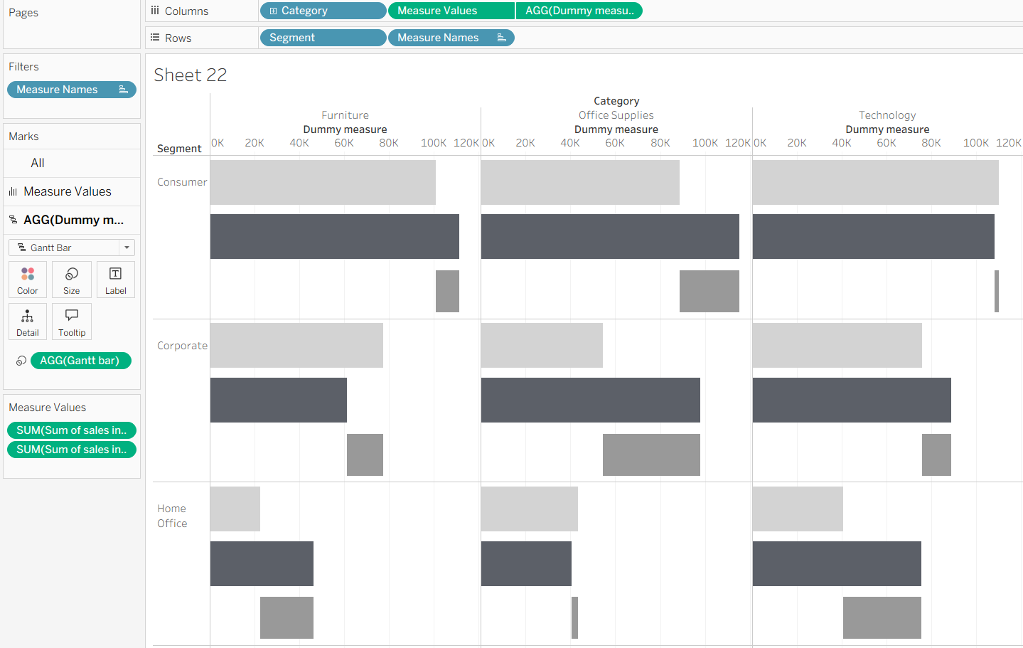
Step 3: Put these calculations into your current chart. Add your dummy measure onto the columns shelf and change the mark type to Gantt bar. Then add your Gantt bar calculation onto size. Make sure that you're doing this in the marks card specific to your dummy measure, otherwise you'll run into trouble quite quickly!
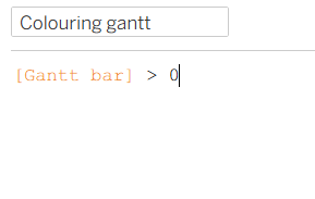
Step 4: Colouring your Gantt bars. Again, a rather simple calculation using a Boolean where if the Gantt bar calculation is greater than zero, it is therefore assigned the true value whilst the false value is given to anything equalling or less than zero. Each value has its own colour. Drag this calculation onto colour on your marks card.
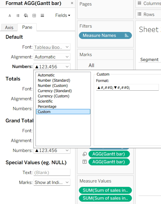
Step 5: Labelling your Gantt bars. Drag your Gantt bar calculation onto labels on the marks card. You then need to do some formatting tricks to get it to match the way that it looks in the feature image. To add the triangles, right click on your Gantt pill and select format. Write in a custom number format with the same layout as below.
Formatting (to copy and paste): ▲#,##0;▼#,##0;
Note, you'll need another triangle if sales difference is ever equal to zero but as it wasn't in this instance and the view is static, I took the triangle out.
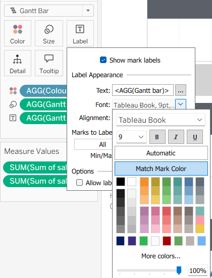
To get your label to be the same colour as your Gantt bar, there's also a nifty trick that I had completely forgotten about before I googled it today! You can simply click on label, go to the font drop down and select match mark colour.
Step 6: Fix the formatting. One of the key points in this Workout Wednesday as far as I remember was a focus on formatting. So make sure to reduce the size of your Gantt bar to the thin line, increase the size of your other bars so they match the correct style and then remove all the additional unnecessary lines on your worksheet before putting it into a dashboard for publishing.
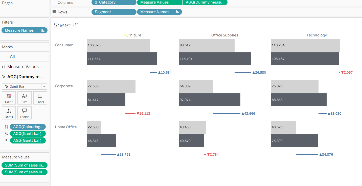
You should have ended up with something similar to what I have above. If you have any issues, go through this blog post carefully because there are lots of little details that contribute to the big picture. As I'm sure you'll already know by now (and what probably brought you to this blog post in the first place), google is your best friend if you still can't figure something out!
That's everything from me today. I hope this has been useful for you and even if you haven't created the Workout Wednesday, you've learnt something new that you can implement in a different chart. Until next time, happy charting!