


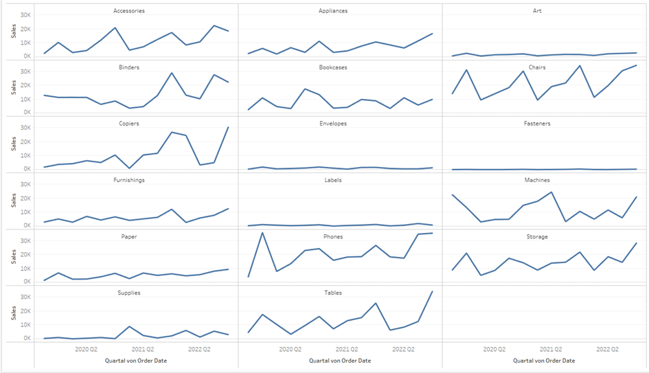
Trellis Charts are used to display multiple charts on one worksheet. They are great to get a quick overview. For example, you could build charts for individual countries, categories, etc. An example is shown in Fig. 1.
To build this Chart you need to create the division into rows and columns manually. Two Calculations are needed (Fig.2). The “Columns Parameter” is an integer parameter and defines how many columns are shown but can of course be also replaced with a predefined number.
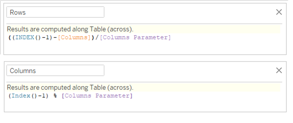
Place the dimension you want to split by onto the details shelf. Then the “Columns” and “Rows” fields need to be placed on Columns and Rows and the computation of the index needs to be computed by the chosen dimension.
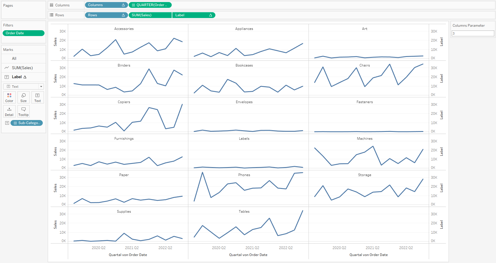
Place the Measures you want to display and you end up with the chart.
One more thing a Trellis Chart requires, and has to be done in a complicated way, is a label. To create this you need a secondary axis. Therefore you should create an additional calculated field (Fig. 3).
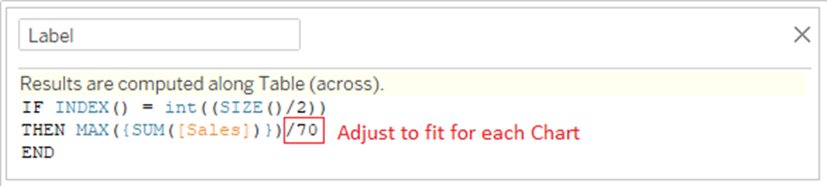
Here the SIZE()-function is used to return the number of rows in the partition and is used to identify the charts that need to be labeled. Then the Label is defined to be at a certain height, here you can use a Fixed LOD to define a value relative to the measure and manually adjust the height of the label.
The Label Marks Card needs to be put on “Text” and has to be used as a dual-axis. The label should be computed using the x-axis measure.
This blog post was inspired by a Workout Wednesday Challenge. Feel free to check it out and also take a look at the calculated fields on Tableau Public if you get stuck.