


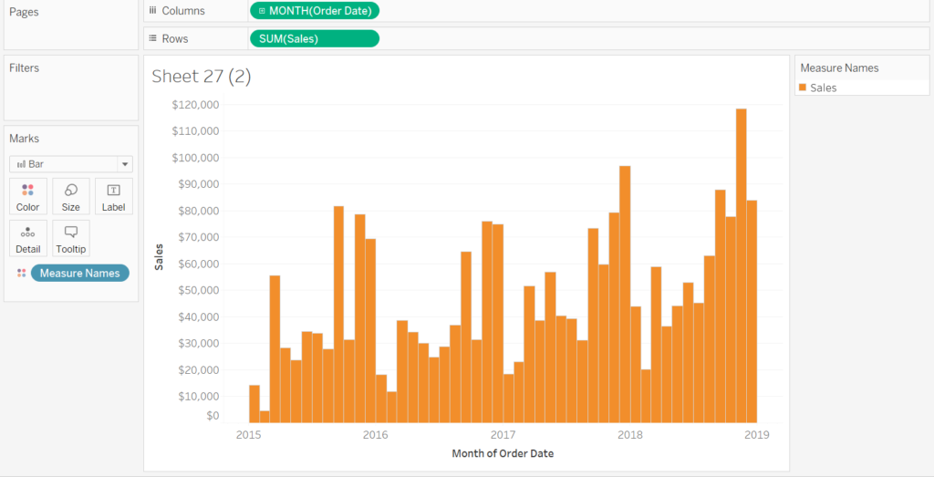
Being able to input more than one field into a single view can be very useful when comparing data. For example, you may want to compare your sales and profit figures over time.
Image1. Sales Over Time
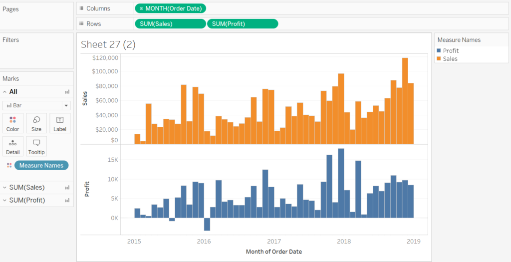
 So how can we add profit into a single chart so that you can clearly compare between sales and profit? If you bring the profit field into rows alongside sales you’ll notice that we get two different charts.
Image 2. Adding a Second Field
A neat trick is to right-click on profit and choose the dual axis option.
Image 3. Using Dual Axis
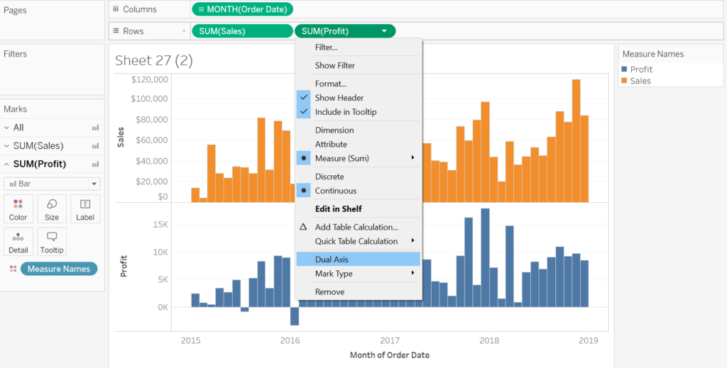
You’ll notice that the green pills in the rows column no longer have curved edges which symbolise the use of dual axis. From here we can view the marks card and choose the SUM(Profit) tab and change it to a line.
Image 4. Changing Marks Card
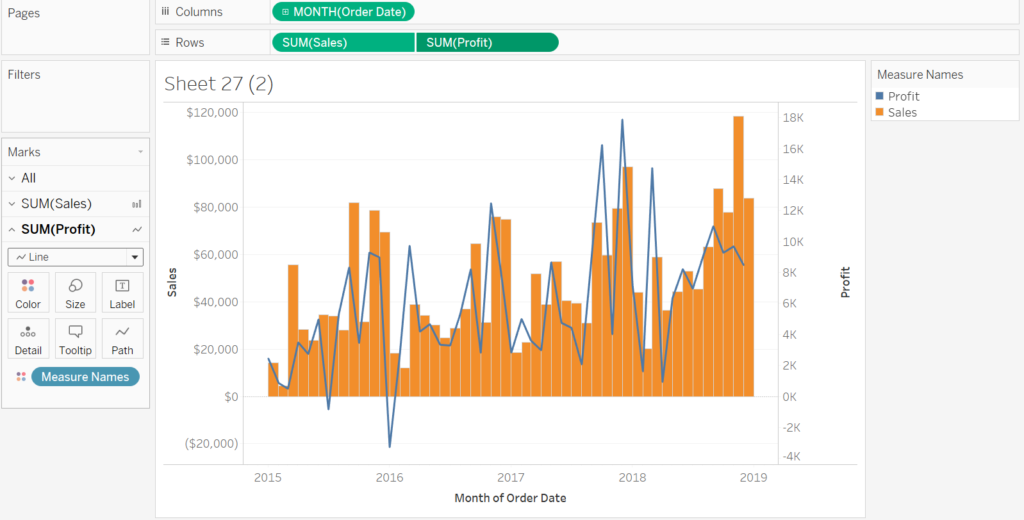
We now have our two fields in a single view!