


After conquering Tableau Next, it’s time to move on to PowerBI! This is a software I’ve been really looking forward to trying out, as it’s been talked about a lot during my time training. That said, jumping in with zero prior experience definitely made for a steep learning curve, and the first hour or two felt pretty overwhelming!
Our task for Day 2 of Dashboard Week was to recreate one of our past Makeover Monday projects. These challenges involve being given a dataset and just one hour to build the best visualization possible. Having done quite a few of these during training, we had a lot of creative freedom in choosing what to build in Power BI.
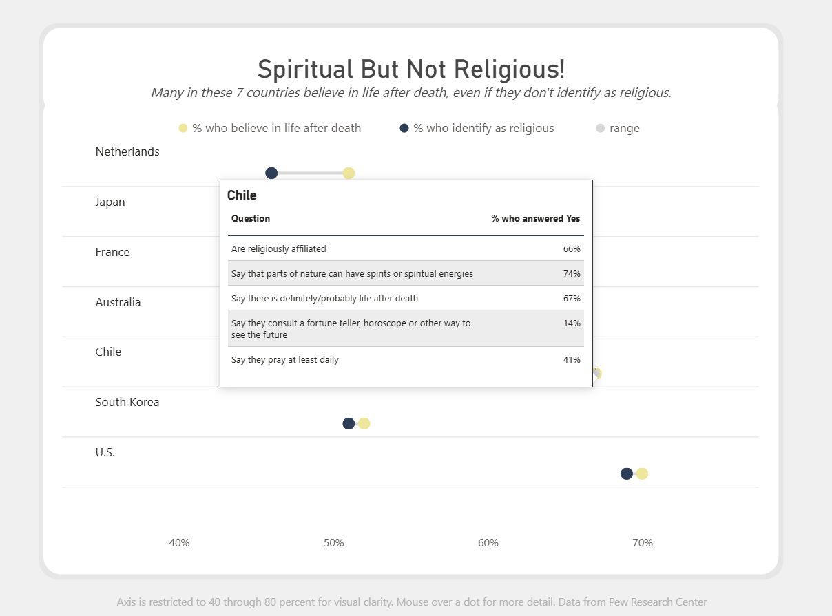
I decided to recreate my most recent Makeover Monday submission. You’ll find a screenshot below, and you can check out the original on my Tableau Public here.

I chose this viz for two reasons: first, I think it looks clean and sleek, and second, because of its simplicity. Having never used PowerBI, I wasn’t sure what kinds of interactivity would be possible, and wanted to go the safer route of assuming I wouldn’t be able to add much.
Upon opening PowerBI and experimenting with a few charts, I found it fairly intuitive. However, I quickly ran into a challenge. There is no option for a dumbbell chart in the visualizations pane. I did some digging, and found two possible options. The first was a downloadable visual, which I was able to download and import successfully. It worked very well, however it came with a frustrating and unremovable prompt asking me to get a license for the full version. I decided to try my second option: building it natively. This is a bit more complicated than building a typical chart in PowerBI, and I had to follow a tutorial to do it successfully. Here’s a look at what my build looked like at this point!

Pretty similar to the original, if you ask me!
Having chosen a fairly simple viz to recreate, I was done earlier than I expected. I took this extra time to play around with PowerBI’s formatting options, taking full advantage of the rounded corner option. I still had some extra time, so I experimented a bit with other chart types, hoping I could create some cool interactivity and potentially create a whole dashboard. Unfortunately, this seemed a bit out of scope, so I backtracked and instead focused on creating an interesting tooltip.
I found out a feature similar to Tableau’s Viz-in-Tooltip exists in PowerBI, so I created a new page and started building out a table. The problem was, I already pivoted my data early on in the build to create the barbell chart. This meant I couldn’t create the table I wanted. I wasn’t quite sure how to approach this, and facing a time crunch I decided to copy the original data again and add it as a new table. This way, I’d have access to the pivoted version and the unpivoted version at once.
After creating my tooltip table, I attached it to the original view and did some additional formatting. Here’s a look at my final chart:

And here's how the tooltips appear:
Tomorrow will be the final day of Dashboard Week, and the final day of my training in the Data School. It's a little bittersweet, but I can't wait to see where my placements take me!