


As a consultant-in-training at The Data School New York, I’m currently in the middle of an intensive 17-week program packed with hands-on learning, real client projects, and an ever-growing toolkit of data skills. I wanted to create something simple, visual, and personal—a way to track my own progress through training. I decided on making a loading bar made from a waffle chart, where every square represents a day of training.
The Idea: Progress as a Loading Bar
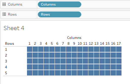
I’ve always liked the clean, compact look of waffle charts. They’re great for showing progress toward a goal in a way that feels satisfying and tangible. Since our training runs for 17 weeks, I designed a chart with 1 row = 1 week (17 rows) and 1 square = 1 training day (Monday to Friday, so 5 columns per row). The finished visual looks like a neat little block of squares slowly filling up as each week passes—basically, a loading bar for my Data School journey.
Building the Data
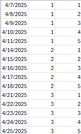
To get started, I created a simple Excel sheet containing each day of training (excluding weekends), as well as its corresponding row and column.
Since I’m fairly new to Excel, I kept the formula simple:
- Date generation: =WORKDAY(A$1, ROW()-1) — to populate training days, skipping weekends
My dataset now had the structure I needed: columns for the training day, week number, and day of the week.
Let’s head to Tableau!
I converted the row and column fields to discrete dimensions, then dragged them onto the Rows and Columns shelves. Setting the mark type to Square started to bring the waffle chart to life.
In order to know how far into training DSNY9 is, we’ve got to know what day it is. I added a parameter to allow the user to select the date.
I also added the following calculated fields:
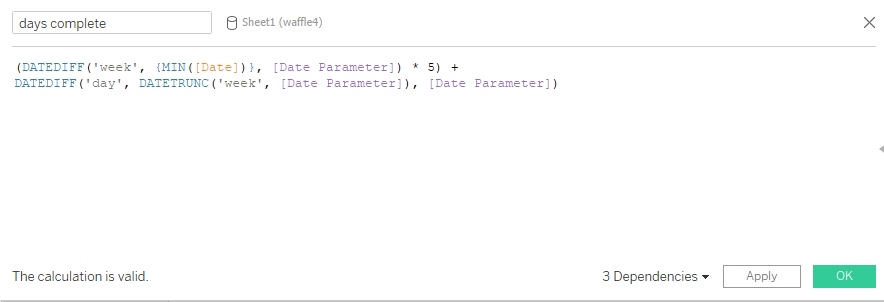
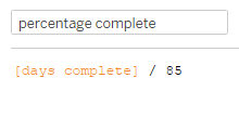
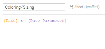
These calculations will help us format our bar.
After placing Coloring/Sizing on the Color and Size marks, as well as placing the Percentage Complete calculation onto detail and inserting it into the sheet title, I was able to create a dashboard that looks like this!
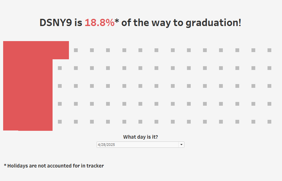
As DSNY9 moves through the remaining weeks, I plan to keep this waffle chart updated. It’s become a fun little ritual—and a nice visual reminder that we’re making progress every single day. Eventually, I’d love to add features like automatic updating based on today’s date, or a version that works across different cohorts. But for now, I’m just enjoying watching the bar fill up.