


For the last day of Dashboard Week, we were given the freedom to choose any API from NASA’s collection and use it to gather data for a Tableau Dashboard.
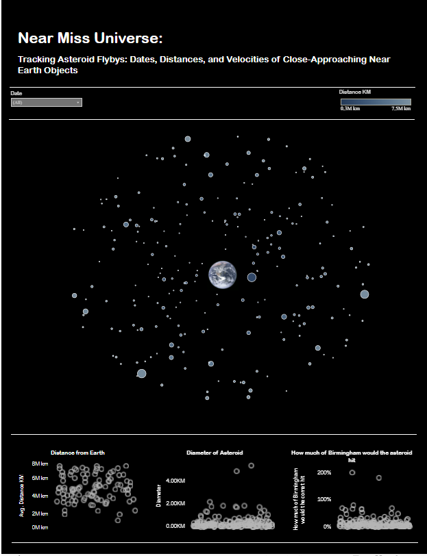
With so many datasets available, I was eager to dive in and quickly settled on exploring data about NASA's SBDB Close-Approach Data API. SBDB stands for Small-Body Database — NASA’s official catalog of asteroids, comets, and other small celestial objects. This also gave me the perfect excuse to create one of my favorite types of visualizations — those where the chart design reflects the subject of the data itself.
I sketched a rough layout of what I imagined my dashboard would look like. Fortunately, I’ve built similar charts before, so I had a good sense of how to bring my concept to life.
I then switched over to Alteryx to start developing my workflow to connect to the API and pull in the necessary data. I’ve included a screenshot of my workflow here — though I’ll admit, with more time I could definitely improve the annotations and documentation within it.
Given the API’s restrictions on how many days' worth of data can be retrieved in a single request — and realizing just how many NEOs actually pass near Earth — I opted to focus on a two-week period for this project.
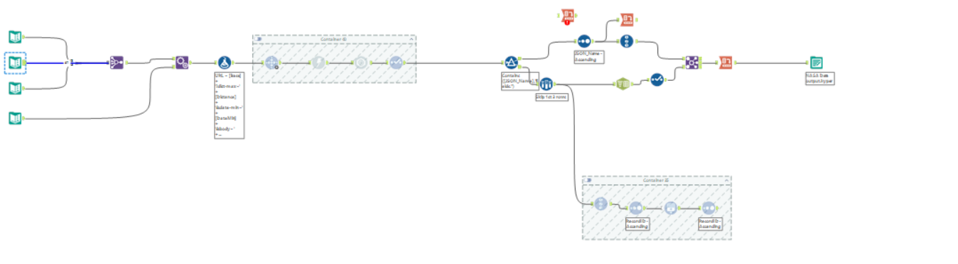
The workflow itself followed a similar structure to others we’ve built in previous weeks, like when we worked with the OpenWeather API. I applied the same principles: connecting to the endpoint, downloading the data, and parsing the JSON response into a usable format. The lessons from those earlier exercises really helped streamline my process this time.
Once the data was ready, I imported it into Tableau and began designing my visuals and dashboard layout.
You can find the link to my tableau public below