


Have you ever looked at a line graph, seen one point much higher than the rest, and wondered whether it was actually an outlier or just normal variance? If so, control charts can give you the answers you've been looking for.
Control charts are a great way to visualize whether a process is remaining "in control" over time. They provide context to line graphs, showing the expected range each point should fall into. If a business starts to see the points in a control chart go outside of the expected range, they know that extra investigation is needed. This ensures issues can go noticed and be addressed before any problems get out of hand.
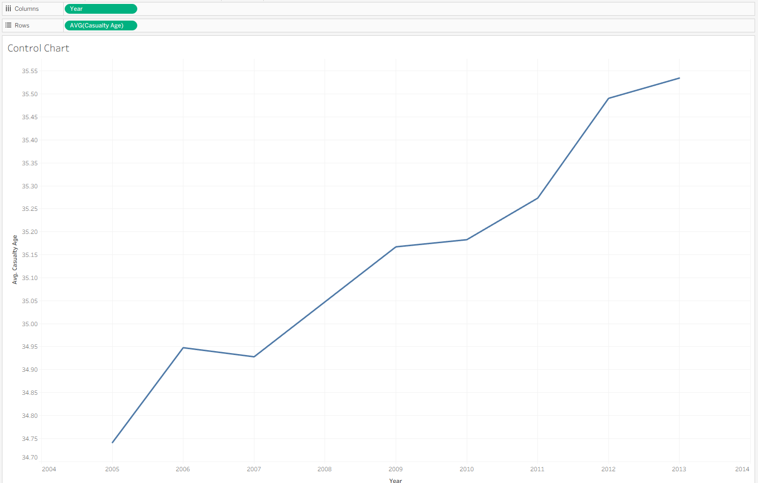
As an example, I am going to use a road traffic accidents data set, and walk through turning this line graph of average causality age over time into a control chart.
Before we calculate the upper and lower bounds for the control chart, we need 3 numbers:
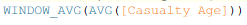
1) The average of all the data. We can calculate it with the formula:
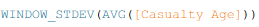
2) The standard deviation for all the data. We can calculate it with the formula:
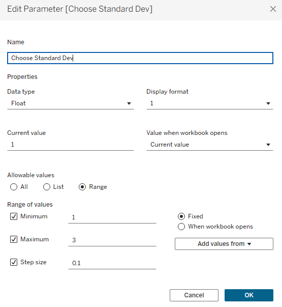
3) How many standard deviations away we want the bounds to be. I will set it to 1, but we can let the user of the chart decide if they want to change it. To do this, I'm going to create a parameter:
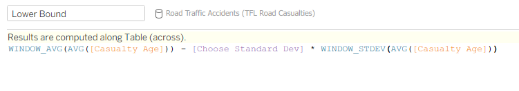
To get the upper and lower bounds, now all we have to do is put together these 3 numbers. For the upper bound, we take the average, then add our standard deviation multiplied by the "Standard Deviations" parameter. For the lower bound, we do the same, except we subtract the standard deviations instead of adding them.
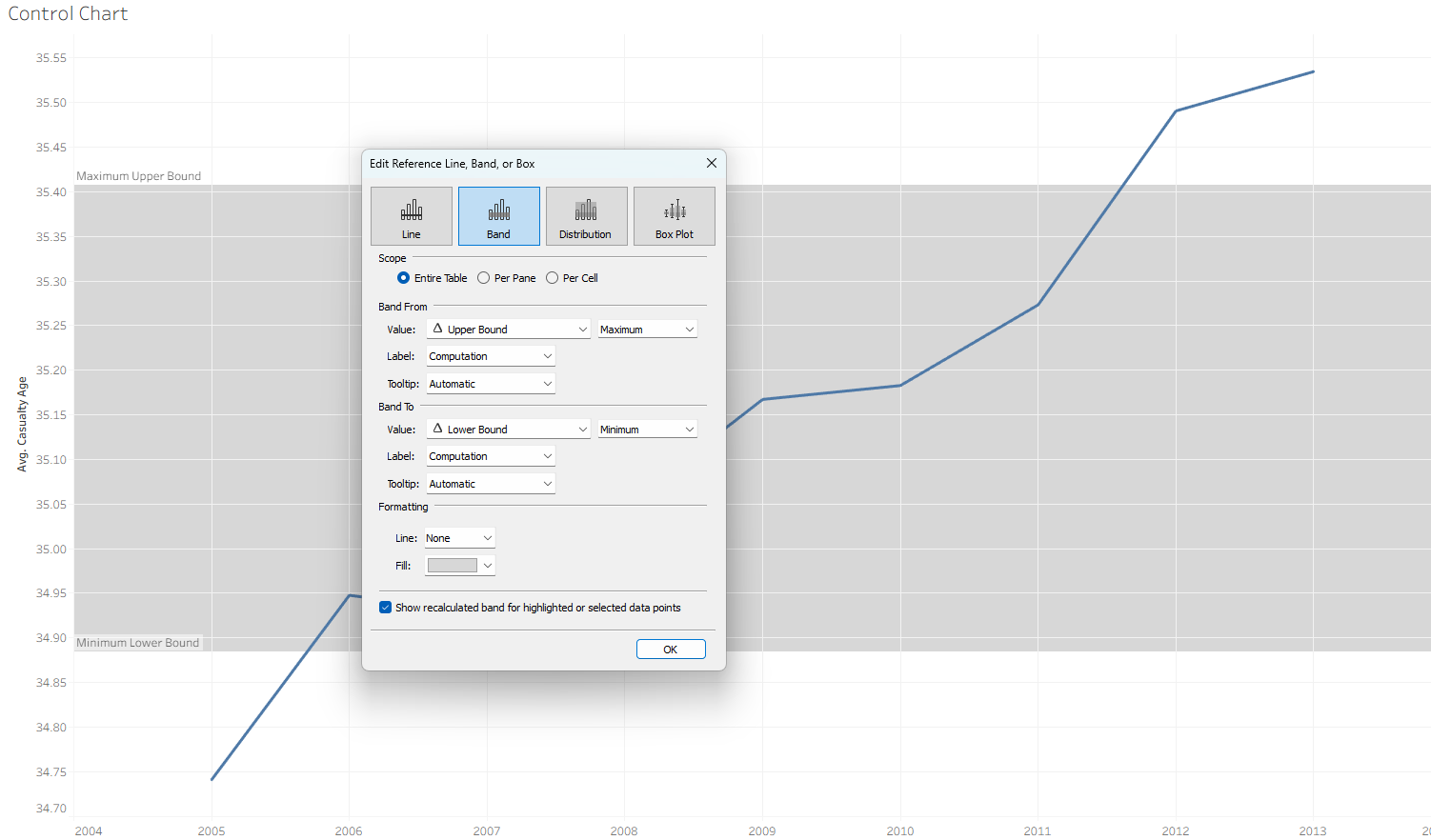
Once both of the bounds are created, we drag them onto details. To show the area between the two bands, we can bring a reference band onto our graph. By setting our upper bound as the maximum and our lower bound as the minimum, we can shade the entire area where we expect our points to fall into.
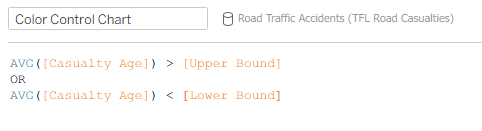
We can stop here, but lets add a little more flavor! We can duplicate the AVG(age) pill on rows, create a duel axis, and set the new pill to display as circles. This shows our individual data points! The final step is to write a calculation that can put a different color onto any datapoint outside of our upper and lower bounds, in order to alert to everyone that the data point is no longer in the controlled range. Writing this calculation:
then dragging it onto color, results in......
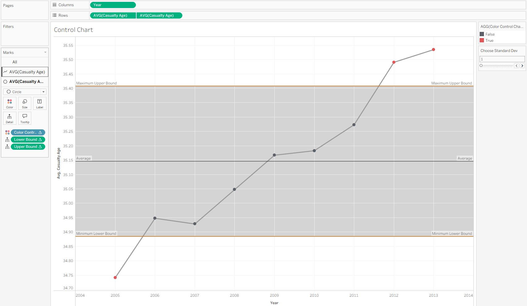
a beautiful control chart!! We now can easily see where the data starts to become "uncontrolled".
Hopefully this article gives you the knowledge needed to go forth and grab control of your datasets!