


Dumbbell charts are a powerful way to compare values across different points in time or categories. While PBI doesn’t offer a built-in option to create them, they can be constructed with a bit of creativity and persistence. This blog walks through how to build a three-point dumbbell chart using error bars, based on an example from a recent Workout Wednesday challenge I completed.
The Data:
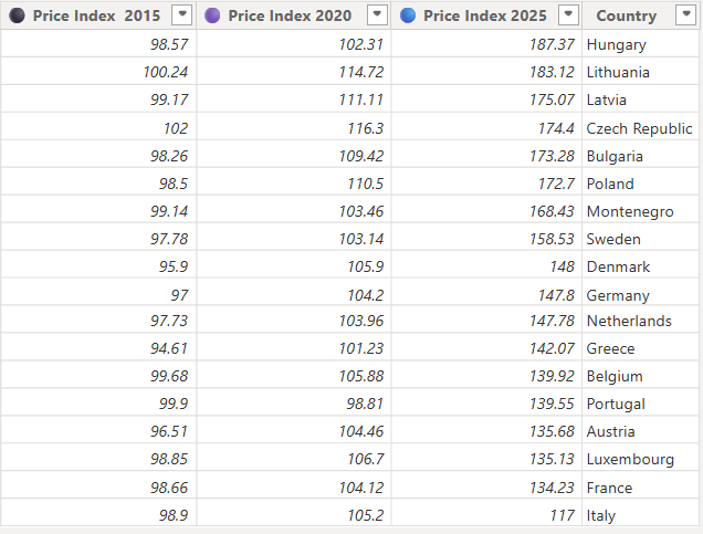
- Consumer price Index for chocolate in different European countries which dates back to 2015.
- 3 measures - Price Index 2015, Price Index 2020, Price Index 2025
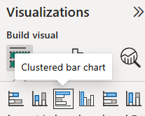
Step 1: Select Clustered Bar Chart from the visualisation pane:
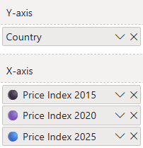
Step 2: Drag your fields onto the axes - Country onto Y and Indices onto X in this case.
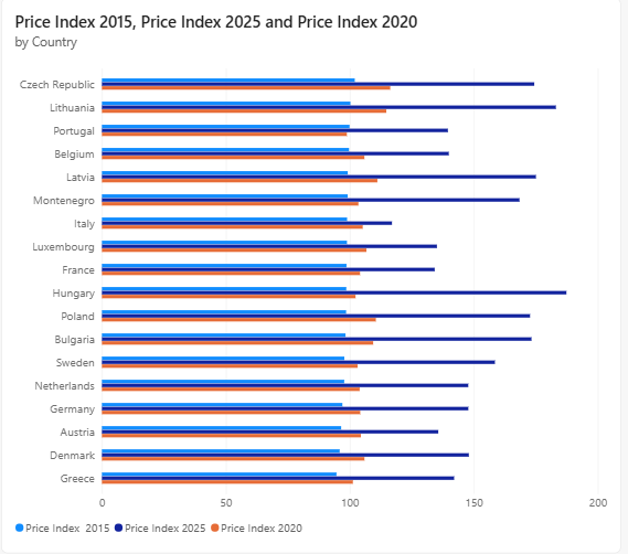
A standard clustered bar chart like this will appear:
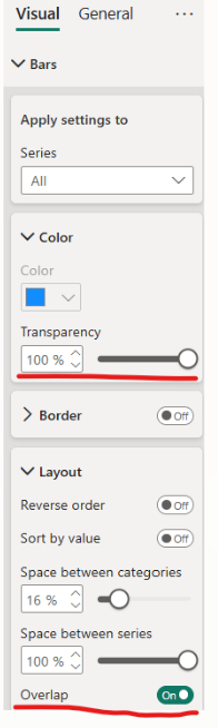
Step 3: Hide the bars.
- Navigate to the visualisation pane and go to Visual → Bars
- Set transparency to 100%.
- Enable overlap.
- Set space between series to 100%.
- Your bars will then disappear from view.
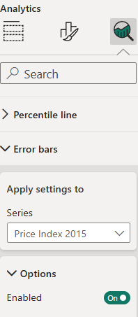
Step 4: Head to the analytics section of PBI and enable error bars.
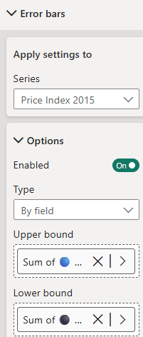
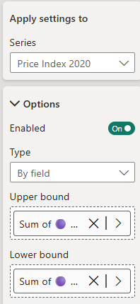
Step 5: Construct the logic for each point:
2015 (lowest point):
- Lower bound = 2015
- Upper bound = 2025
2020 (middle point):
- Lower bound = 2020
- Upper bound = 2020
- This isolates it as a standalone point.
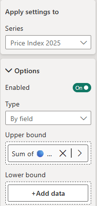
2025 (highest point):
- Lower bound = 2015
- Upper bound = 2025
- This structure means the points will connect in a dumbbell shape.
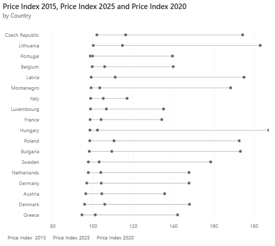
The chart will now look more like a dumbbell:
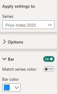
Step 6: Formatting - If you followed the logic of the bounds, you can now change the colours of each point as you please. Just go to error bars and change the bar colour, then add error markers.
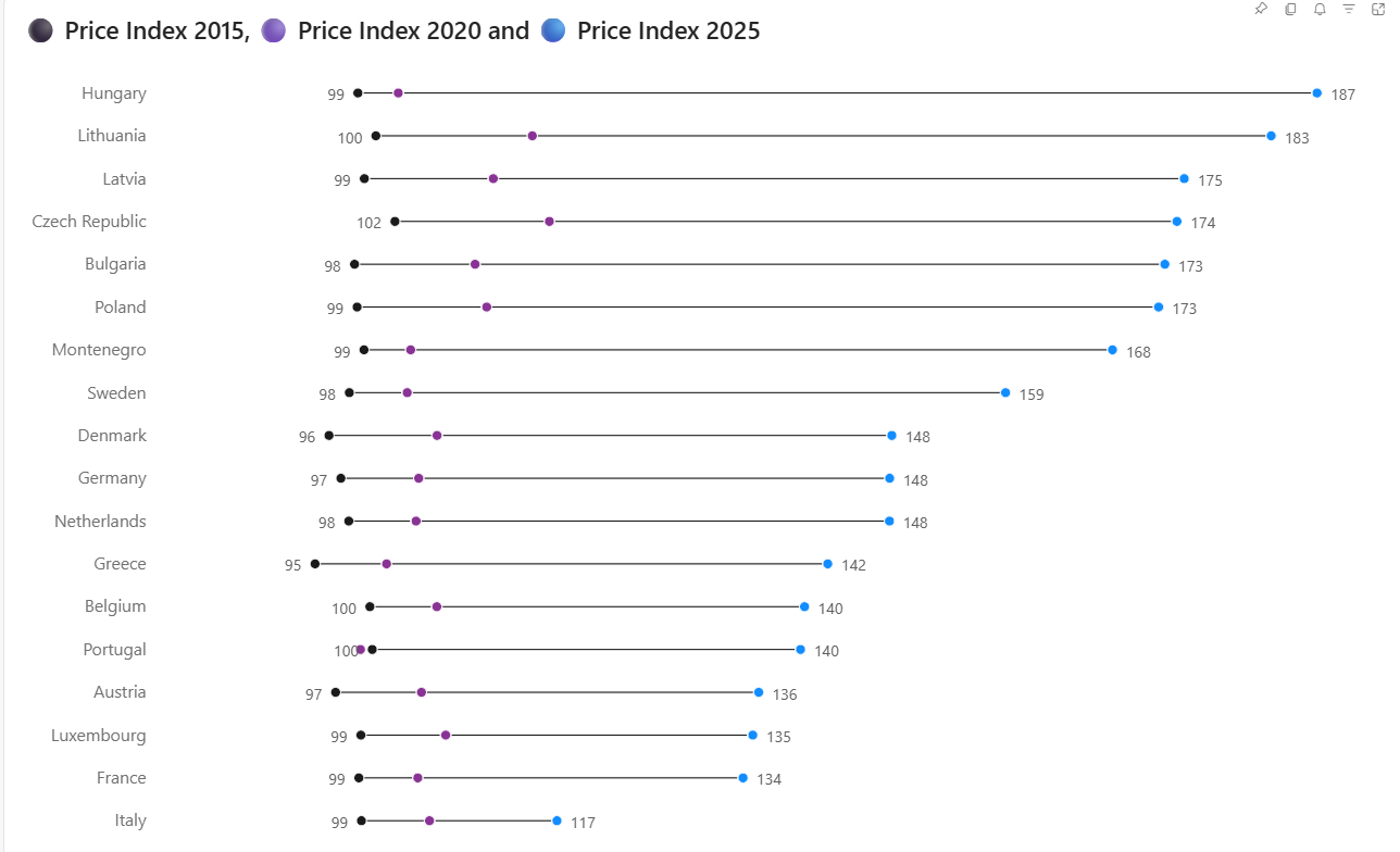
Final chart: Add any other formatting you may require and now you will have a lovely dumbbell chart like the one below...
Key Takeaways:
Dumbbell charts are a great tool for displaying change over several points. They can be constructed with error bars by carefully designing lower and upper bounds, even if they are not native to the software.