Today's blog is all about day 3 of (daunting) dashboard week. For a brief background of what this entails; this week occurs during our last week of training. Andy provides us with a dataset in the morning and have a few hours throughout the course of the day to create a dashboard.
Today we were given a dataset on Art Garfunkel's Library. The legendary folk singer’s official website includes a catalog of “every book Art has read since 1968.” It lists each book’s title, author, year published, month/year read, page count, and whether it was one of the musician’s favorites. The requirements from Andy today were, "Let's see something beautiful today. I don't want to see a standard KPI dashboard. The team needs to think out of the box and create something "fancy" that they haven't before. This is their day to create something they've always wanted to learn how to create. Maybe it's a chart they've been wanting to build. Maybe it a day to learn more about storytelling. The choice is theirs, as long as it's not boring."
As I was scoping the project requirements and scrolling through Tableau Public to get some inspiration, I decided to try to recreate a 'Library' sort of design and get creative with building a dashboard in this arbitrary way as I had never done before. I will explain the steps I took to get to my final design.
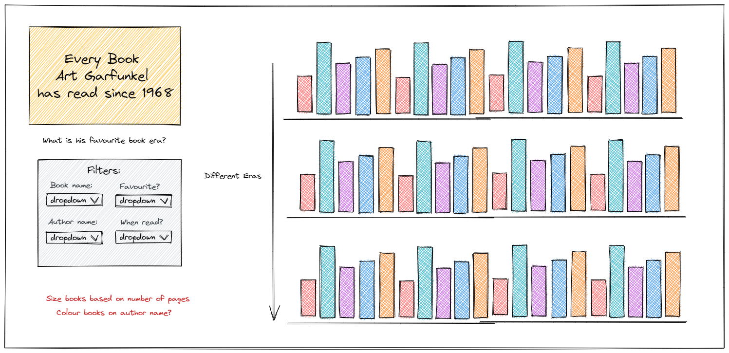
My sketch:
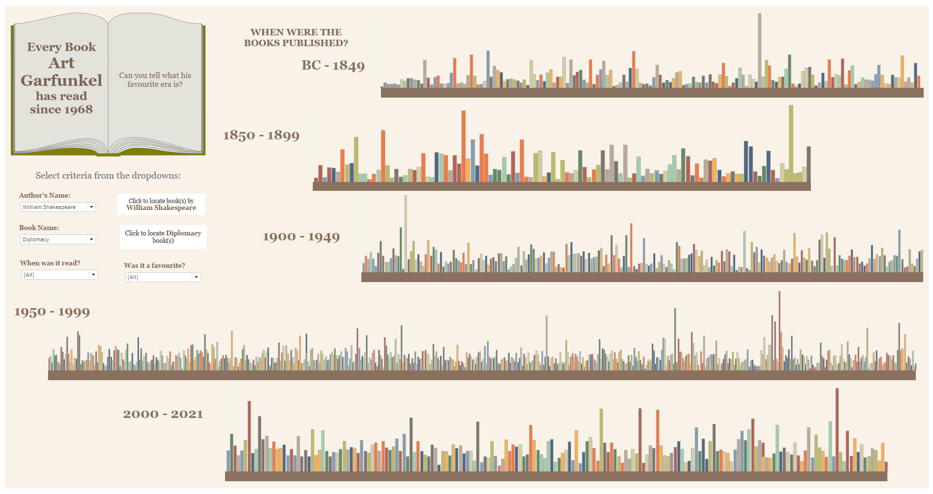
The first step of approaching any project we've been taught since day one at the Data School is SKETCH. If I wanted to recreate a library design for my dashboard, how would I go about doing this? How would the books be shaped, designed, coloured, arranged? What is the main story I am trying to tell from my dashboard? I decided that the main story I wanted to tell was what Art Garfunkel's favourite era is to read books from. Each shelf of the 'library' would represent when the books were published to depict this.
My sketch was as follows:
Data Prep:
Luckily the data we received was clean, except for some of the date fields that were expressed in various formats. I used Alteryx to put these dates into the correct format.
The dashboard:
Overall, I was happy with the way my dashboard turned out. A few challenges I faced were using the filters to highlight the books on the individual shelves instead of filtering down to the author or book names chosen. I really enjoyed the creativity that we were encouraged to explore today.
My final dashboard: