Day 2 was actually day 1 for me after taking the day off on Monday – and I could feel the cobwebs from that additional 24 hour period as I started on today’s challenge.
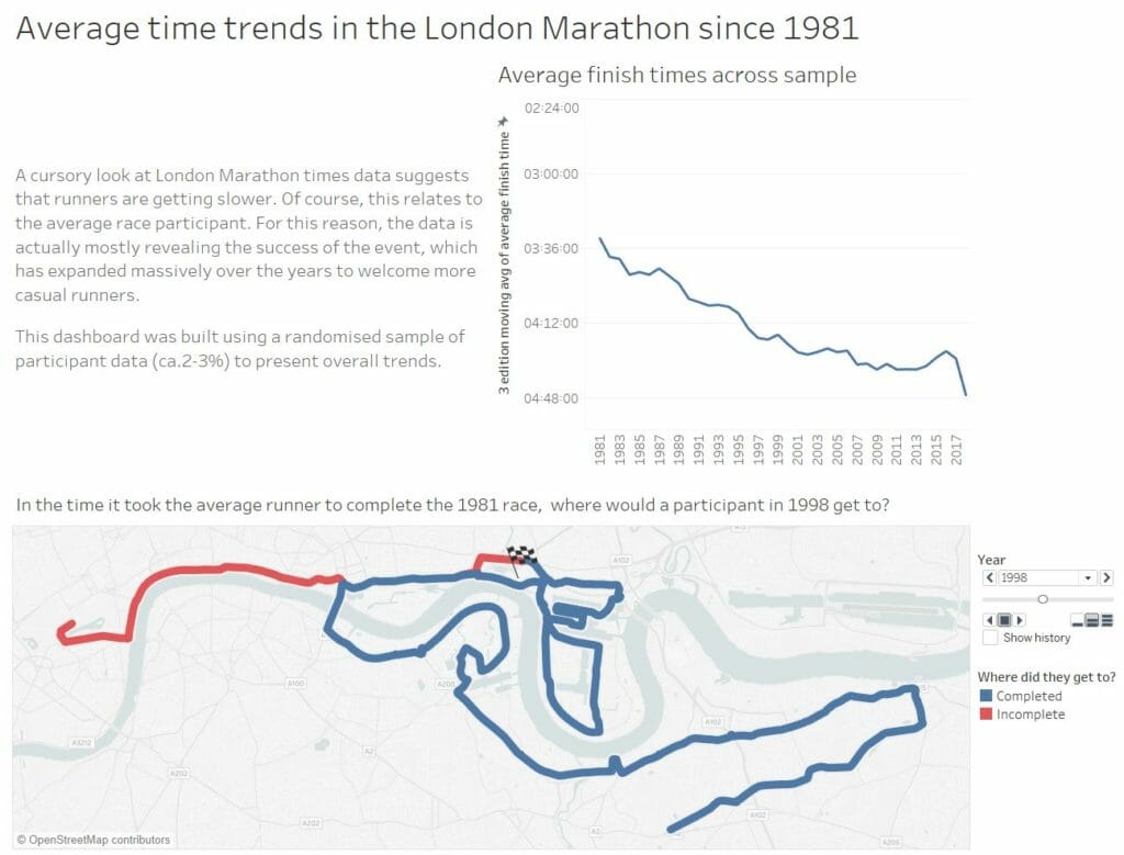
Looking at London Marathon data seemed promising for me, since I have an interest in running but I encountered a few data limitations that kept me from achieving some of my original goals. First of all, the data we looked at was a random subset of the 1 million participants who have run since 1981. In my mind, that made it tricky to look to closely at the numbers for outliers (records) or even plot the top N runners over time. For that reason I chose to focus on average trends on the assumption that the 2% or so of data would be broadly representative of long-term patterns.
Once I was done with the initial data prep in in Alteryx I set about designing my viz with the aim of showcasing my observation that average times have been consistently declining since the race’s creation. My idea was to have a map that would show for the average participant how far behind they were from the quickest year by average time (which also happened to be the first). This much I managed to achieve – just. Aside from taking longer than I had anticipated, I was forced to compromise. The only way I could manage (in the time) to link route data with runner data was to join them at a high level of aggregation (by year) in Alteryx. This meant I lost a lot of detail, preventing me from comparing the top 10 runners each year in the sample over time.
As such the viz, although interesting, lacks important context. Sure – the average runner is slower than in the 80s, but this is largely because the race itself is attracting more casual runners. Adding in parameters to track how non-casual runners have progressed would add an important additional dimension to the story.