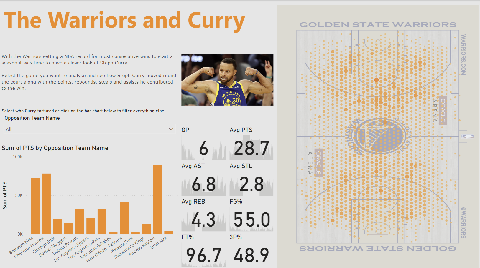
The second day of dashboard week was a Power BI task. I was tasked with recreating Carl Allchin's 'The Warriors and Curry' Tableau dashboard on Power BI.
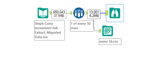
Initially I had a lot of problems when loading the data into Power BI and kept receiving an error message. I considered pivoting to another dashboard to recreate but instead decided to persist as I found it to be an interesting dashboard. The size of the csv seemed to be a problem, so I inputted the data into Alteryx and used the sample tool to keep 1 of every 50 rows.
With a much smaller file I was able to bring the data into Power BI with more ease, and I could now finally start recreating the dashboard.
Most of the time was spend creating the hexmap over the court. I tried to use the hexmap extension I could download from the microsoft store however the native scatter plot worked much better. The KPIs were pretty simple to make. The final barchart required more time which I didn't have. The barchart displayed the difference from the overall average to compare Curry's points by his season average.
Due to time constraints I decided to use the barchart to compare how many points curry had scored against each team. I also used the hexmap to display where his points have come from rather than number of times captured in each position on the court.
After completing the charts formatting the layout was pretty easy due to the the floating nature of Power BI.