Dashboard Week Day 2: The data set we were given today is about the National Survey of College Graduates: 2021. One thing to note is that there is a lot of data available for selection within this topic. The data I chose to work with is 'Median annual salaries of full-time employed college graduates, by major occupation, age, level of highest degree, and sex: 2021.' This data provides information about how much salary individuals with specific degrees, ages, and sexes earn, with an overall median value.
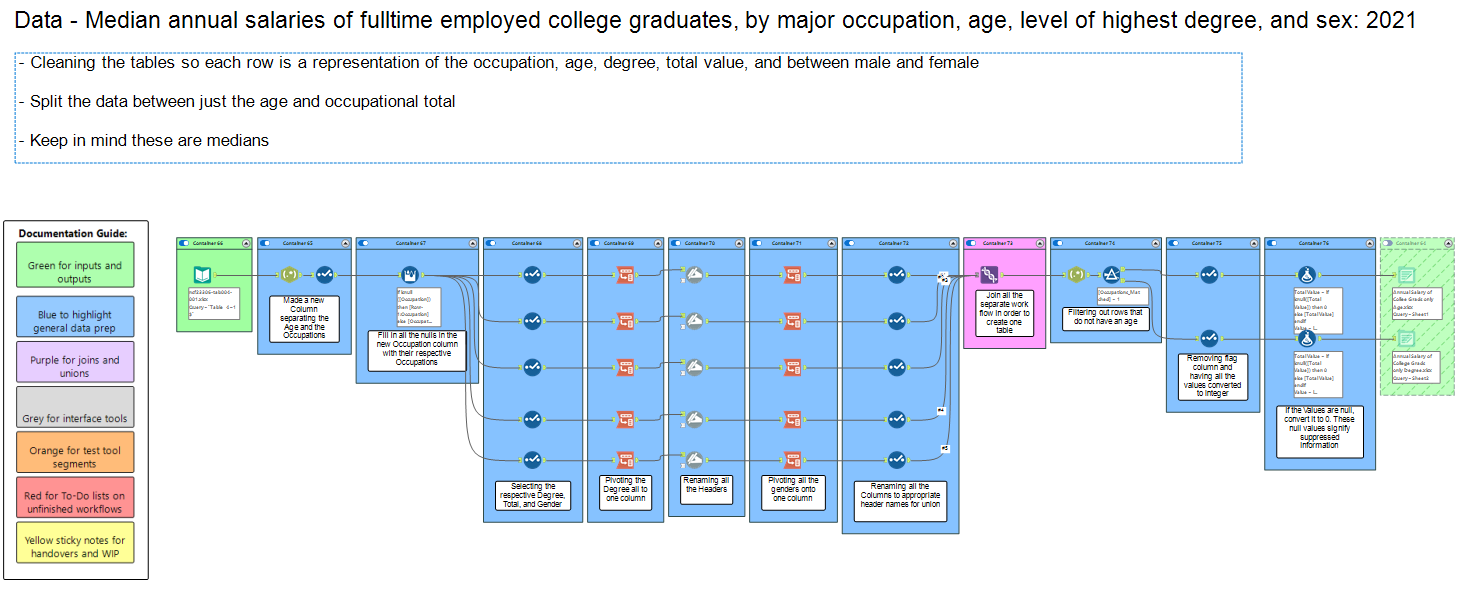
The first step I took was to drop the dataset into Alteryx to begin cleaning it. A few particular things I noticed were how the data was laid out: there was a row that aggregated all occupations into a single value, while S&E (Science and Engineering) occupations had a deeper level of granularity compared to the other two S&E fields.
My initial action was to find the actual headers for my data and then combine all the education degrees into one column, along with the gender information.
I imported the data, only reading rows 4 and above, and then split the occupations and ages into separate columns. I filled in the null values in the occupation columns with the values above them, ensuring that each age could be correctly mapped to its corresponding occupation. Next, I pivoted each section by degree, total value, gender, and gender values.
I repeated this process for each section to simplify the dataset and finally unioned them into one dataset. Subsequently, I converted all the values to a numerical data type and set all the nulls to 0. Then, I split the data into two datasets: one containing age only and another containing the overall data.
I then drew out a dashboard sketch in Excalidraw to give me a small idea on how I would want my dashboard to be presented.
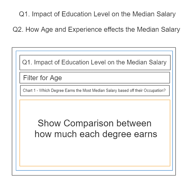
Moving to Tableau, I established a relationship between the two datasets based on their occupations. Now comes the question. The two questions I had in mind throughout this process were: how does the annual salary differ based on degree and age? When considering these questions, a bar chart comes to mind that illustrates the comparison between degrees and how education correlates with the salary earned.
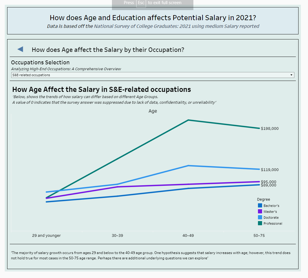
For the next question, I thought about using a line chart to show the difference in earnings for each degree based on age.
I then added filters to both charts, excluding the 'All Degree' field and only including the high-end fields, such as 'S&E.' Next, I added both charts to my dashboard and implemented a dynamic zone visibility function so that I could switch between the two charts. This way, my overall dashboard will appear much neater.