June 1st, 2023, marks the 3rd day of Dashboard Week. Today, our task is to web scrape a German football website. Our goal by the end of the day is to create an exploratory dashboard with a good amount of user interactivity.
To start, I opened the website I was assigned to scrape. I spent some time exploring the website to understand where I can gather information from and how to navigate between webpages with data found in the source page. After noting down the areas I will be parsing, I moved to Alteryx to begin my web scraping process.
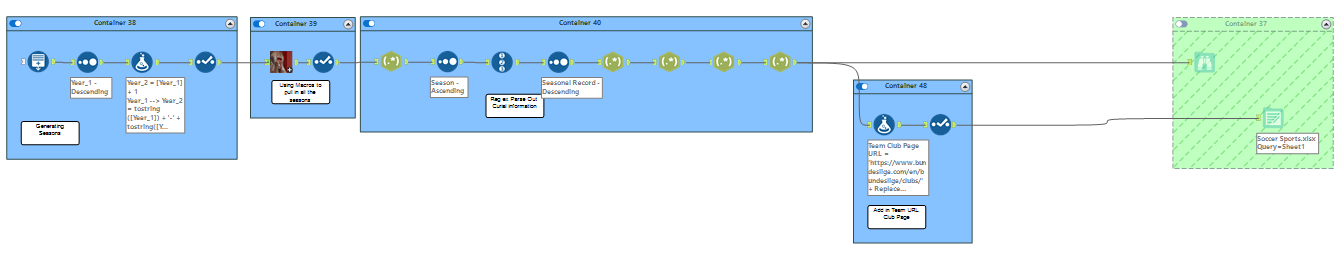
In Alteryx, the first step was to generate a table containing all the seasons. This table is used for my batch macro, where I can modify the football season listed in the URL using the rows I have generated. Next, I filtered the data to focus on one specific season, making it easier to work with. Then, I parsed out important information such as team names, matches, win/loss ratios, and more. After performing some minor cleaning, I saved the output as an Excel file.
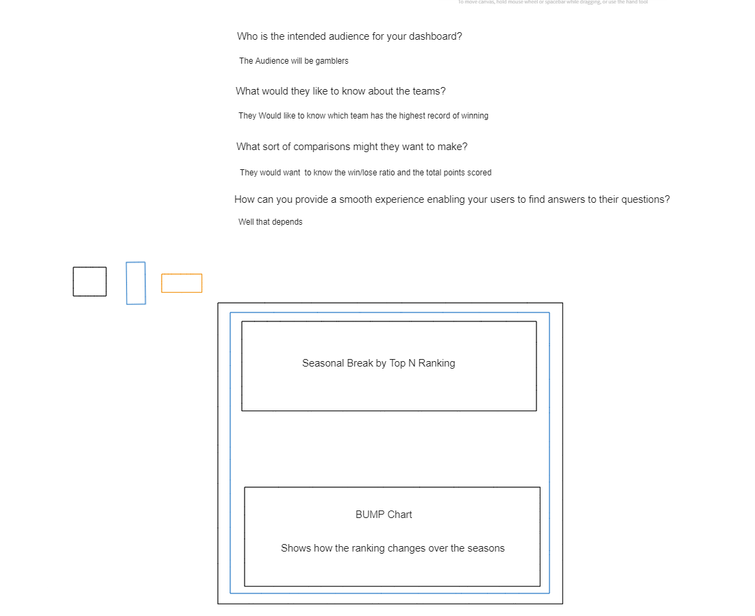
Using Excalidraw, I started by writing out the questions I will be addressing. Originally, my plan was to create a Sports Gambling Center that shows which team has a higher chance of placing 1st, 2nd, and 3rd based on previous records. I intended to create a bump chart to visualize ranking trends and a donut chart to display the distribution of teams that have been in 1st, 2nd, and 3rd place in the selected seasons. However, due to time constraints, I had to change my approach and ended up making a seasonal review instead.
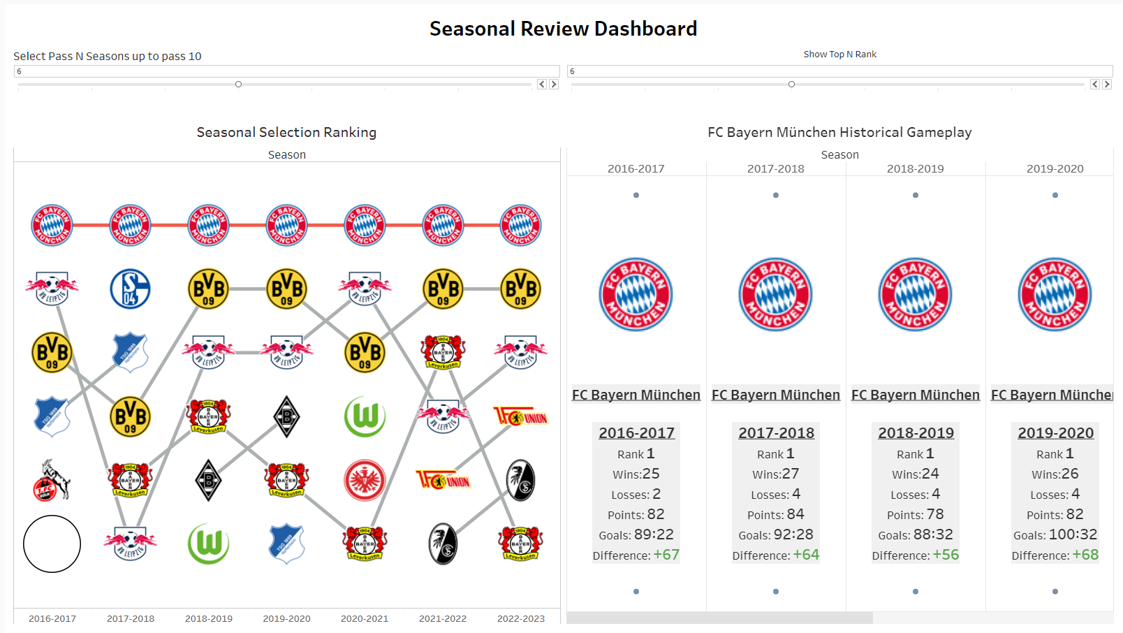
In Tableau, the first chart I created was a bump chart. The interactivity I added allows users to review the current and prior N seasons of the game. Next, I included a team selection feature where users can choose a team on the bump chart to highlight its trends throughout the filtered seasons. My next chart is a Seasonal Review Chart that displays the season, ranking, and game information. I implemented this chart using a map layering technique rather than a plain table chart.