


In this blog, I will talk about our challenge for day 1 of dashboard week, as well as some super useful things I learnt about on the way.
Overview of the Brief
Make a pitch to the Department of Health, visualising UK COVID data, whilst ensuring that your analysis is as accessible as possible.
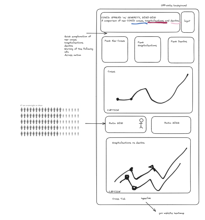
Plan
Considerations included:
· Off-white background
· Consistent colour scheme representing the three main metrics that separate ‘spread’ and ‘severity’ of COVID-19
· Intro- sets colour consistency, context for a range of data fluencies
· Download cross-tab button- where graphs cannot be narrated
· Planned containers for smooth tabbing- creating a natural order for screen readers
· Double encoding with shape and colour
· Font- veranda because capital i and l aren’t the same letter
· Font size- minimum 14
· .Gov showed a good county heat map which I aimed to hyperlink. Maps cannot be seen by screen readers
· Off-white background for contrast
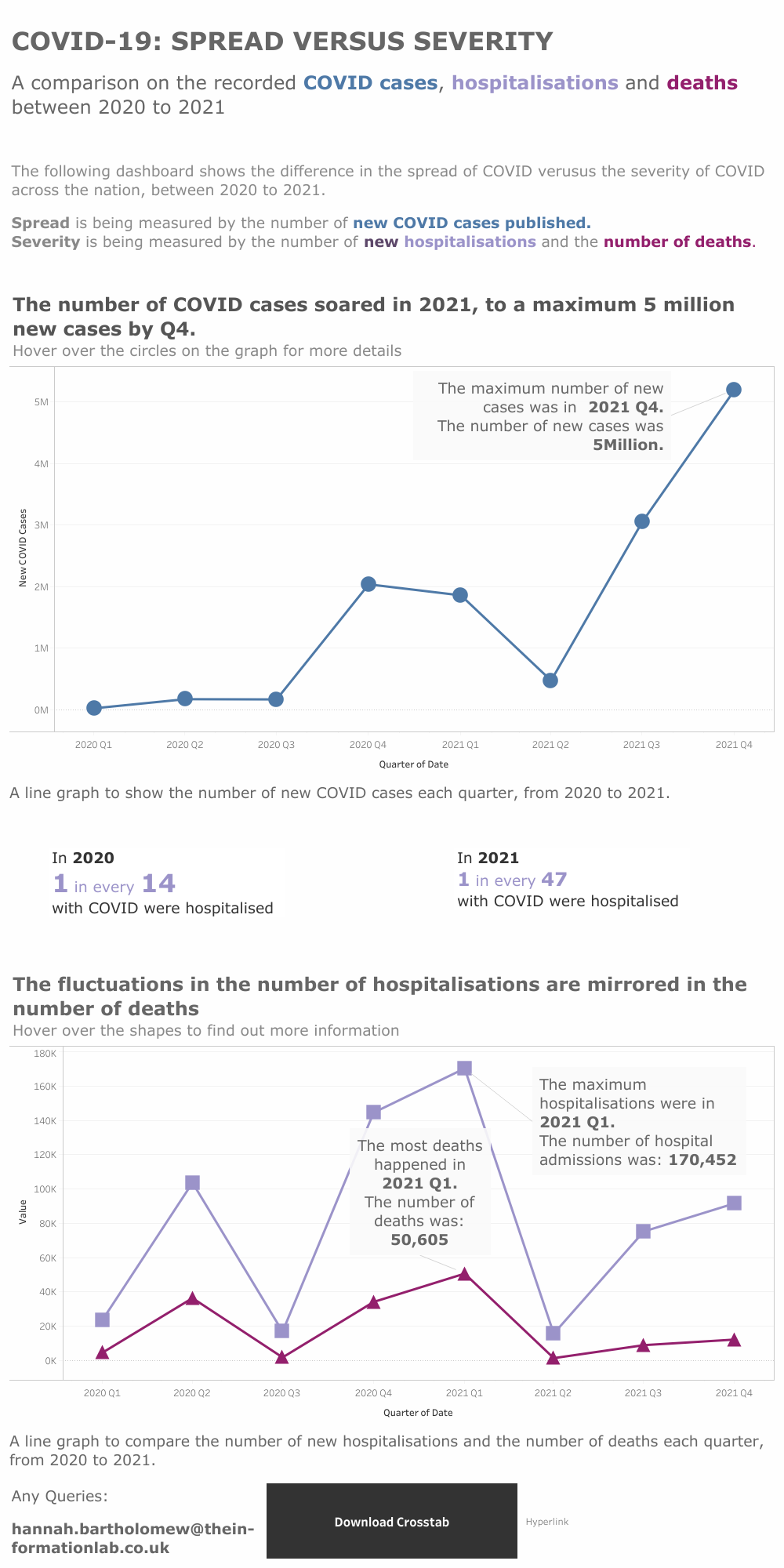
Outcome
Further considerations considered:
· Captions- extra description of graphs for screen readers
· Descriptive titles: for screen reader/ clarity
· Marking key points- highlight key observations for you
· Consistent axis e.g. time was always measured as quarter and year
· Number format rounded for ease of readers/ limit confusion
Dashboard next steps:
· Universally bigger font size. Some of the default axes need changing
· Word choice for ratios
· Keep working at tabbing at keyboard shortcuts
· Spacing
· Edit my tooltips
Reflection
Considering how much I learnt in 2 hours, accessibility is an after thought to normal practices, including dashboard design. I will definitely take some of the tips I learnt today, such as descriptive, statement titles and font/ size considerations, to enrich my future dashboards.