Explanatory vs Exploratory analysis
What is exploratory analysis?
An exploratory visualization puts the user in control. The point of this visualization is to allow the user to explore, to find their own insights. The conclusions drawn can differ between users, based on their different interests in the data.
Why are exploratory visualizations good?
This type of data exploration can satisfy the needs of a range of stakeholders that use it. It is usually very interactive, so the user can drill down to their unique area(s) of interest. Therefore, the insights are personalized. Furthermore, it can build trust with the client because they can see what you have done at an overview level, so they trust the validity of your working methods. Finally, it can be a great proof of concept for the client, perhaps when they are not sure what questions to ask of their data.
Why are they bad?
There is usually loads of information in the visualizations, which can lead to:
· Getting lost in the visualization
· Making the wrong conclusions
· Being completely unreadable to a user that lacks data fluency
· Inaccessible to different viewing platforms/ disabilities
· Particularly if it is a live connection to the dataset, it could lead to a lag when presenting findings
What is explanatory analysis?
An explanatory visualization will guide the user through the data, inviting them to make specific and universal findings, regardless of the user.
Why are explanatory visualizations good?
It can lead to a tailored message, which makes it accessible for a range of audiences, including a range data fluencies. This type of visualization is fantastic for a time-poor user, by highlighting key insights quickly and easily.
Why are they bad?
Bias is a huge risk, and depends on the author of the visualization. Obviously not me! Despite your best efforts, even your decisions to define by specific criteria over others creates bias. The key is to limit its effect on your findings as much as possible. By tailoring the findings, you can loose granularity or wider context- this can lead to confusion. Finally, it isn’t expandable to a change in the dataset.
The best of both worlds?
The ideal visualization would combine both techniques. The relative contribution of both would depend on the user story. Within a consulting position, I would lean toward the explanatory side. But that’s because the client regularly comes you you with a specific question to answer. Let me reiterate, if the client is not sure what they want answered/ aren’t sure what you or tableau can achieve, then a more exploratory, proof of concept piece would make a great start.
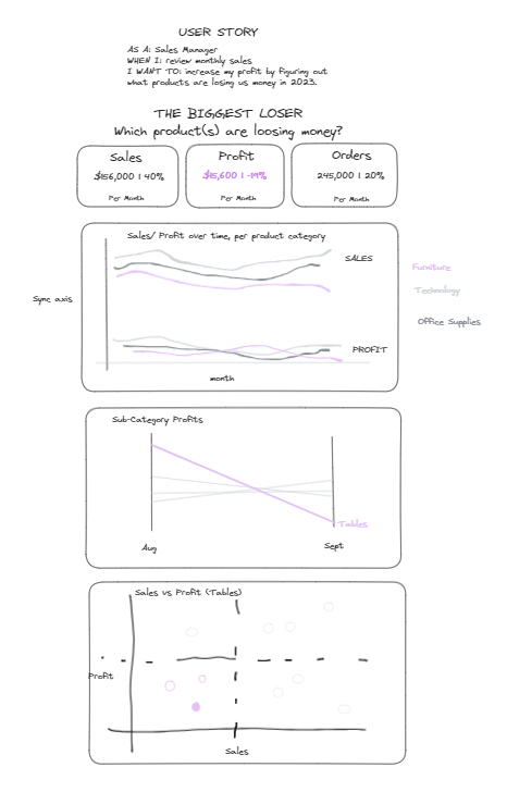
Great, you have decided which type of analysis you want to do… just need to go and make the dashboard. Piece of cake right? (See my attempt below!)