Today the dataset was much more accessible and required only a little bit of Alteryx intervention. The catch with today’s project is that we have to create a dashboard both in Tableau and in PowerBI.
We just had to transpose 6 excel sheets and then join them all together and boom – we’re done in Alteryx.
Although the dataset was very clean and easy to understand it was very detailed with years from 1890 – 2018 and 24 different countries to look at. This posed me with a different issue of being overwhelmed and struggling to find a specific direction to take the project.
For some reason, in both uni projects and my A-Level history coursework I focused on Australia so I decided to do the same thing with this.
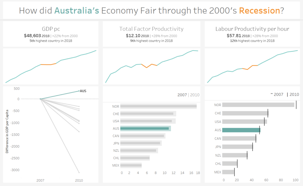
My tableau KPI dashboard looks at Australia’s economy from 2000-2018 with specific focus on how the recession in this time period affected them. It is interesting to note that Australia’s trade relationship massively helped Australia escape the worst effects of the global economic meltdown in 2008.
My dashboard first gives some insight into how Australia’s economy compares to other countries’ GDP per capita, Total Factor Productivity and Labour Productivity per hour.
These factors are further analysed with a sparkline of the trend showing the recession years highlighted in orange.
The bottom third of the dashboard further looks into the recession years and how from 2007 to 2010 Australia compared to other non-EU countries. I chose to represent this with three different chart types to practice showing change and comparison in different ways. The feedback from Andy was that this would be better if all three charts were the same format so taking this further I will look for consistency rather than complexity in my dashboards.
Going into PowerBI I didn’t know what to expect and found that a lot of the aspects seem counterintuitive but I think that’s due to my Tableau bias. I liked the ease of dragging things around on the canvas which is more difficult to do with containers on tableau.
PowerBI is very obviously a Microsoft product and the interface and usability correlate with a lot of their other well-known products so I think starting out on a data visualization tool PowerBI is probably very accessible.
I managed to create a few different chart types and fiddled with the formatting and filtering in the tool as well. I would like to spend some more time in the tool to be able to create something more interactive and accessible. Maybe that’s a job for my weekend in lockdown.
Here is a screenshot of my Tableau Dashboard.