


This week I have been learning how to create a Trellis chart in Tableau using data from https://ourworldindata.org/working-hours#research-writing , which explores the average number of hours worked by the average person annually for each country.
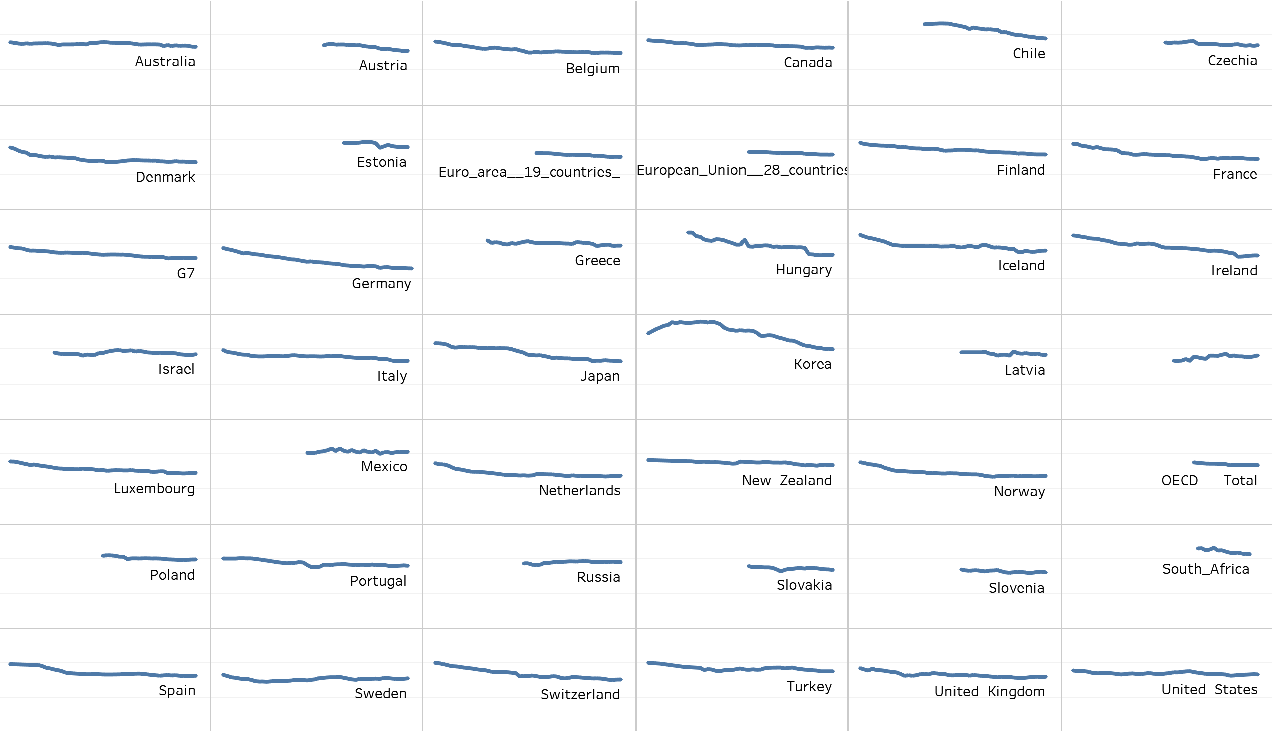
For this, I wanted to plot a chart where each section looks at the average hours for each country, like so:
To do this, I used the following YouTube video to help me get going (though I will summarise below): https://youtu.be/mKydUH-3p-E?feature=shared
Building the Trellis Chart in Tableau
Start off with a fresh sheet in Tableau.
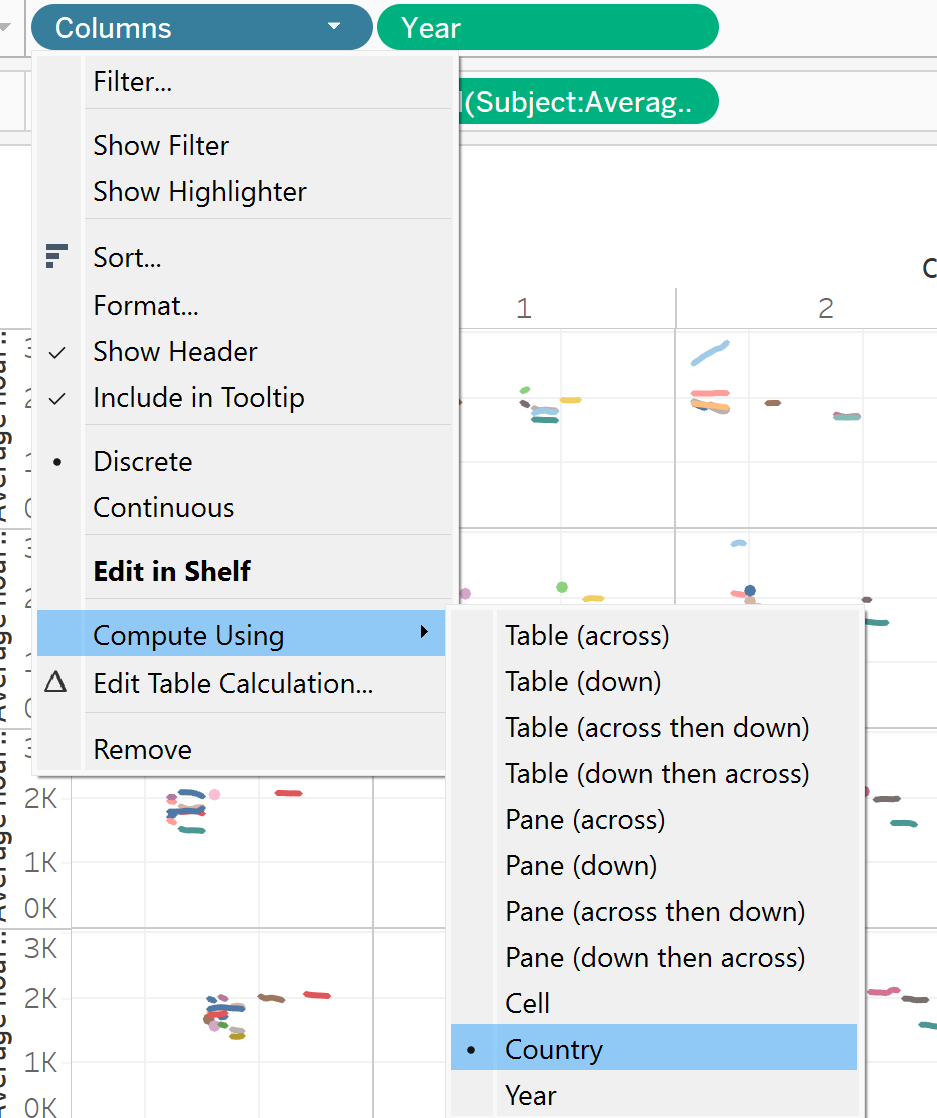
To build a Trellis chart you need two calculations which work to divide your sheet up into different sections (this defines the "mini charts" within each sheet").
Calculation 1: Columns -> (index()-1)%(round(sqrt(size())))
Calculation 2: Rows -> int((index()-1)/(round(sqrt(size()))))
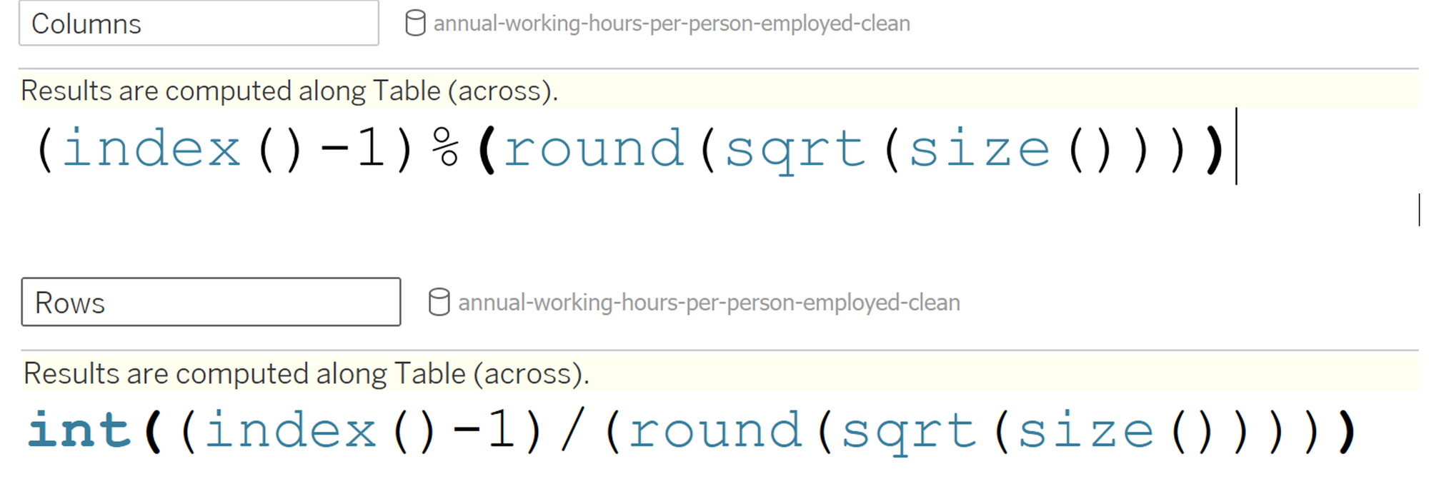
These are essentially some complex Table calculations - which makes sense as we want to divide up what is in the view.
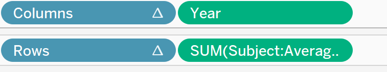
In your sheet, drag your columns calculation to columns and your Rows calculation to rows. Ensure these are both discrete (blue). You can also drag the relevant field to columns and rows here (I'm dragging the year to columns and my average hours worked to rows.
Onto detail/colour of your marks card, drag the field you want to divide up your chart by. As I want each line to represent a country, I'm going to put my country field here. To check my chart is working, I'm going to drag my country onto colour (so each line should be a different colour).
This doesn't quite look right, so I'm going to change my Table calculations (Columns and Rows) to ensure they are repeating every country.
This is essentially building a Trellis chart in a nutshell, so what was my final output?
Troubleshooting my Chart
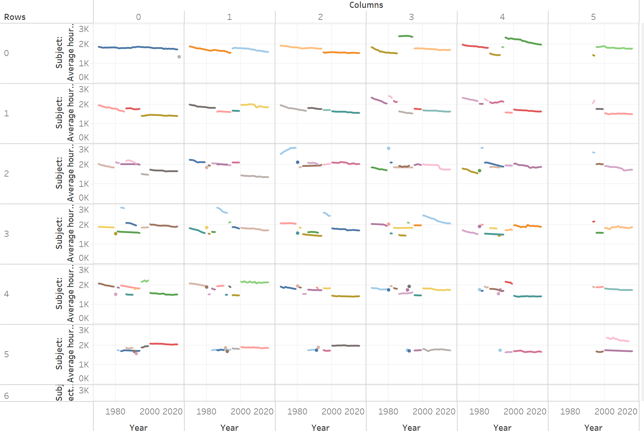
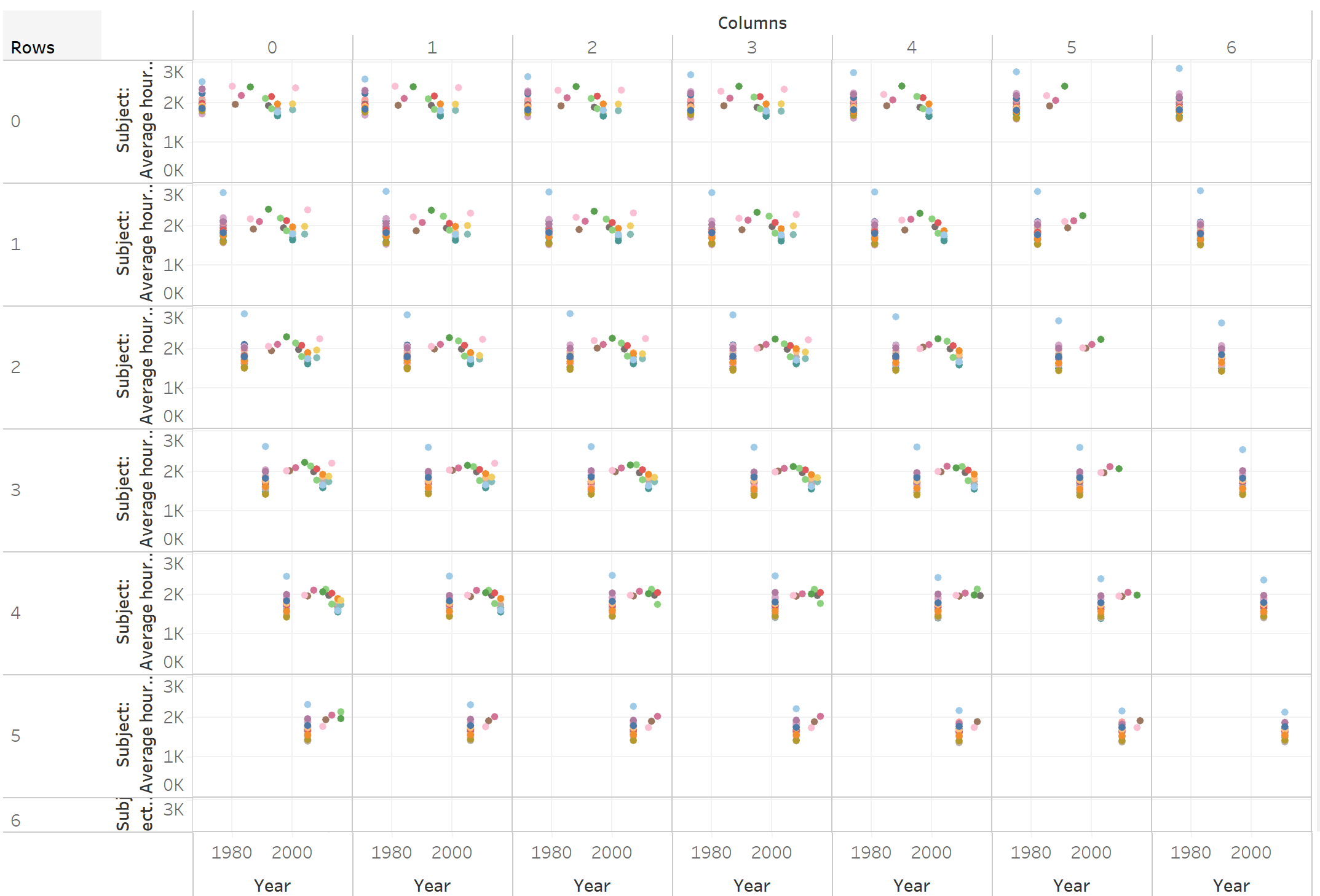
Despite following all tutorials to a T, my chart was a bit of a mess. My countries had managed to sneak in all across differing rows and columns.
Gaining a deeper understanding of Trellis Charts
After a long time scrutinising this with fellow colleagues, the underlying problem was finally found, and made a lot of sense in the long run.
Take the first row of my chart, where I have added labels for reference:
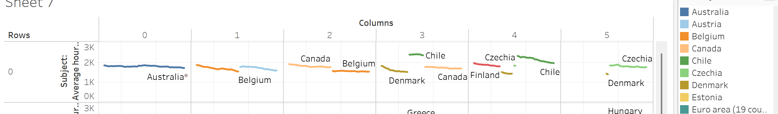
The Rows and Columns calculated fields try to order my countries alphabetically, starting from 0,0.
Looking at my first segment (0,0), where my tooltip is looking at the grey dot:
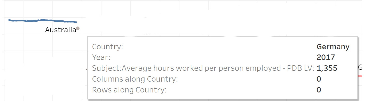
There is a rogue mark for Germany in 2017, whilst the rest of the line shows average hours for Australians.
Looking at the dataset, we found that there was no data for Australia in 2017, and the first country alphabetically to have this data in 2017 was Germany - hence why it had been placed in the first segment on my chart.
The Solution: Scaffolding my data
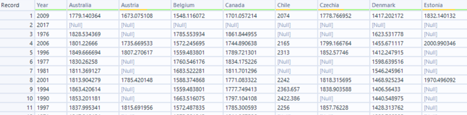
There were a lot of holes in my data - meaning there weren't values every country for each year. This was causing my table calculations to re-assign my countries alphabetically for each given year, hence the strange appearance.
So, I put my data in Alteryx and did the following:
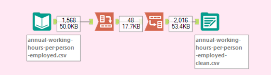
Step 1: Transpose
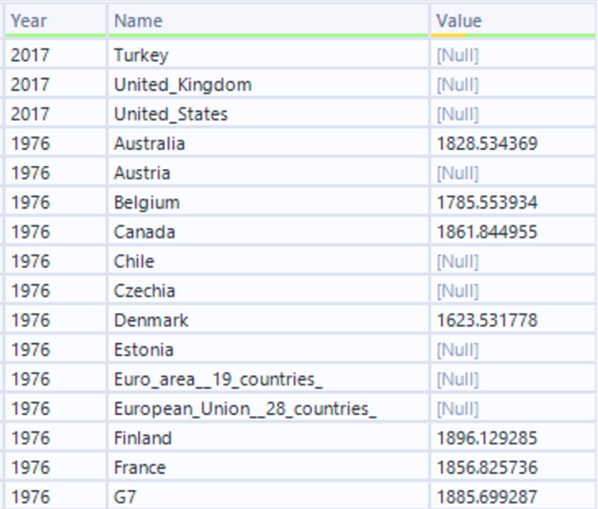
Here, the Years field are in the key column and pivoted the countries into individual fields - in doing so, countries without data for corresponding years would appear as null:
Step 2: Cross Tab
Now, we can bring our table back to its original format, which will now also contain the null values for missing data.
Step 3: Inputting into Tableau
Using this newly-scaffolded data, and following the same steps as previously, we now have the following:
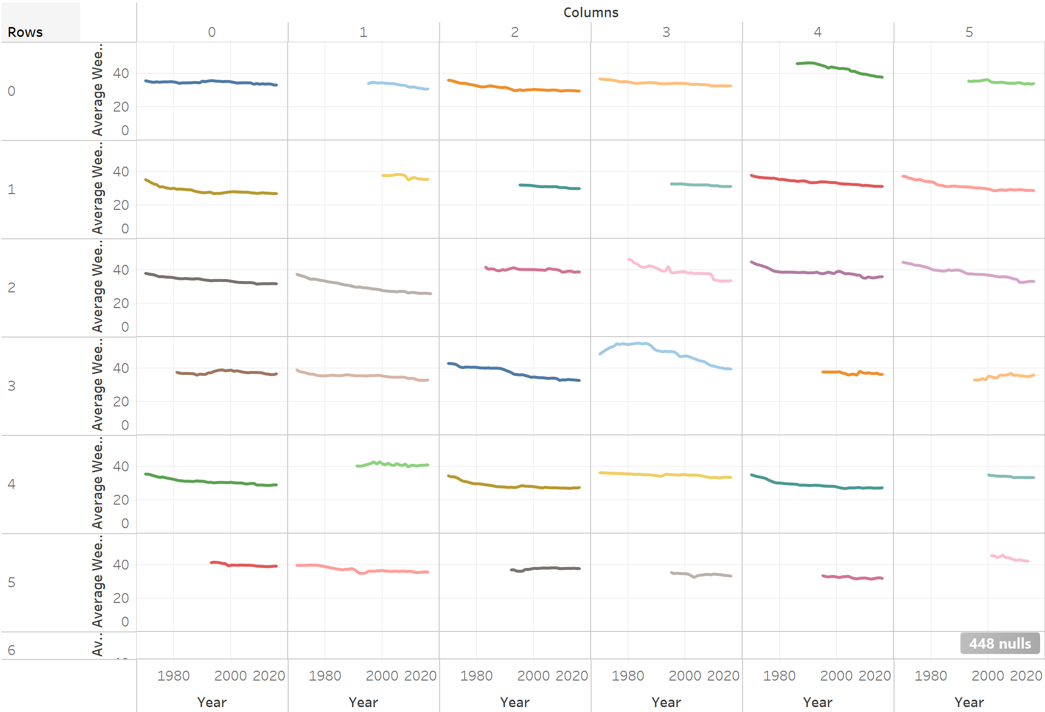
With our lines all neatly organised, we can now format to get our final output (and hide the null indicator, although it is useful to know how many values were missing from the original data set).