


The challenge for days 3 + 4 were set by Tableau themselves, where we had to create an infographic dashboard using IMDb data. We could design any story we wanted using the data, so long as it kept to the summer theme.
To do this we just had to download the packaged workbook which would give us access to an example dashboard in addition to all the data.
Here's how the project went
Day 1: Finding a Story and Planning
I decided to focus my dashboard on summer tv series released over the years, and was initially keen to find the top shows for every summer.
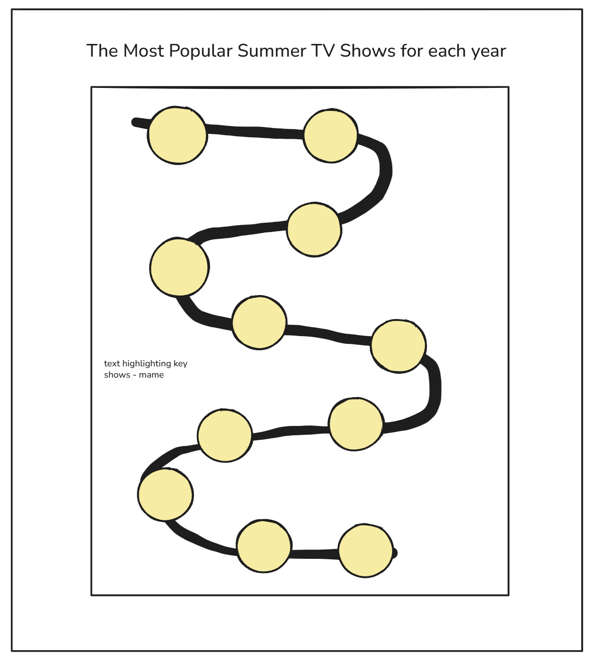
With this project being over 2 days, I wanted to learn how to do something complex, so opted to create a curved timeline to show the top shows each summer, like so:
Once I had this built, I would then build supporting charts around it to look into this temporal breakdown. I wanted this dashboard to be really visually appealing, as this is something you don't get to do when creating business-oriented dashboards.
Hurdle 1: Defining the Top Show
The first difficulty was defining the top show - was this the most highly rated show? Or the show with most votes (as it suggested a wider outreach?) Or potentially both?
I ended up exploring all three choices, having not been convinced with the results that were produced. Ultimately, for this case, I decided to use the ratings to define the top shows.
Hurdle 2: Creating a Curved Timeline
The next (and significantly larger) hurdle was creating a timeline. Having found this useful webpage from the Flerlage twins on how to create one, I thought this process would be manageable. However, to create a curved timeline, you need to create a scaffold which creates 20 points for each year, which is then joined onto your original dataset. However, the dataset was extremely difficult to manipulate beyond Tableau Desktop. After several hours of troubleshooting, having tried every possible option in Tableau Pre and Desktop, I had to put my dreams of a curved timeline to rest, and repivot the focus for my entire dashboard.
Day 2: Making the best from a bad situation
After a tough first day, I still wanted to use what I had to create a different style of dashboard. Despite wanting to try more technical charts, the time constraints meant this would no longer be possible. I finished off my second sketch and began building charts left right and centre.
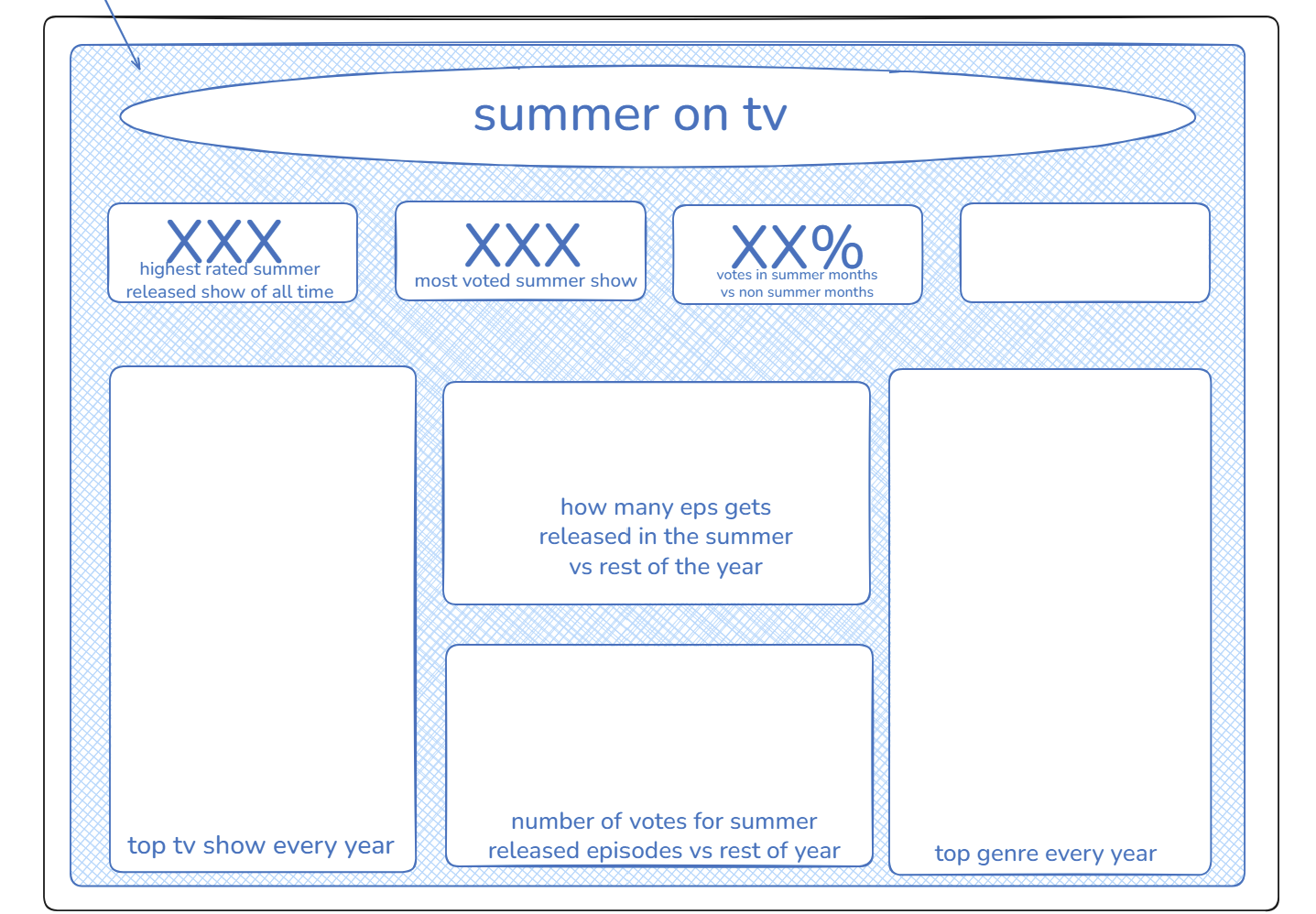
Once the separate components were done, I went onto Figma and began creating an appropriate background. This took several iterations between adjusting my background design and my charts themselves before the perfect balance was created.
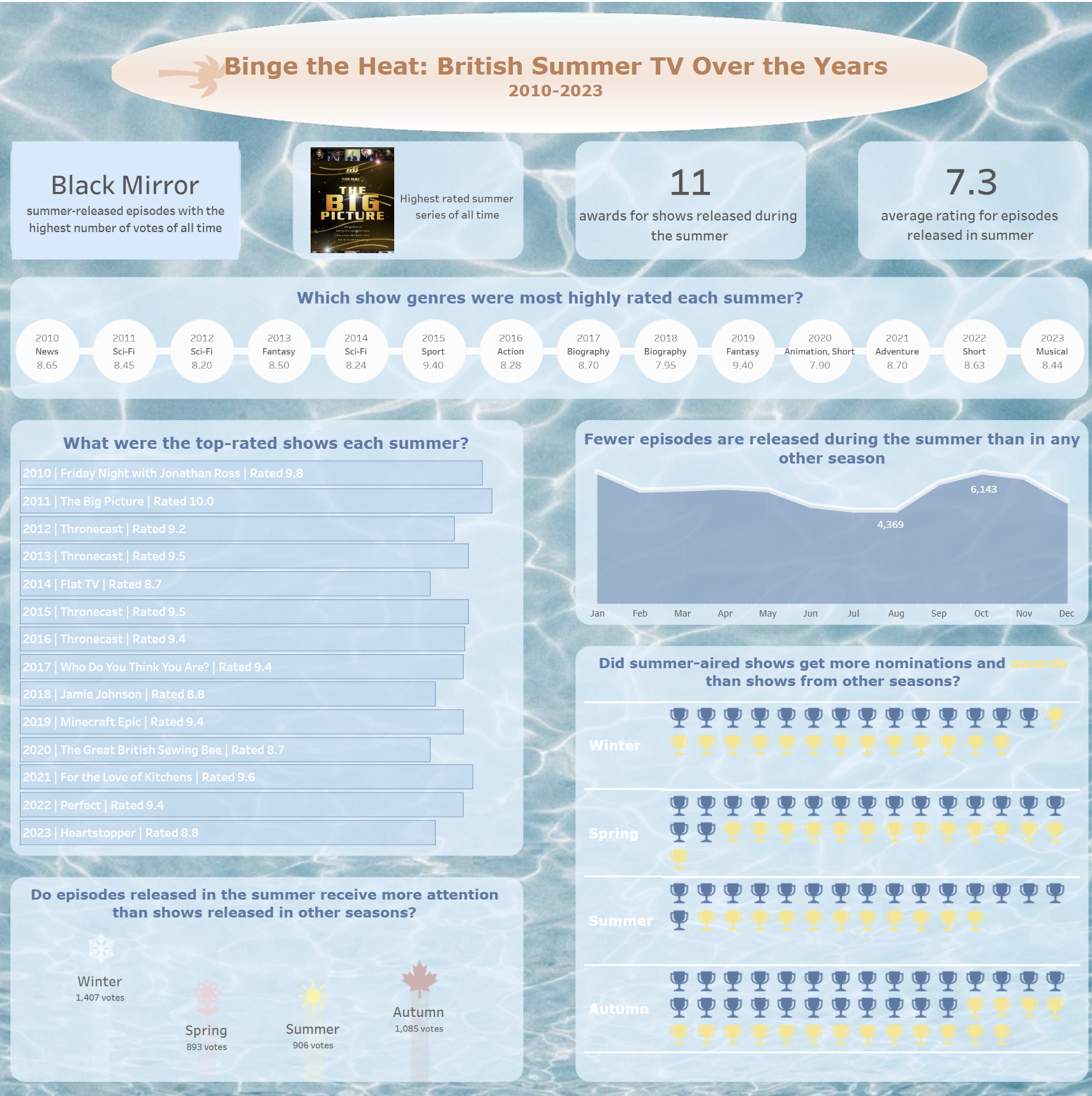
The Dashboard
Overall, I feel indifferent about this. I wish I had incorporated some more complex charts into this.
In the future I am looking forward to using this dataset again to create more dashboards on specific shows!