


As DS50's training draws to a close, today we began our dashboard week journey. Here's how it went:
The Brief
We needed to scrape data from https://www.priceoftravel.com/cheapest-places-visit which helps travellers find their next destination, providing a breakdown of things such as: costs of different types of hotels, food prices, local drinks, and weather.
My task was specifically looking at an overview of the global data provided, where others looked at specific continents, and I decided to visualise this in Power BI.
My Initial Approach
I initially spent some time creating a rough overview of the day, breaking down everything into four general tasks:
- Re-learning how to web-scrape
- Obtaining the data and cleaning it up
- Sketching my dashboard
- Building my dashboard
Unsurprisingly, this plan (and the initial timings I had laid out) completely fell through. Although I began to grasp the general steps of web-scraping fairly quickly (my biggest challenge being with Regex), I did not necessarily know what data I needed, and my dashboard paid the price for this later on.
Web-scraping and Data Preparation
I needed to scrape the initial information from the first page, and then gather further information from the individual city links. Although I planned on sketching later on, I wish I had looked at the website properly first, then sketched, then gathered the data I needed.
I ended up gathering data on the overall price index for each city alongside its ranking, in addition to year-round temperatures and sunrise/sunset times.
Behold the workflow!
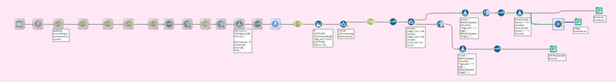
If you are new to web-scraping/Regex, something key that I had learnt was the importance of .+? for harnessing data.
Sketching and Dashboarding
My initial sketch took the first hit as I had spent so long gathering data I didn't (yet) know how to present. I knew visualising data on a global level would be tough, but thought it would be great for user interactivity, so wanted to incorporate a Top N filter for the indexes (which I knew would be a learning curve in itself).
Here is the final dashboard:
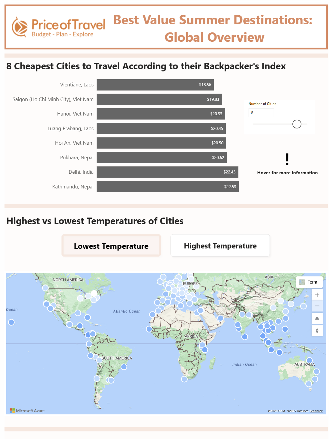
Overall, I was disappointed at the simplicity of the dashboard - some KPIs at least would have made this global overview much more impactful. I was also disappointed that I didn't get the temperatures to show over time, despite many efforts with my date table.
However, there were some wins:
- Managed to get a Top N filter to work
- Created a "hover over" button to provide extra information on the backpacker's index
- Learnt about some of the limitations on maps (you cannot colour these based on a measure switch parameter), which also led me to learn:
- How to use bookmarks again
Key findings:
- Vietnam has several of the cheapest cities for travellers
- For a cooler (temperature-wise) trip, consider Europe or cities nearer mountains