


The Brief
I needed to create a dashboard in Power BI for a client with a visual impairment who only uses a keyboard to navigate the dashboard.
The Plan
Having learnt from my lack of planning yesterday, I spent some time looking over my data and creating a rough sketch with my client's visual impairment at the forefront of my design.
With this, I wanted a format by which the order for keyboard navigation would be clear and sensical, so I decided to include a control panel at the top with corresponding charts and KPI's underneath.
Delivery
Power BI made this challenge surprisingly less intimidating - there was a really useful page on how to reorder each element for keyboard navigation, as well as other useful aspects for accessibility (see https://learn.microsoft.com/en-us/power-bi/create-reports/desktop-accessibility-creating-reports ).
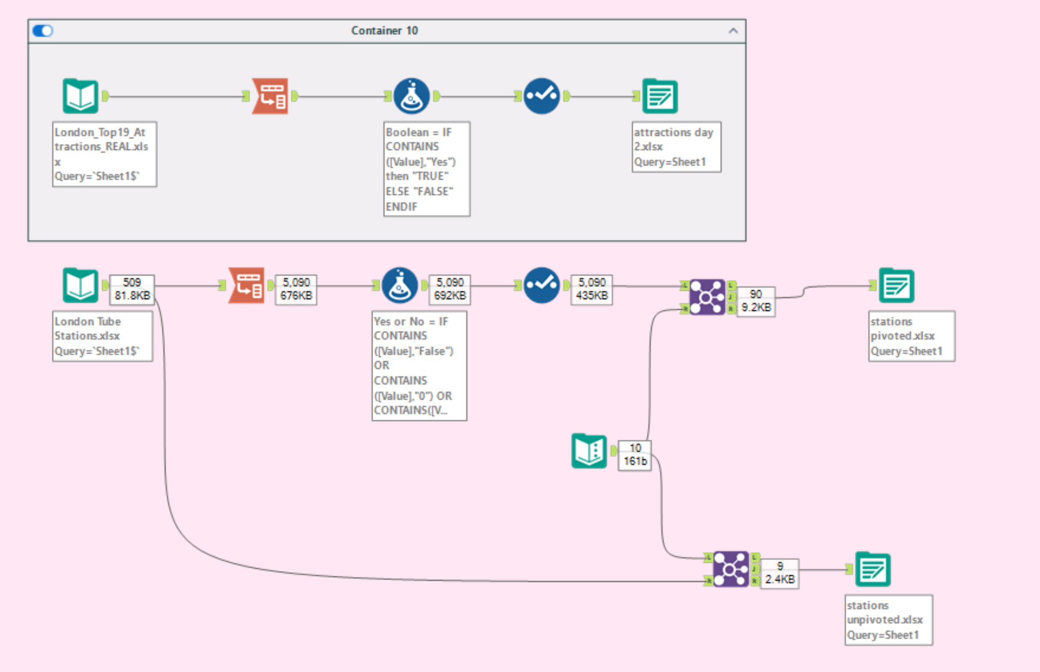
As I wanted to look at the number of attractions with certain accessibility features, I ended up pivoting my datasets so these aspects could be compared/filtered more easily. Other cleaning aspects I did was to ensure relationships could be built in Power BI. Overall, the data was nicely laid out so not much was done.
My main issue was how to present the data. I didn't originally want to use bar charts, due to my client's visual impairment - I had hoped to create a lollipop chart of sorts to incorporate different shapes and colours to make my comparisons as clear as possible. However, as far as I'm aware this isn't possible in Power BI, so I decided to fill one bar in red and the other to have a black outline (as filling bars with patterns was not yet possible either).
The Dashboard
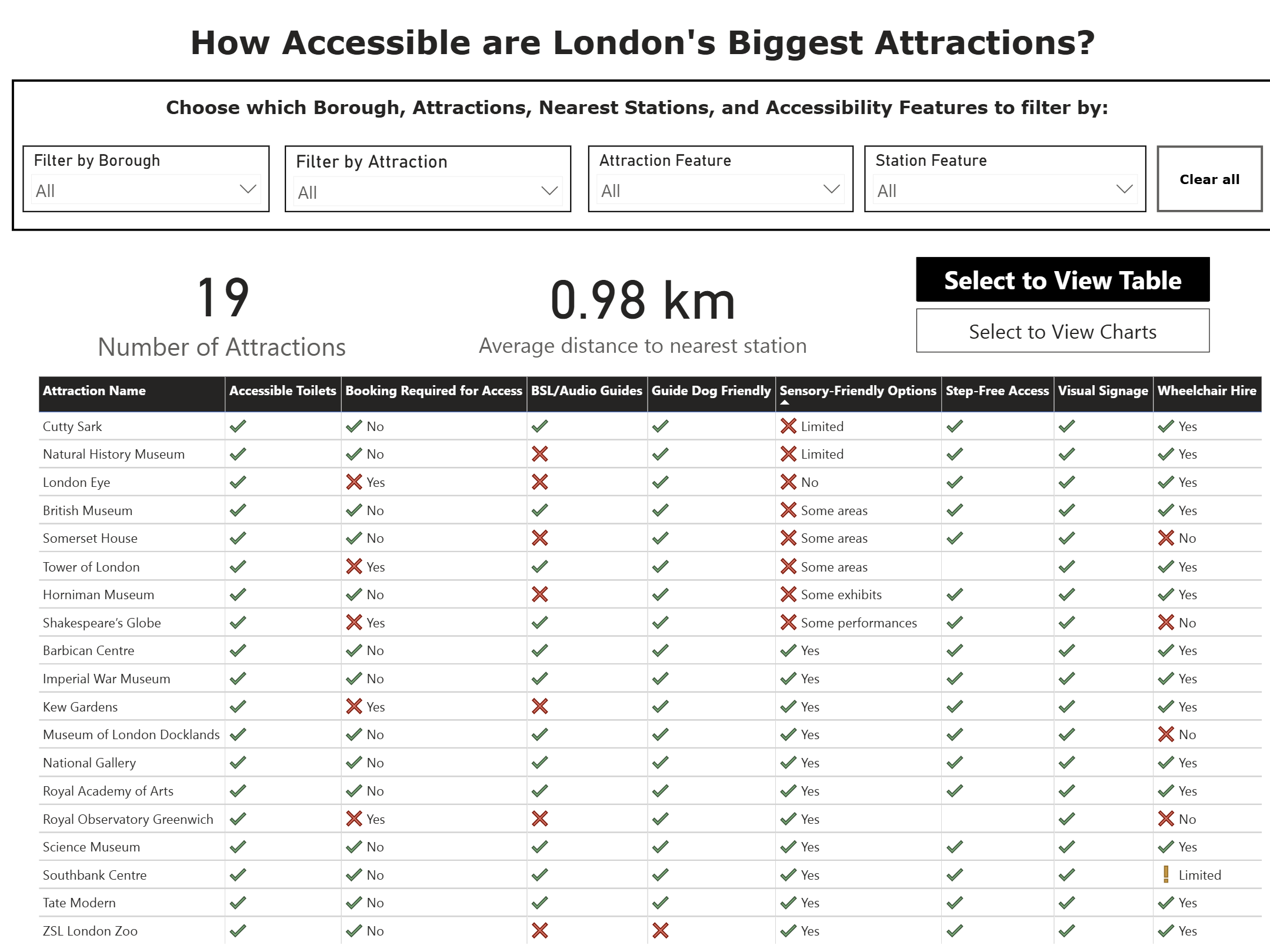
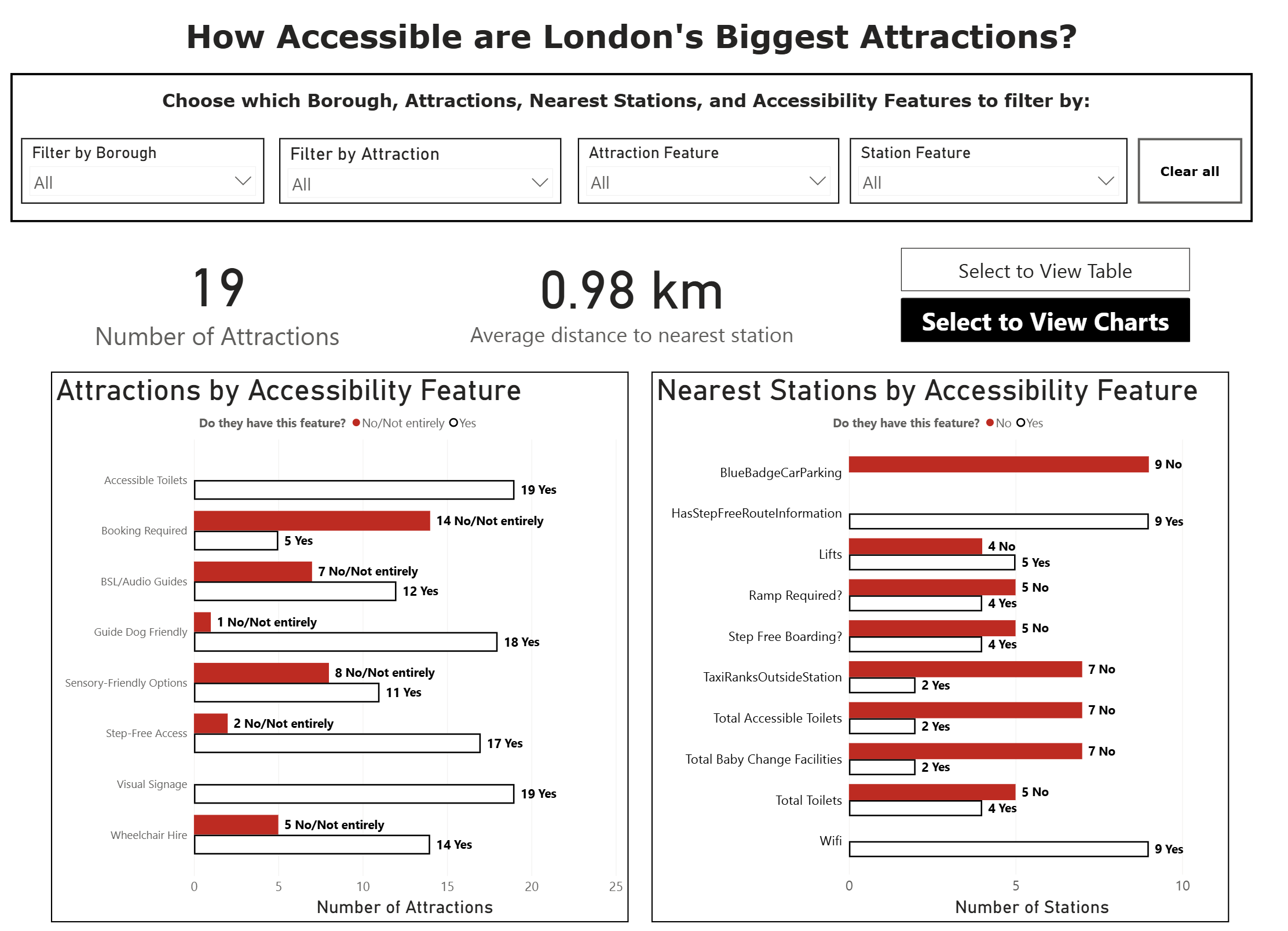
Overall, I'm quite pleased with how this ended up. I kept the colours extremely basic as I wasn't aware of the nature of the client's visual impairment, and the dashboard and key findings can be accessed via keyboard navigation only.
My biggest challenge with this will be demonstrating this ability during my presentation, as my keyboard navigation skills aren't quite up to scratch...
Feedback
Overall, feedback was very useful. Some things to bear in mind for the future would be:
- Choose a different colour instead of red for the bars due to the negative associations
- Having a black on white contrast is a bit too intense! I should consider having an off-white background or making my black lines slightly more grey