Dashboard Week Day 3 brief was a challenge set by Tableau themselves: Using IMDB data, select a TV Series of choice and create an infographic dashboard that delves into a range of elements of it.
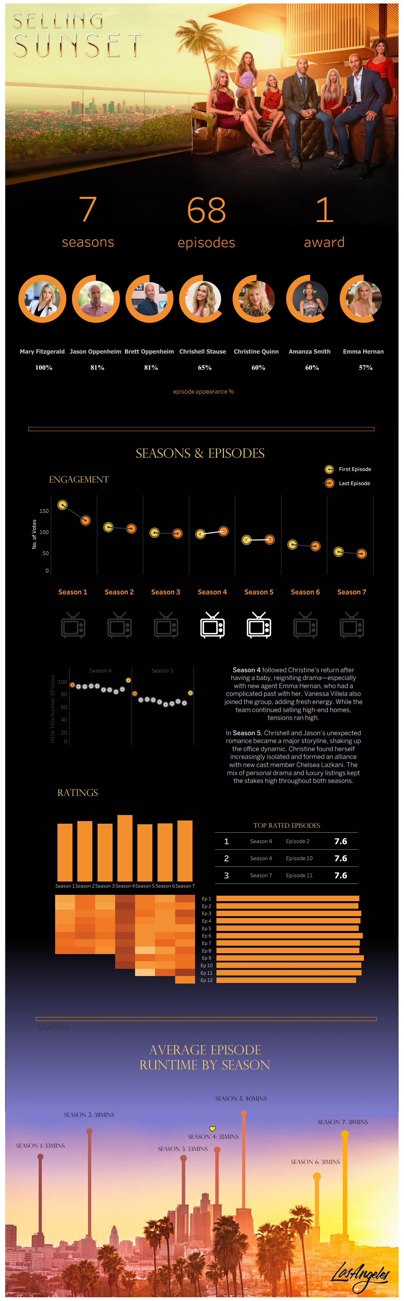
I chose to do my project on: Selling Sunset
Selling Sunset is a reality television series on Netflix that follows the elite real estate agents of The Oppenheim Group, a high-end brokerage firm in Los Angeles. The show centers around the agents as they sell luxurious, multi-million dollar homes in some of LA’s most exclusive neighborhoods. Alongside showcasing impressive properties, the programme delves into the personal and professional lives of the agents, highlighting their rivalries, friendships, and dramatic conflicts. With a mix of high fashion, high stakes real estate, and interpersonal drama, the show offers a glamorous look into both the luxury housing market and the lives of those who sell it.
A key aim of the project was to make the dashboard aesthetically pleasing. To do this I utilized Figma, Window Image editor, Tableau and many more software's to create an aesthetic infographic.
The project dives into the individual seasons and episodes to investigate how viewer engagement and ratings has varied overtime.
Challenges
- Using Figma to ensure the gradient of background colours looks seamless
- Developing a dashboard that can be viewed solely in report/infographic style
- Creating shapes within a Donut Chart to be faces of the characters
Please see as follows for the dashboard:
https://public.tableau.com/app/profile/harry.caplin/viz/SellingSunsetSeriesAnalysis/SellingSunset