


Tableau Next is an agentic analytics platform built on the Salesforce platform. It aims to democratize data access and insights by providing personalized, contextual, and actionable insights to users across various workflows.
With a redesigned interface, improved semantic modelling, enhanced AI-driven insights, and smoother integrations across platforms, Tableau Next makes building dashboards more intuitive, and more powerful.
In this blog, I will guide you through creating your first Tableau Next dashboard. Whether you're a seasoned Tableau user or brand new to the platform, this guide will walk you through the process of creating a basic dashboard in Tableau Next from scratch. We'll explore the updated workspace, drag-and-drop functionality, and new features that simplify everything from data preparation to interactive design.
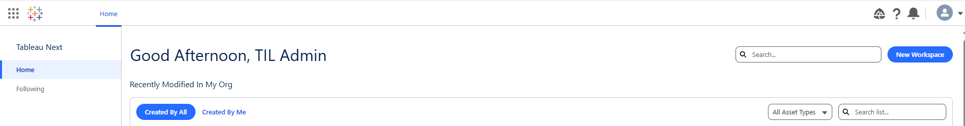
After accessing and logging in to Tableau Next you will be greeted with this view:
The first thing you are going to want to do is create your own workspace. Workspaces are a collaborative environment for building and sharing analytics assets. It allows teams to work together on data connections, semantic models, visualizations, and dashboards within a unified space. A key benefit of a 'Workspace' is that it is a centralized location for all relating assets, and allows for teams to collaborate together on visualisations, and dashboards thus differing from Tableau Desktop.
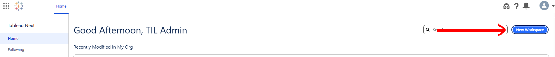
The way in which you create this is by selecting 'New Workspace' and the naming and describing your workspace.
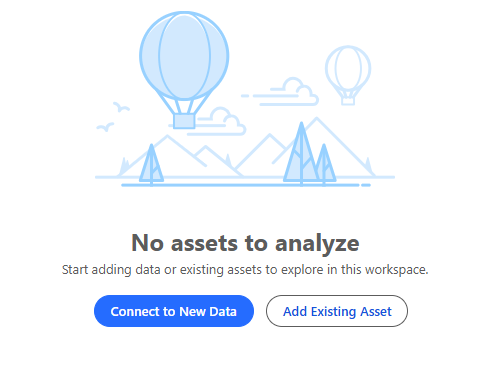
Once your workspace has been created, you now need to connect it to some data that you would like to work with. For this blog, I am going to be working with Sample-Superstore data.
Important to note: Tableau Next currently only supports CSV. files!
Select Connect to New Data and bring in Sample-Superstore.csv:
Once you have brought your data into Tableau Next, the next step is to select 'Create a Semantic Model'. This blog doesn't dive into how to create a semantic model; please see Rosh Khan's blog: https://www.thedataschool.co.uk/rosh-khan/tableau-next-building-a-semantic-model/ for further information diving deeper into building a semantic model.
We will be using the auto-created semantic model to build our metrics, calculated fields and visualisations.
Once you are in the semantic layer of your workspace you will be met with a view, in which you create the key features of your dashboard.
Unlike Tableau Desktop, all features of the dashboard and created within the semantic layer of Tableau Next, and then organized for visual purposes within a dashboard.
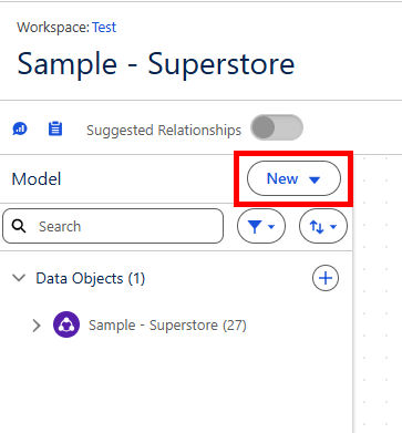
Selecting 'New' will give you a list of dashboard features which can be created in the semantic model e.g. Parameters, Calculated fields etc.
If you are used to Tableau Desktop, metrics are a new form of visualisation similar to a KPI, which auto-generate spark lines and additional textual information within the view. This blog doesn't dive deeper into metrics, however if you would like to include them in this dashboard, please see Rosh Khans blog on semantic models which includes metric creation: https://www.thedataschool.co.uk/rosh-khan/tableau-next-building-a-semantic-model/.
Now we have connected to our required data, and have a working Semantic Model, we can now begin building visualisations....
Select 'Create Visualisation' in the top-left of the screen.
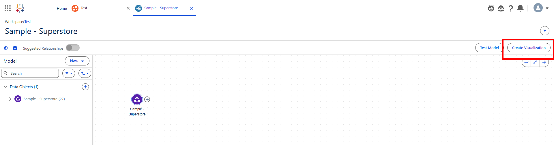
This will bring you to a view which will be very familiar to Tableau Desktop users. A view in which we can build our visualisation.
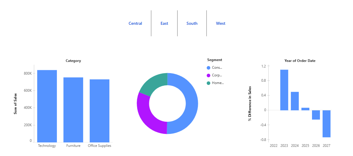
This dashboard will delve deeper into performance by Category.
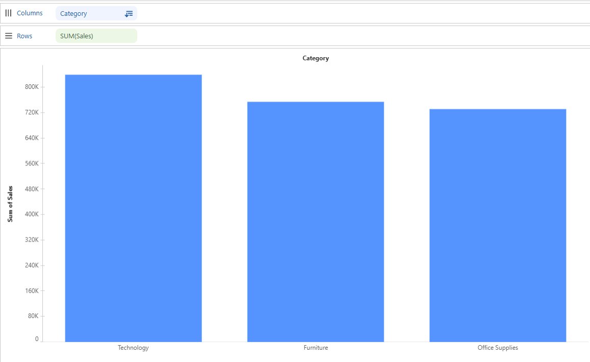
For our first visualisation we would like to see Sales by Category:
Step 1: Drag Sales to Rows (For our method of aggregation we wat to use 'SUM', Tableau Next will auto-use 'SUM' to aggregate Sales, but if you wanted to use a different method of aggregation, select the drop down on the Sales tab in Rows and adjust as you see fit).
Step 2: Drag Category to Columns (and sort descending)
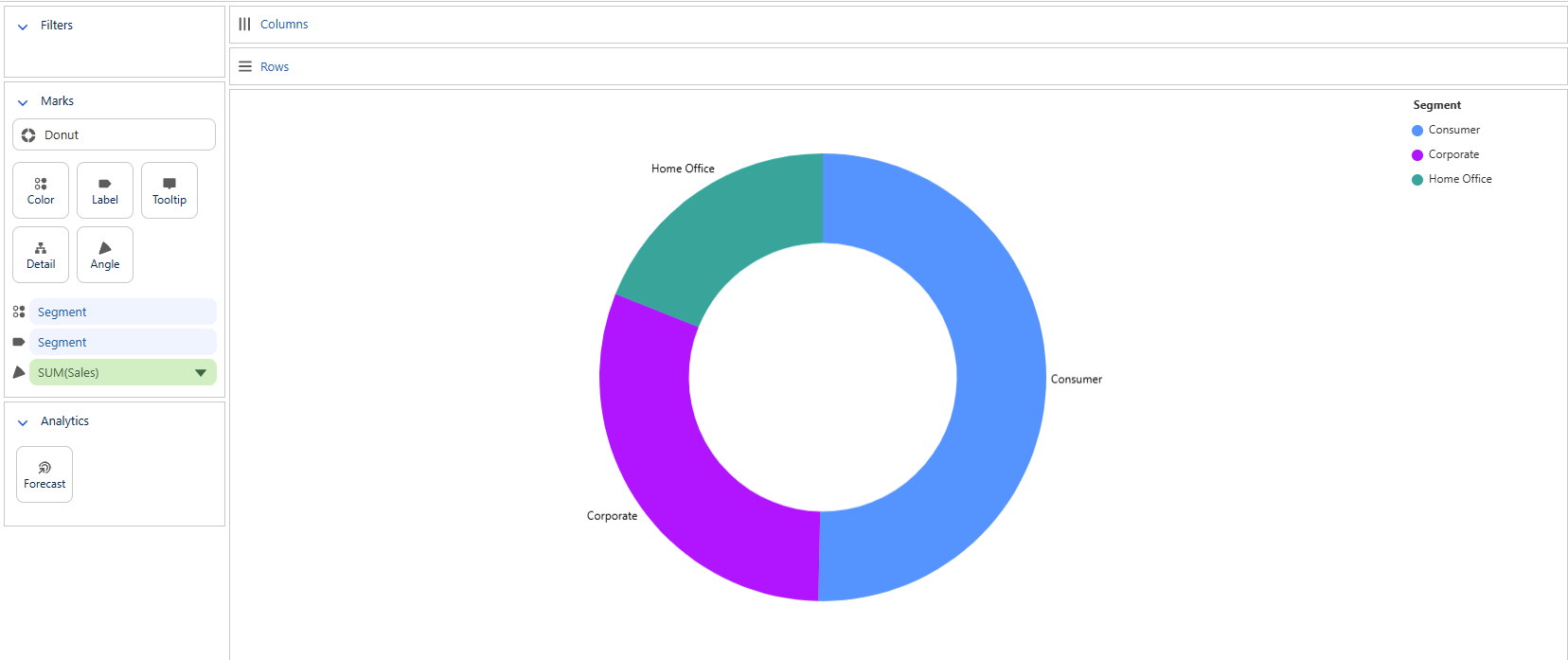
For our next visualisation we will be using one of the new 'Suggest (Beta)' easy-build graphs: A Donut Chart
We will be using the Donut Chart to visualise the contributions of different Segments within Superstore to Sales:
Step 1: Change your mark type to 'Donut'.
Step 2: Drag [Sales] to 'Angle' and Tableau will auto-aggregate the value to SUM[Sales]; which is what we require for this example.
Step 3: Drag [Segment] to Colour.
Step 4: Drag [Segment] to Label.
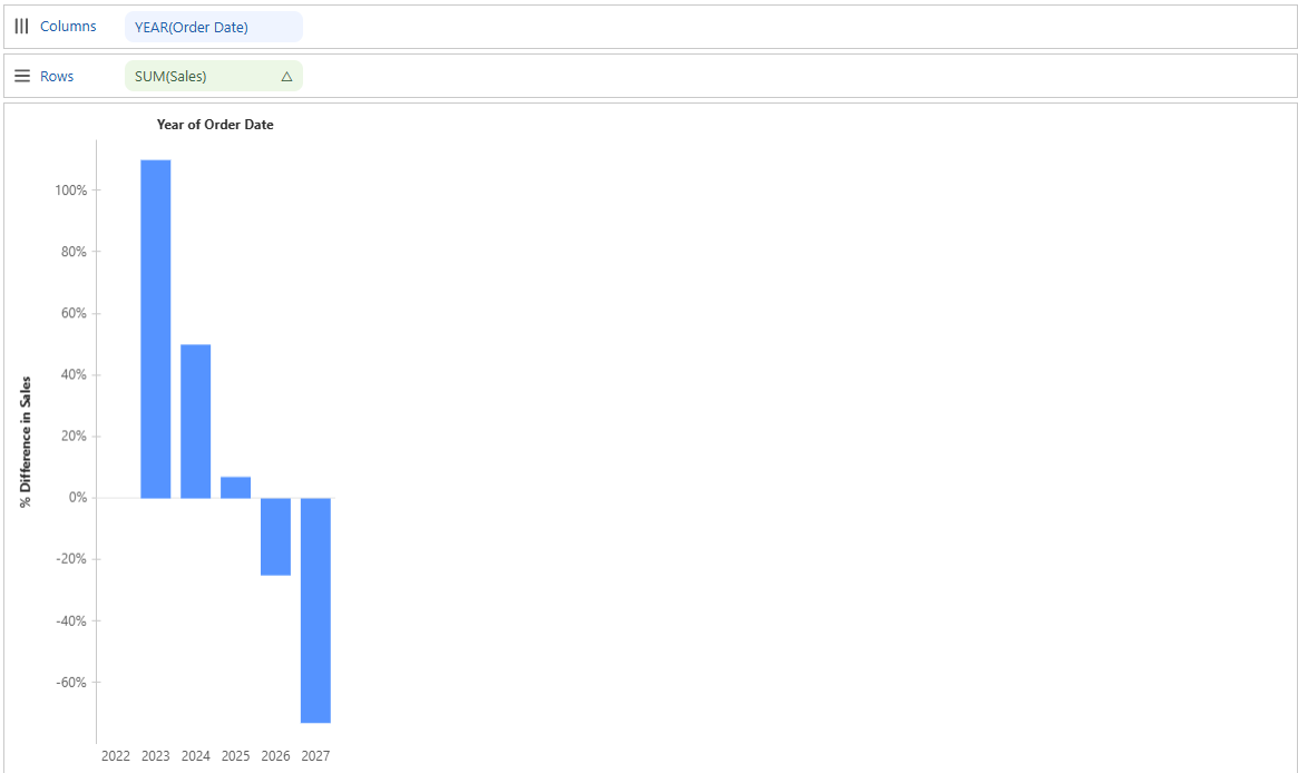
For our final visualisation we are going to incorporate a 'Quick Table Calculation' to allow deeper insight into Sales change overtime.
Step 1: Drag [Order Date] onto Columns, and select YEAR as the Date part (this should happen automatically).
Step 2: Drag [Sales] onto Rows (once again this should auto-aggregate to SUM[Sales])
Step 3: Select the Drop down on [Sales] and using the 'Quick Table Calculation', select 'Percent Difference'.
Now we have created the visualisations we wanted, we can begin to assemble these anyway we like to form our dashboard.
Head back into your workspace and in the same location where you selected 'New Visualisation', select 'New Dashboard'.
You will be met with this view:
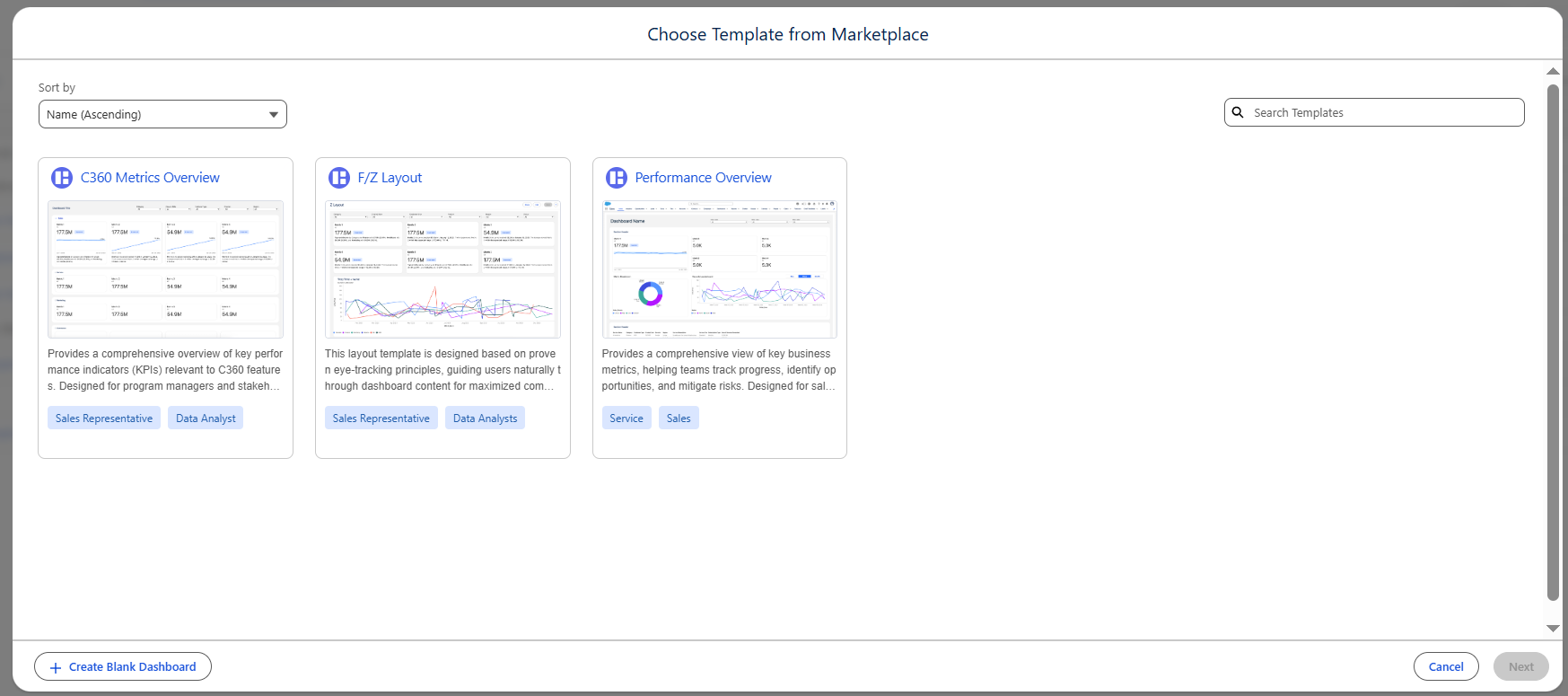
In this area, we are given the opportunity to use a template to build our dashboard, but for this example we are to select 'Create Blank Dashboard' in the bottom left corner.
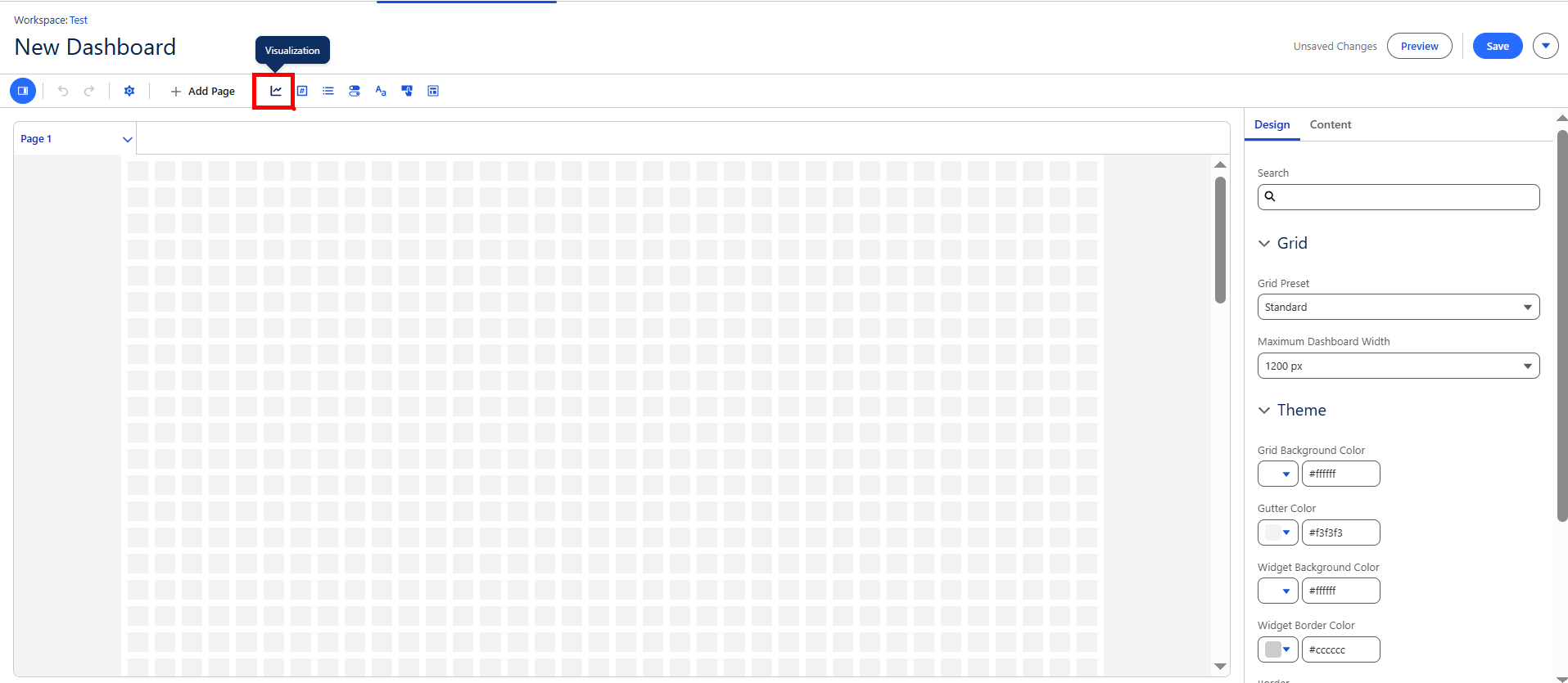
The dashboard assembly view is very different to a view which Tableau Users will be familiar to. The Tableau Next dashboard configuration pane operates through a drag and drop interface typically using what would be described in a Tableau Desktop as a 'floating' dashboard.
From the blank view we are going to select visualisation to bring in what we have created:
We are then able to drag that into the view and place it where we like.
Once we have dragged that in, we can select which visualisation we would like to be contained within the view we have just brought in.
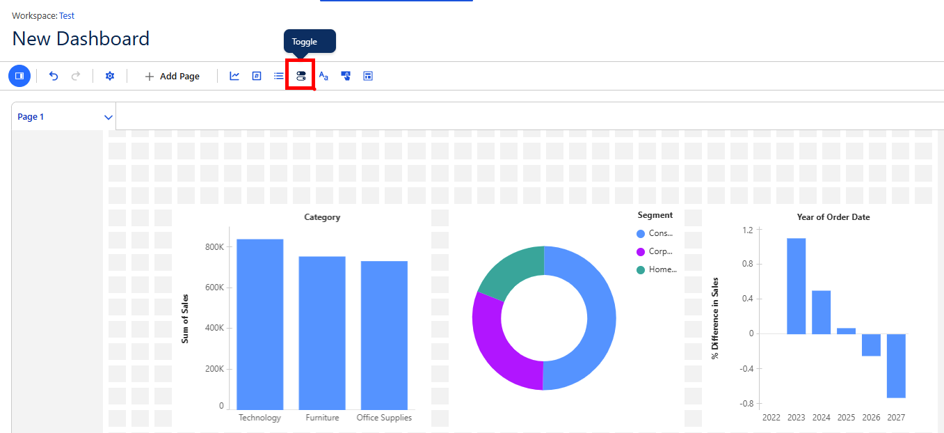
Repeat this process until you have brought in all 3 of your created visualisations.
Now you have all 3 visualisations within your dashboard, you can include Text boxes and many more features to style the dashboard the way you like.
The final addition to these visualisations is: we are going to add is a toggle to filter our view.
To bring this in, Select toggle:
Then select [Region] within the fields section:
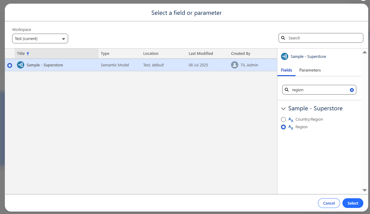
Once this has been brought in you can use this button to filter down your dashboard in the preview view.
In Summary:
-- We have connected to data within a workspace
-- We have built visualisations using multiple features in Tableau Next
-- We have used these visualisations to build a Basic Dashboard
-- We have used Toggles to filter down our dashboard view