


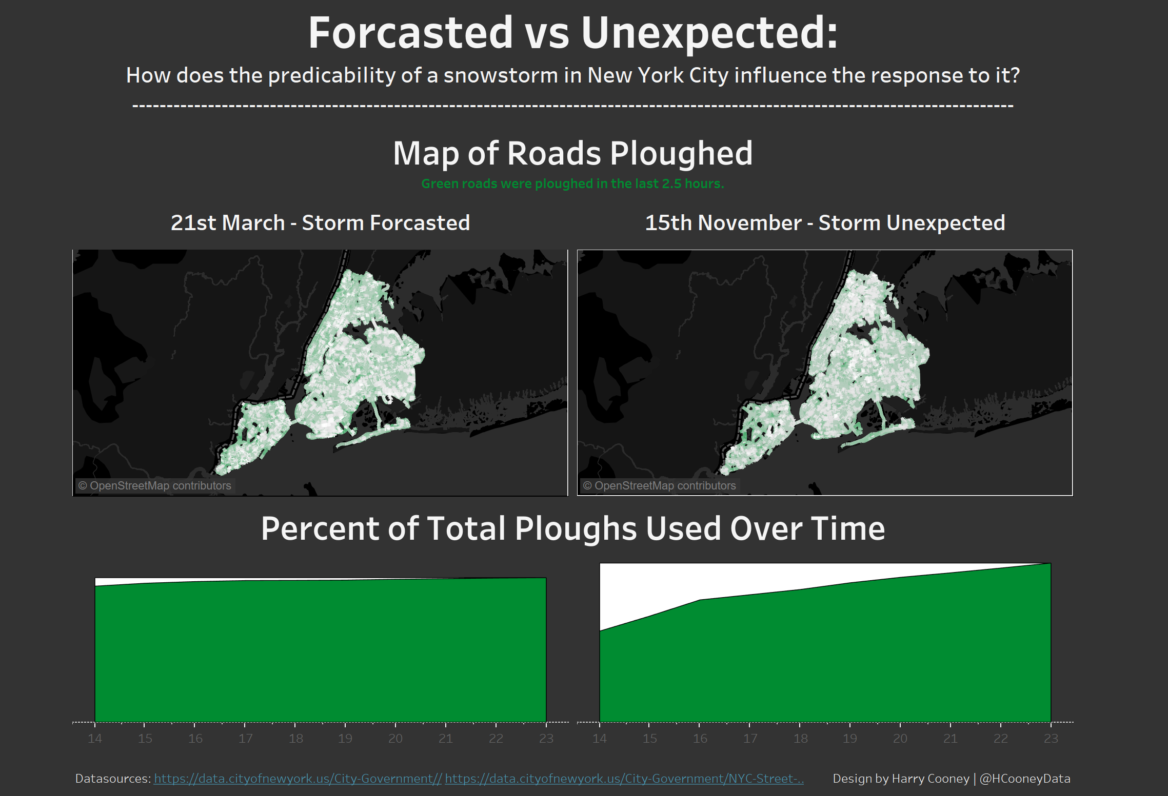
For our first day of Dashboard Week we were given the task of visualising ploughing in New York during snow storms. The original article from which the task was based (found here) looked into plough utilisation on November 15th 2018 due to the poor response to the unexpected snowstorm. The author compared this to the response on the 21st of March when there was a similarly strong snowstorm which was predicted beforehand. I liked this line of thought and wanted to investigate this comparison further with my Dashboard. My initial idea after going through the data was to use the pages shelf to see how plough use developed across the two days via a map of every street, and an area chart showing plough utilisation develop over time. I hoped this would take the author’s argument further and show more clearly that less roads were cleared on the 15th of November and this was due to lower utilisation of snow ploughs. Unfortunately getting the data into Tableau proved difficult and I was left with little time at the end to make my dashboard. I couldn’t make the necessary calculations and so the pages method was abandoned. I did, however, still stick to the same story showing the maps at a point in time (5 O’Clock as in the article) and the plough utilisation over time as a static area chart. Here is an image of the final dashboard:
The first data set included location ID’s, snapshots of times every 15 minutes during snowstorms and the last time each of the locations referenced in the location ID was ploughed. This had to be uploaded to an Exasol server using SQL. It also had to be joined to a spatial file which had the New York City streets mapped and which could be joined using the location ID’s. This spatial file could not be joined with the Exasol server however. Therefore, once the first data set was uploaded we had to connect to it then attempt a join in Tableau. We realised at this point that it was better to take extracts of the specific parts of the data set we wanted to investigate and then join onto that so as to increase load times. Even so, after extracting the two dates I required the data set was still 8 million rows long. It was around half 3 when I was finally able to start building things in Tableau.
Now in Tableau I set about quickly making what I had planned earlier. The calculations to make the animated street map were something I should’ve thought about earlier whilst waiting for the data to be fully loaded as I quickly realised it would not be as easy as I thought. With limited time remaining and long waits for the data to load with every action in Tableau the pause data connection button became my friend. Finally, after many painstaking, thumb twiddling, several minute long pauses I had competed the four charts I wanted to include. Just as I was about to begin formatting them to try out different colours Tableau crashed. I hadn’t saved.
Seething, but also aware I still had 40 minutes and a fresh memory of the charts set up, I restarted Tableau and connected to the data. Again pausing the connection I set up the charts as before and saved. I then tried out different colours, finding it hard to settle on a scheme for street map. I settled on a black background to make the streets that hadn’t been ploughed for over 2-3 hours stand out in white (yes, the colour of snow). Streets that had been ploughed recently and the percentage of ploughs being utilised I coloured green to make them stand out. The maps did not come out as clearly different as I had hoped but it is still evident that the streets were cleared better on the 21st of March, when the storm was predicted. The response as a result of the prediction can be clearly seen in the area charts with the March utilisation of ploughs being much higher than November. Also included in the data was the fact that ploughs were being used earlier in March than in November, another benefit of the forcasting and an explanation for higher plough usage overall. However I did not include this in my dashboard as I wanted the comparison between area charts to be equal and therefore easy to read.
Find my dashboard here.